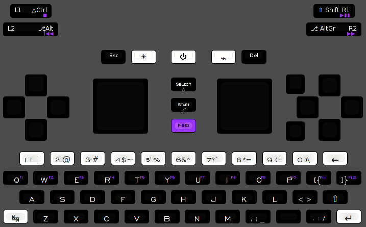
Explaining keyboard layout proposals. Fn hotkeys updated, language switching, powertoggles etc

Functional layout vs reduced layout


  • Total voters
    38

Swapped Shift and Alt, so shoulder Shift is now opposite keyboard Shift.
So with this, Pyra is meta then? Hrm... an interesting idea. On the one hand, the Pandora button is mostly useless, it's functions could easily be subsumed by some other key combo so there's no reason to think the Pyra button needs to be dedicated either. This is a good idea you've pointed out.The location of Tab still bothers me but I'm now thinking that's more to do with just being used to it being on the far left of a normal keyboard rather than any rational reasoning. It could be that after some getting used to it works out just fine.
 
Wizardstan: pretty sure im talking past you, bit tired. Could you propose a change, and what that is better for, then i can explain better so we shed some light on all sides of the issue.

WB: Looks much much better.

Z X  should be  <   >   to be more in tune with standard ISO.

On shoulders, if it was:

L1 Meta                   R1  Shift

L2 Ctrl                      R2 Alt                there would be some sense. You can do that because you have no AltGr.

(old one was: http://www.keyboard-layout-editor.com/#/layouts/a4aa76daa1e52378057f5d7677b478b3)

http://www.keyboard-layout-editor.com/#/layouts/ff3252141f233530ae02dbb250a34424

swapped around some things.

Every numberkey is now a diactric,  also <>   and   ,:_   has one     but    . : / has three...    Of those ä  is really used though. (if you arent hungarian . is ċ ė ı ġ ż Ċ Ė Ġ İ Ż or scandinavian / is ł ø Ł Ø ) scandanavians dont use it like that.  I think its icelandic and polish otherwise.

4 5 6 7 resembles the diactrics used as special letters 2 7 9 0 by the french.

Some layouts have | on the button to the left of 1. Standard ISO is bottom left.

- on 3 is the oddball

* on 8  is standard US/ANSI

? on 7 is russian

\  is standard german 0+1

_ is now in a standard position
 
Last edited by a moderator:
Wizardstan: pretty sure im talking past you, bit tired. Could you propose a change, and what that is better for, then i can explain better so we shed some light on all sides of the issue.

WB: Looks much much better.
Basically exactly what _wb_ did, putting the keyboard shift on the left corner and the trigger shift on the right. It's better because you can use your right hand with the trigger and left thumb to hit those keys which are most often used, and either the trigger and right thumb (which is less comfortable because single handed but can work) or the left thumb keyboard shift and the right thumb for those keys on the right.
 
You have two hands:  Right shoulder shift and right shift is more effective, because that is where punctuation is. You arent tying up left hand, instead left hand gets to focus on typing, also this hand begins most sentences.

You have one hand: You can just right shoulder shift and still use your left hand to type on the right side.

Keyboard shift does nothing so long as you have shouldershift. It never accentuates the shouldershift. Are you lefthanded and like to one-hand operate with left?

You have no hands:  You can still use right shift with pinkey and reach the whole keyboard with index finger. We are assuming here that the pyra is on a table.

Reasons to have keyboard-shift on the right: thats where punctuation is, more effective since it becomes a combo rather than a slalom-event.

Reasons to have shoulder-shift also on the right:  Most sentences start on the left side.

Reasons to have both on the same side:  Convergence. Easier to learn that both are right. Easier when one hand does the shifting.

Reasons to have both on the right:   Thats the side of the key the imprint is on.

When is it you run into a problem?
 
Last edited by a moderator:
Reasons to have keyboard-shift on the right: thats where punctuation is, more effective since it becomes a combo rather than a slalom-event.
So you are hitting the right shift and the punctuation one handed? I don't understand what you're trying to say. Keyboard shift on the left means you can hit it with the left thumb and then use the right thumb to hit the punctuation key. How are you envisioning it working with the shift on the right? What is the left thumb doing?
 
Swapped Shift and Alt, so shoulder Shift is now opposite keyboard Shift.
So with this, Pyra is meta then? Hrm... an interesting idea. On the one hand, the Pandora button is mostly useless, it's functions could easily be subsumed by some other key combo so there's no reason to think the Pyra button needs to be dedicated either. This is a good idea you've pointed out.
We could make it so that a tap of the Pyra button opens the main menu (like the Pandora button does on the Pandora), and still use it as an Fn/Meta/AltGr key in combinations. This is what Ubuntu's Unity does with the Super and Alt keys: tapping one of them does something, but you can still use them as modifiers.

This is annoying if you change your mind mid-combo (you get unwanted main menu popups), so I propose to have this behavior only on the keyboard versions of the modifiers, not on the shoulder ones.

The keyboard Shift, Alt, Ctrl could also have this special behavior when pressed and released without modifying anything: they can be sticky modifiers. I would make the Pyra button sticky too then, for uniformity of behavior, but then of course some other key has to be found for the main menu.

The location of Tab still bothers me but I'm now thinking that's more to do with just being used to it being on the far left of a normal keyboard rather than any rational reasoning. It could be that after some getting used to it works out just fine.
Yes, one would expect Tab on the left, but as comradekingu pointed out, Tab on the right actually makes more sense: when indenting text (e.g. code), it's nice if you can use left thumb for dpad while using right thumb for Tab, Enter, Backspace (and Delete).
 
http://www.keyboard-layout-editor.com/#/layouts/80f840d80a640a966bdd56efda7bce9a

New icon on powertoggle, reflecting that its also hdmi and usb, and radios.

My research suggests brightnesstoggle is most often to the left.

Cleaned space key to have less visual clutter.

Renamed meta.

Edit: Wizardstan, i see your proposed change to the shift as an argument to have two shifts. We do, but not on an equal level. Keyboardshift never offsets the shouldershift.
 
Last edited by a moderator:
Not sure if a general icon reflects what exactly you have to do to toggle things. Or was your plan to make it show a menu? Not sure if that's a good idea...

On my laptop, brightness toggles are on the right (Fn+arrow up/down for display brightness, Fn+arrow right for keyboard backlight (cycles between 5 steps)).

"Press F-ing Q for help!"

Yep, sounds legit...

Can't find much more to improve in my proposal. Suggestions are welcome.

kbd_layout_proposal.png


http://www.keyboard-layout-editor.com/#/layouts/31c8ee9b342fe57cc4fd356c47e1d3e9
 
Tourettes is the new meta. ;)   I noticed F1-F12 is a button on many laptops that have an alternative 6th row. Also on some leopold keyboards. The wireless logitech BT keyboards have a key called F-mode that does the same.  Alt effing R is a very satisfying way of saying commands.   Alt+F-r     is Alt+F4

Fixings.

Z for < and X for >  is an easy fix to get ISO-ish layout

Add underscore to C or V

Make backspace button into ←

Swap ctrl and alt on shoulders. Or swap them on column-row

I would make <> lower left button and place ' and " on N M

Any suggestions for what Meta+L1 should be?  Stop could be useful for phonecalls.
 
Last edited by a moderator:
Tourettes is the new meta. ;)   I noticed F1-F12 is a button on many laptops that have an alternative 6th row. Also on some leopold keyboards. The wireless logitech BT keyboards have a key called F-mode that does the same.  Alt effing R is a very satisfying way of saying commands.   Alt+F-r     is Alt+F4

Fixings.

Z for < and X for >  is an easy fix to get ISO-ish layout

Add underscore to C or V

Make backspace button into ←

Swap ctrl and alt on shoulders. Or swap them on column-row

I would make <> lower left button and place ' and " on N M

Any suggestions for what Meta+L1 should be?  Stop could be useful for phonecalls.
< and > belong on the row of [ ] { } imo.

Underscore could be on C or V, but why not on space? It's a kind_of_space imo.

Backspace ⌫ is nice for symmetry with Insert ⌦.

Swapping Ctrl and Alt again? When I had Ctrl on top you complained that it didn't correspond with column row, now I have Alt on top and they still have to be swapped?

' and " on a dedicated key have the advantage that they can be used as dead diacritics with Pyra.

Super+L1 could be user-definable, e.g. could be another Next or Play/Pause: useful when putting it in your pocket with only the left side exposed (with the volume wheel and audio jack).
 
Not sure if a general icon reflects what exactly you have to do to toggle things. Or was your plan to make it show a menu? Not sure if that's a good idea...

On my laptop, brightness toggles are on the right (Fn+arrow up/down for display brightness, Fn+arrow right for keyboard backlight (cycles between 5 steps)).

"Press F-ing Q for help!"

Yep, sounds legit...

Can't find much more to improve in my proposal. Suggestions are welcome.

kbd_layout_proposal.png


http://www.keyboard-layout-editor.com/#/layouts/31c8ee9b342fe57cc4fd356c47e1d3e9
Suggestion for a 4 way key swap:

Put Insert where + is now.

Put Delete where - is now.

Put + and shift - where Enter is now.

Put Enter where Delete is now.

Logic/reasons for above multi way swap:

Currently Delete is where most users would expect to find Enter (one down from BS).

Any confusion between Enter (launch program) and Delete (delete icon/program/file) should be avoided when possible.

Insert and Delete logically and historically belong with page up, page down, home and end.

Having + and - share a key with shift to make - simply makes sense.

Enter simply 'feels more right' to have directly under Backspace on the upper right side.

If Enter must be on a dedicated key, move F12 to where Insert is now.

IMHO - it's your layout and you asked for opinions.
 
↖↗          Select

↙↘

↘ ↙          Start

↗ ↖

Are those good pictograms to use?

Edit:  No, because without the lettering it fails. Select/ctrl  and start/Alt  is too verbose  Too much to print on each key. For 2key and 3key alike.

SELE
       CTRL

ST  AL       

  ART

SELECTRL

STARTALT 

The easier option would be to print symbols for alt and ctrl and write start select.
 
Last edited by a moderator:
Not sure if a general icon reflects what exactly you have to do to toggle things. Or was your plan to make it show a menu? Not sure if that's a good idea...

On my laptop, brightness toggles are on the right (Fn+arrow up/down for display brightness, Fn+arrow right for keyboard backlight (cycles between 5 steps)).

"Press F-ing Q for help!"

Yep, sounds legit...

Can't find much more to improve in my proposal. Suggestions are welcome.

kbd_layout_proposal.png


http://www.keyboard-layout-editor.com/#/layouts/31c8ee9b342fe57cc4fd356c47e1d3e9
Suggestion for a 4 way key swap:

Put Insert where + is now.

Put Delete where - is now.

Put + and shift - where Enter is now.

Put Enter where Delete is now.

Logic/reasons for above multi way swap:

Currently Delete is where most users would expect to find Enter (one down from BS).

Any confusion between Enter (launch program) and Delete (delete icon/program/file) should be avoided when possible.

Insert and Delete logically and historically belong with page up, page down, home and end.

Having + and - share a key with shift to make - simply makes sense.

Enter simply 'feels more right' to have directly under Backspace on the upper right side.

If Enter must be on a dedicated key, move F12 to where Insert is now.

IMHO - it's your layout and you asked for opinions.
I agree!
 
Not sure if a general icon reflects what exactly you have to do to toggle things. Or was your plan to make it show a menu? Not sure if that's a good idea...

On my laptop, brightness toggles are on the right (Fn+arrow up/down for display brightness, Fn+arrow right for keyboard backlight (cycles between 5 steps)).

"Press F-ing Q for help!"

Yep, sounds legit...

Can't find much more to improve in my proposal. Suggestions are welcome.

kbd_layout_proposal.png


http://www.keyboard-layout-editor.com/#/layouts/31c8ee9b342fe57cc4fd356c47e1d3e9
Suggestion for a 4 way key swap:

Put Insert where + is now.

Put Delete where - is now.

Put + and shift - where Enter is now.

Put Enter where Delete is now.

Logic/reasons for above multi way swap:

Currently Delete is where most users would expect to find Enter (one down from BS).

Any confusion between Enter (launch program) and Delete (delete icon/program/file) should be avoided when possible.

Insert and Delete logically and historically belong with page up, page down, home and end.

Having + and - share a key with shift to make - simply makes sense.

Enter simply 'feels more right' to have directly under Backspace on the upper right side.

If Enter must be on a dedicated key, move F12 to where Insert is now.

IMHO - it's your layout and you asked for opinions.
I agree!
There certainly is merit in those changes, but there are also some disadvantages:

  • no primary "-" means you need an additional modifier to produce it, while hyphen/dash is an important punctuation symbol (according to some sources it's the most important punctuation symbol after comma and period)
  • you lose intuitive zooming shortcuts (often +/- or Ctrl-+/- are used for zoom in and zoom out), while zooming is an important aspect of navigation, especially on a device with a small screen
  • while historically, Ins/Del are with Home/End/PgUp/PgDn, semantically it makes no sense to put them there. Home/End/PgUp/PgDn are navigation keys (just like zooming and arrow keys), while Insert is a rarely used toggle (like CapsLock, NumLock and ScrollLock) which also happens to be used in shortcuts for copy/paste (although probably most people use Ctrl-C/V now, or Ctrl-Shift-C/V in a terminal emulator), and Delete is a forward version of Backspace.
  • a dedicated key for Insert is probably a waste for most people
  • while I agree that confusion between Enter and Delete should be avoided, putting Delete close to Home and PgDn (frequently used navigation keys) could also lead to accidental presses of Delete
  • Enter in the lower-right corner also makes sense if you think about full keyboard with a numeric keypad, and also because it's a very easy to find location, and it makes sense to put it in the comma-period-space cluster since you'll often have period followed by a newline.
  • Ins and Del are lousy labels for game action buttons
If you really want Ins and Del as action buttons (which I still think is not optimal), I would do it like this:

http://www.keyboard-layout-editor.com/#/layouts/ff7d462dece1e957a8c5e735ac0afb21
 
Here's another one, this time with all three Lock keys:

ScrollLock (⤓) at Pyra+X

CapsLock (⇪) at Pyra+C

NumLock (⇭) at Pyra+V

numlock.png


http://www.keyboard-layout-editor.com/#/layouts/d38c19f48236d86d79e8c4a7880fabe0

Requires an extra color for the numeric keypad.

I think this probably makes the labels too complicated, and I doubt people would actually use it; the staggered keyboard rows are not very well suited to emulate a number pad (although with proper care, the labels themselves could be arranged in a perfect grid). But maybe it would be nice for spreadsheet number entry stuff on-the-go. Or for calculator stuff.

If the color of those number keys is changed to something non-distracting (dark blue maybe, or to save on printing costs, just a darker shade of orange/red, like this), then I could live with it. I probably would rarely use it myself though.

Any thoughts?
 
Last edited by a moderator:
I think it's time I give some input into this as it's getting out of hand and becoming a head / desk session.

1) No need for a print button. I mean come on ... it's 2014 and it's not exactly hard to go to the print menu. If you really want to print so badly you can do it that way and think twice. (_wb_ has confirmed it's a print screen button now but still it's confusing).

2) Numlock / extra numpad.. It just adds to confusion. Get rid of it. If you're doing spreadsheet stuff on the go (as this is favoured more as a gaming device vs an office device) use a bluetooth keyboard or something ;) .

3) Fkeys should be associated with numbers.. and assigned to the super key rather than messing with the QWERTY Layout and adding some confusion.

4) Greek Symbols don't look natural, what's wrong with XYAB?

5) Shift / Capslock are not in a position where people would look for them as most keyboards have. Besides they should be one key 

6) Last but not least. Full sized spacebar please. I hate the idea of having to search for the spacebar.

I do agree with:

1)Separate ESC key. (Thank you)

2) The number shift keys (Yes!)
 
Here's an improved layout, more minimalistic:

http://www.keyboard-layout-editor.com/#/layouts/ed68212219179c0c2880086e1017ad03

1) PrintScreen is an existing key on full keyboards, and it's the only one in the PrtScn/ScrollLock/PauseBreak block that is still more or less widely used (for making screenshots). I think it's sufficiently useful to be justified to give it a place (of course not as a dedicated key)

2) I agree.

3) I want F11 and F12 too, and it's nice to have them in a row with F1-F10.

4) The main problem with ABXY is that we already have ABXY keys on the keyboard. Also for emulators there's no way to order ABXY to make it correspond with existing layouts (e.g. Nintendo and Sega order them differently), so it adds confusion.

5) I put Shift back on the left. I dropped CapsLock because it's useless. You can't have it as Pyra+Shift because then you can't do Pyra+Shift combinations (e.g. Shift-F1).

6) Double-width spacebar has many disadvantages: we lose a key, alternative layouts like Dvorak or Russian become impossible. The only advantage it has, is visually. The main reason a full-size keyboard spacebar is a big bar, is to make it accessible to both thumbs. We can't do that.

Edit:

http://www.keyboard-layout-editor.com/#/layouts/65dd2bc5c4c4bd8b750b55b27ba4dc9b

changed / | \ on Pyra+ A S D into \ | /, for easier "cd /" and HTML closing tags </foo>
 
Last edited by a moderator:
Wally: If you have to search for space then you have to search for enter, which is also non-standard visually. That would be a keyboard problem. 1-key wide size has to work, otherwise everything fails. If it does, there is no reason other than initial visual recognition to have doublespace.  Reasons for not having doublespace is a functional one, it takes away one usable key in a quite central position. Usable here means 1-key, since that is what you rely on for the keyboard to work.

Wb: Full keyboards are from 1985. Caps lock is a standard key, and has been ever since keyboards were hardware interrupts that the OS couldnt translate on the fly. And systems that didnt support lowercase anything. Those days are gone.

People regularly didn't have mouse input then, and no net-connection, so they relied on printing.  Printscreening is not a very known use, nor a particularly common use-case.   It would be much more useful to print alt+tab or something else instead. There is a nice little menu option in XFCE for printscreen.

Printing numpad makes the keyboard look like laptops with fake-numpads. Its unprofessional, it makes the layout look cheap. And you lose all benefits of 2perkey. Printing 10  3perkey to have a semi-numpad isnt worth it.

I use 14 3perkey in standard positions to resemble standard layout.  This also uses 14 http://img824.imageshack.us/img824/1137/04kb.jpg   and its a "standard" 66-key layout.

One of the more expensive keyboards money can buy.
 
Back
Top