Design discussion


ShleeDragon

Pro-Catflip
Joined
Aug 28, 2010
Messages
1,749
I'm going to start the basics and continue to edit this as people continue to come up with ideas.


Please try to visualize your ideas. Show an example if possible and list the pros/cons. Please limit the short replies if you're not adding visual content.


Needs:

  • Case: This is a big question - This really needs to be planned sooner than later.
  • Touchscreen: The bigger, the better.. brighter and faster with less ghosting.
    Keep the resistive touchscreen due to precision.
  • speakers and mic: ?
  • Keyboard: ?
  • dpad: The current design is pretty awesome. Id like to see more 8way friendly. [2]
  • nubs: The nubs will likely depend on the case design and hopefully should be more responsive/accurate in P2 - There has been discussion in threads. [1][2]
  • L1/R1 shoulder: These are awesome. Keep them.
  • CPU/GPU: Below.
  • RAM: 1GB or whatever is affordable.
  • wifi: BGN?
  • Bluetooth: Bluetooth 4 is out. worth investigating the costs.
  • Storage: NAND storage: More the better.
  • SD storage: The two slots are great but do we need them?
  • OS: angstorm/OE will likely be kept because the developers like it...


Ideas:

  • Add L2/R2 shoulders:
  • Clickable nubs:
  • Charge over USB:
  • IRDA: If the price is right
  • Camera: I doubt it.
  • pandora online: dd
  • USB hub: - 3 full USB ports on the back?
  • Accelerometer: - If the price is right?
  • HDMI: TV out cable has been a real mess :)


Case:


The Clamshell design works well for protection and the pivoting screen angle helps with playability.

  • Original clamshell design
    256px-PandoraFront.JPG

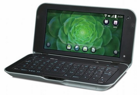
  • The clamshell with a more slim look
    KDDI-au-Sharp-IS01-SnapDragon-powered-Android-MID.jpg

  • Flat unit (Tablet-ish) with screen on the top. controls on the side and a keyboard attached to the bottom.
    wikipad_b.jpg

  • Gaming controller space with a keyboard (This is my personal favorite)
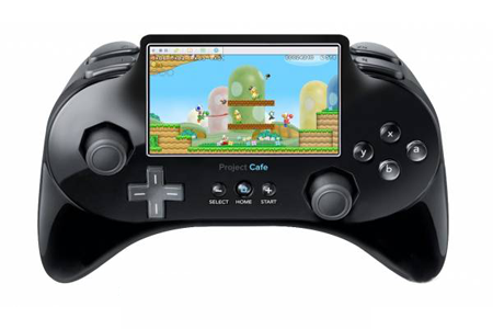
    Project-Cafe-Controller-Concept..png

    The common keyboard design would be placed at the bottom to be used by the thumbs.
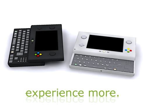
  • Slide with hidden keyboard. More portable, moving parts break. More expensive design.
    Dapeng_T5000_Quad_band_Qwerty_Keyboard_TV_WIFI_JAVA_Slide_Mobile_Phone.jpg

  • gaming tablet with slide keyboard
    sony-psp-phone-concept-2.jpg

  • Gaming portable device with slide keyboard

    11.09.08.tgs.psp_mod_keyboard_size_9.jpg
    xbox_portable_2.jpg


To be continued.
 
Last edited by a moderator:
CPU: This is kind of an obvious discussion and is best left up to the weston to discuss but the CPU/GPU SOCs have become much more advanced due to the massive increase in mobile device performance - The next CPU/GPU should be faster and use less power. win/win.


The major discussion is, the SOC must be equal or more open than the current device. we know the OMAP3530 SGX/DSP has a number of restrictions and issues. hardfp is limited in SGX for this reason. Over time TI has granted us less restrictions over time but that's likely due to the age of the SOC in questions.


Opinions on using sharing a SOC used in other FOSS friendly projects similar to raspberry pi or beagleboard would help with compatibility.


Keyboard: The layout needs to be redesigned with a set of standard repeatable actions in mind. eg: The options button for games/emulations and the quit button. alt/ctrl and start/select. I generally think tab should be used as quit.


Designs coming!
 
Last edited by a moderator:
openmokast_and_openmoko-sm.jpg


Make it possible to add: (by means of an expansion layer)

  • Internal USB devices
  • A second battery
  • or a PCB with GPS, DAB, HSPDA etc


see here


----


I'm imagining a PSP with a keyboard that slides out from underneath;


The lower section would house the battery to maintain balance when open...
 
Last edited by a moderator:
How about:


Upper unit with full-width capacitive touchscreen* & main PCB


Lower part (with battery) slides one way to reveal game controls


slides other way to reveal keyboard


When using it as a desktop, you would control the cursor with a touchpad on the back of the lower part


There would be back, home, menu, search, pandora buttons and a tiny optical (or mechanical) trackball on the upper part


these would make android more practical, and provide a scroll control / mouse buttons


It would certainly uphold the 'take the controls' slogan


dual nubs+trackball+trackpad+touchscreen= :)


*Preferably with added accuracy enhancements
 
Last edited by a moderator:
I think the current clamshell is wonderfull. However I always have this nagging feeling of thinking back to the Sharp Zaurus and feel that the screen should flip over and to be able to use it as a pda haha.


I think in terms of design and build quality there is still nothing like those.


An evolution out of the RD-CMP2000R and the Pandora would be awesome!


sharp_zaurus_1.jpg
 
Last edited by a moderator:
An evolution out of the RD-CMP2000R and the Pandora would be awesome!
quote=quote^5


I'm wondering how much it would cost to add that kind of screen-flip mechanism to a P2 (including any patent fees)
 
Remember, you can forget around 90% of the ideas when you calculate the costs and patented stuff in. ;)


Only Suggestions I have is a better case with less sharp edges and a D-Pad that is not glued on the keyboard mat but held in place like every other D-Pad. So we can change the D-Pad without changing the mat or vice versa if needed. :)
 
I think complexity over form. It needs to be functional, easy to build, hard to break. having 360 turning displays and hinges with extra movement will break and increase production costs.


some of these would require pretty complex molds to be created and that's the main cost.


I'm sure the pandora team know some professionals who would design the casing. The patented stuff is a problem but could be avoided by not just copying an existing design al la the gamecube controller or something.


That said, the clamshell design works really well.
 
Last edited by a moderator:
Maybe because the copies are awful, at an entirely different price bracket, and not a real competitor to the original product


Has anyone thought about using hard/flat-topped keys..?
 
China copies all the time without getting sued?
Yes, and they also copy all the time while getting sued. The lawsuits go nowhere, the accused just close up shop and go elsewhere. I don't think China has an extradition treaty with the USA (or anyone, for that matter) or if they do it's not enforced, so there is absolutely no real recourse if a company wants to shut them down, or recoup direct losses.
 
Has anyone thought about using hard/flat-topped keys..?

It might use thinner hard keys and dome switches.


This is something we're experimenting with at the moment.

nice :)


---


Would it be a good policy to add hardware with no stock purpose?


e.g.


spare buttons


spare leds


a cheap lcd behind the logo on the lid


some external GPIO header pins


an internal usb connector


etc
 
Last edited by a moderator:
Display: Keep resistive touch, add brightness slider: http://www.recycledg..._41993_zoom.jpg


See that slider on the right? Great! I hate software solutions for simple problems.


L1/L2 R1/R2: Not on top of each other but side by side, L1 and R1 smaller than on Pandora1 and pushable on the corner as it is now, L2/R2 next to them.


Like this: [L1] [L2] connectors [R2] [R1]


Keyboard: Keep the layout, its awesome, but: Real Escape button without FN


Nubs: No deadzone. IBM-like trackpoints without continuous self calibration could do the job.


Pros: Very precise, superb mousing, good for shooters, user changeable caps.


Cons: They do not move because they measure the force, not the displacement from center -> you never know if you are at "maximum". They miscalibrate if you push them for a longer time into one direction <- Firmware should only calibrate if point completely still for more than 10 seconds or so.


Case: Function first, design doesn't matter. Its good as is.
 
Last edited by a moderator:
I disagree. While it is great to have L1/R1, the quality of the buttons is tremendously disappointing. They are easily the worst controls on the Pandora.
Could we explore this a bit further? I mean I agree that the quality could be improved, but to me the weak point seems to me purely a matter of ergonomy. I think the click response is fine, don't you? Couldn't we just change out the plastic corners for some rounder rubber ones (at the expense of the continuity of the case geometry)?

Has anyone thought about using hard/flat-topped keys..?

It might use thinner hard keys and dome switches.


This is something we're experimenting with at the moment.
No. :eek: The keys are fine aren't they? They don't seem to be any higher than the rest of the controls. Sure, the special characters and whatnot could be shifted around, but I think the shape, feel, response, and spacing are right as rain.


At least do a poll before killing the keymat... I've truly fallen in love with this handheld specifically for the keyboard's tactile affinity. :wub:
 
Back
Top