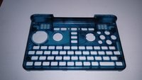
Case Improvements and the keymat


I agree with @Grench. The case by no means needs to be aesthetically 'perfect'. In fact I feel it would add to it's idiosyncratic, community-driven (as opposed to a made-to-measure commercial) nature, with a few unique features. It's not as though they affect the structural integrity or functionality in any way, after all.
 
Best looking case part I've seen to date

32442-feab774a36b313480edc2b814908a349.jpg
 
I agree with @Grench. The case by no means needs to be aesthetically 'perfect'. In fact I feel it would add to it's idiosyncratic, community-driven (as opposed to a made-to-measure commercial) nature, with a few unique features. It's not as though they affect the structural integrity or functionality in any way, after all.
Don't forget, you may want to sell the Pyra also outside of this community some day. ;) You can't expect that they accept everything "suspicious looking" because most people don't have the background insights we may have here.
 
Don't forget, you may want to sell the Pyra also outside of this community some day. ;) You can't expect that they accept everything "suspicious looking" because most people don't have the background insights we may have here.

I've been waiting for it for over 3 years now, so do you honestly think I might sell it again? Nah, not gonna happen ;-)
 
Not isolating heat, but electricity (3.5 KV breakdown).
The usage of graphite was not visible in the datasheet, anyway, if it works, it works :)

BTW: The Heat sink can NEVER heat up more than the processor (second law of thermodynamics) but I know what you mean ;).
Ah, sorry, it is copper and Polyester, not graphite (I was confused).
But yeah, it should be isolating electricity, we want to move the heat away without causing any short circuit :)

And sure, the CPU is hotter on the inside, but on the surface, the heatsink is visibly hotter.
 
This plastic looks better than previous ones because it's semi-transparent - which is something we can't do because of the keyboard backlight.

And the black one looks really horrible... you don't want that. But yeah, maybe a mixture of two colors could be a solution. Would hide the issues and every unit would be unique.
 
maybe a mixture of two colors could be a solution. Would hide the issues and every unit would be unique.

good morning ed,
i could imagine some (c64c like) light beige and maybe a blueberry "fruity-sauce" mixed in and twirled around a bit would look quite nice ...
lets make it some unique art! :cool:
 
Do You mean the "plastic" logo? The idea is to put first the plastic logo, then the aluminium plate so the plate and the case make a "sandwich" where inside is the plastic. I will try to make a little draw of it tomorrow.
 
Yeah, looking at that I can't figure it out either. Given the aluminium plate comes out of a different machine than the case plastics, I can't imagine a way to squeeze the logo plate such that the flanges come out behind the plastics but the face in front, short of bending the plate and hoping you don't go over its elasic limit.

For those thinking that blue doesn't look too bad, make sure you go back to ED's original post of it, then click on the picture to see if full size (I've not idea why that doesn't work if someone's quoted it). The splurge around the right nub is really prominent, and in fact the texture of the coating looks off where you can see the shine on it.
 
Yeah, looking at that I can't figure it out either. Given the aluminium plate comes out of a different machine than the case plastics, I can't imagine a way to squeeze the logo plate such that the flanges come out behind the plastics but the face in front, short of bending the plate and hoping you don't go over its elasic limit.

12914595.jpg


Who the fuck talked about "squeez" something? Bending what? "Elasic"? Are you on drugs @levi?
 
If I'm not allowed to bend it at all, then an aluminium flange just ain't going through a few mm or polycarbonate without breaking it.

Edit: Unless those flanges are in fact tabs, designed to go onto the case then be bent out from the inside. Docbroke below has outlined his concerns with that method though, I thing.
 
Last edited:
@EvilDragon, can we have transparent outer case with solid colored keyboard area. That will solve issue with keyboard backlight.

Do You mean the "plastic" logo? The idea is to put first the plastic logo, then the aluminium plate so the plate and the case make a "sandwich" where inside is the plastic. I will try to make a little draw of it tomorrow.
I think if we use aluminium plate with flanges, it may look either ugly with partially visible flanges or it may be very tight fit in the case, also this may rattle if not very tight fit. I am confused too or may be I am on drugs too :eek:

@levi I didn't noticed your post, as I took too much time typing this.
 
Last edited:
Yeah, looking at that I can't figure it out either. Given the aluminium plate comes out of a different machine than the case plastics, I can't imagine a way to squeeze the logo plate such that the flanges come out behind the plastics but the face in front, short of bending the plate and hoping you don't go over its elasic limit.

For those thinking that blue doesn't look too bad, make sure you go back to ED's original post of it, then click on the picture to see if full size (I've not idea why that doesn't work if someone's quoted it). The splurge around the right nub is really prominent, and in fact the texture of the coating looks off where you can see the shine on it.

The right nub is the injection point. The mold is filled from there. That is where the density and temperature, pressure, and flow differences will be most pronounced?

@EvilDragon I would like to see a picture of the black case you mentioned even if/though it is ugly. It could give us an idea of how bad is bad? It may very well be impossible to fully remove this effect. Maybe it would be more pallatable to have those patterns appear in a primary color instead of black? Gradations of black tend to clash with each other. Gradations of red (or other color), for example, can be quite complimentary.

I suspect that the lid with it's central fill point has an awesome sunburst pattern. Maybe this is something natural to be embraced instead of overcome? Hard to know or speculate on how a depth-less solid color would look from the blue jelly case picture where we see depth and internal textures.
 
Back
Top