Beautiful landscapes are prettier than portraits

What are your feelings about that development?

  • I want the FullHD display, no matter what! It'll look so much better! I don't care about the perform

    Votes: 14 4.0%
  • FullHD would've been nice, but with those issues, HalfHD is better. I still would've preferred FullH

    Votes: 72 20.8%
  • FullHD is overkill anyways in my opinion. HalfHD is way better suited for a screen that size.

    Votes: 139 40.2%
  • CPU performance and easy development are more important than the higher resolution. I'm fine with th

    Votes: 208 60.1%
  • I don't really care about the difference between FullHD or HalfHD - it's more important that the gam

    Votes: 116 33.5%

  • Total voters
    346

I wouldn't call that test image "hard core". I would further explore what exactly you need to do to get the visible differences from that image. There might be specific stuff which doesn't look all that crazy at first glance but which nevertheless triggers weaknesses in the compression algorithm.
 
Based on a few minutes of squinting: Except for the hardcore test, I think I couldn't visually tell which image is the original if given both and an hour to inspect them (visually with zoom, no analysis tools). Expecting a report when you see moving stuff on it :)
 
The only thing I did not see is how pixel art is affected.

Show us a Cave Story image and it's compressed version (a lttp screenies would do) please.

EDIT: and my last concern is about lattency. I know you replied on this. I'm just sceptical and I wanna see for myself
 
Last edited by a moderator:
There must be tools out there that can just take too images and provide a decent metric of how good/bad the compression is that someone might want to investigate.
ImageMagick compare utility. I was playing with it this morning. By default you give it two input images and an output image and it draws anywhere the pixels are different in red to the output. I'm trying to figure out how to make it give relative differences (so you can see shades of blue, etc... where it is different) rather than just a solid red is/isn't different, or at the very least a scale where dark means very different and light means barely different. That would give a more accurate representation.
I wouldn't call that test image "hard core".
It's an image specifically designed to make compression very very hard. That's what makes it hardcore.Using the ImageMagick compare utility, most of the images are just kind of splattered with red, lines tracing objects and letters where there are hard colour borders mostly, and then the hardcore image is almost solid red meaning just about every single pixel was changed to compress it.
 
^ Zoom to the parens
okay see it now.
If you have to zoom in in order to see it, that probably means there's not really a perceivable difference. ;) I displayed the images on a 15" monitor at 1280x720 and then stood 3 feet away basically simulating a 5" screen from one foot away, then I flipped back and forth between the two images rapidly. Personally I couldn't tell the difference.
 
The only thing I did not see is how pixel art is affected.

Show us a Cave Story image and it's compressed version (a lttp screenies would do) please.
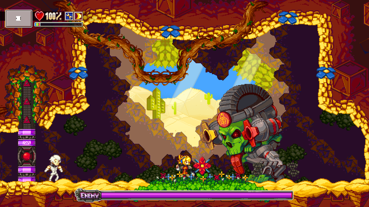
 This. Put up some screencaps from the Iconoclasts, Noitu Love 2, or Legend of Princess. I think konjak's art-style would make for a good test of this algorithm.

Check the lower text in the hardcore-BMP :)
It might be my cheap ViewSonic monitors I have at work.. still not seeing it.
I'll check with my expensive NEC monitors when I get home. :p

-God Ginrai
 
Some quick non-visual inspection shows that the compression corresponds roughly to JPEG compression at quality setting 93, at least in terms of root mean square error and peak signal-to-noise ratio:

$ convert hardcore.bmp -quality 92 hardcore92.jpg
$ convert hardcore.bmp -quality 93 hardcore93.jpg
$ convert hardcore.bmp -quality 94 hardcore94.jpg


$ compare -metric RMSE hardcore.bmp hardcore92.jpg foo.bmp
686.474 (0.0104749)
$ compare -metric PSNR hardcore.bmp hardcore92.jpg foo.bmp
39.597
$ compare -metric RMSE hardcore.bmp hardcore93.jpg foo.bmp
538.724 (0.0082204)
$ compare -metric PSNR hardcore.bmp hardcore93.jpg foo.bmp
41.7021
$ compare -metric RMSE hardcore.bmp hardcore94.jpg foo.bmp
489.303 (0.00746629)
$ compare -metric PSNR hardcore.bmp hardcore94.jpg foo.bmp
42.5379

$ compare -metric RMSE hardcore.bmp hardcore_2X0.bmp foo.bmp
522.842 (0.00797805)
$ compare -metric PSNR hardcore.bmp hardcore_2X0.bmp foo.bmp
41.9621

 For the other test images the results are similar (it's a bit better for images with less entropy).

It's not nearly as bad as JPEG of course, there is no mosquito noise, just typical quantization errors.

Here are the difference images using ImageMagick compare with default settings (not much you can see on those, except maybe the quantization block size):

gradient_diff.png


gta5_diff.png


hardcore_diff.png


skyrim_diff.png


slashdot_diff.png


Knytt_Underground_diff.png
 
This does look good, better than I expected. I actually found Knytt the most visibly different, with a section appearing fuzzier and a high frequency area with a dark to light transition ending up having a darker spot. It's not desirable, but still a pretty minor defect.
 
The only thing I did not see is how pixel art is affected.

Show us a Cave Story image and it's compressed version (a lttp screenies would do) please.
Here you go:

http://evildragon.openpandora.org/Pixelart.zip

Nothing wrong with Cavestory (except that I rather wouldn't like to play it with that resolution... just see how small Mimiga Villag is :eek: ).

You can see some artifacts in the PixelArt images, but there's a hell lot going on as well there (not sure if any game would make use of that).

Still, the artifacts are really only visible when you zoom in a lot - if you can really see them on a 5" screen is something else.

A Link to the Past doesn't make sense - anything that's less than 960x600 px does not need compression, which includes all classic consoles (as 960x600 is more than a classic TV had).

EDIT: and my last concern is about lattency. I know you replied on this. I'm just sceptical and I wanna see for myself
Well, there CAN'T be a high latency technical wise, as the RAM doesn't take more than 2 frames, so with doublebuffering (which is does), the whole thing would not work if it would need more than 1 frame for everything ;)

This does look good, better than I expected. I actually found Knytt the most visibly different, with a section appearing fuzzier and a high frequency area with a dark to light transition ending up having a darker spot. It's not desirable, but still a pretty minor defect.
Yes, I saw that as well.

Actually, I do wonder if you could see that with a touchscreen in front of the screen - as the touchscreen damages the LCD crispiness as well (you should see a Pandora screen with the touch removed... it's a lot more crisp!
 
A Link to the Past doesn't make sense - anything that's less than 960x600 px does not need compression, which includes all classic consoles (as 960x600 is more than a classic TV had).
That's forgetting the pixel doubling/trippling that will take place on the pyra. How will we take advantage of the large resolution if we cant do these type of things ? ;)
 
A Link to the Past doesn't make sense - anything that's less than 960x600 px does not need compression, which includes all classic consoles (as 960x600 is more than a classic TV had).
I was going to say "what if we want hq3x scaling or something" but even at 3 times the SNES was still under that many pixels... assuming the 960x600 is an example resolution and the actual storage space is 5760000 pixels, not hard borders.
 
The only thing I did not see is how pixel art is affected.

Show us a Cave Story image and it's compressed version (a lttp screenies would do) please.
Here you go:

http://evildragon.openpandora.org/Pixelart.zip

Nothing wrong with Cavestory (except that I rather wouldn't like to play it with that resolution... just see how small Mimiga Villag is :eek: ).

You can see some artifacts in the PixelArt images, but there's a hell lot going on as well there (not sure if any game would make use of that).

Still, the artifacts are really only visible when you zoom in a lot - if you can really see them on a 5" screen is something else.

A Link to the Past doesn't make sense - anything that's less than 960x600 px does not need compression, which includes all classic consoles (as 960x600 is more than a classic TV had).
Could you please try it with these images?

tumblr_mutpxfnIsH1rihtq2o1_1280.png


ScreenHunter_06+Oct.+28+20.05.jpg


Iconoclasts_9dec2012-2013-01-04-21-31-48-57.jpg


-God Ginrai
 
There's some visible discoloration in the pixelart images, but only visible when zooming or knowing where to look.
 
A Link to the Past doesn't make sense - anything that's less than 960x600 px does not need compression, which includes all classic consoles (as 960x600 is more than a classic TV had).
I was going to say "what if we want hq3x scaling or something" but even at 3 times the SNES was still under that many pixels... assuming the 960x600 is an example resolution and the actual storage space is 5760000 pixels, not hard borders.
Also for emulation of classic consoles there should be no problem to bypass the rotation chip completely, use the screen losslessly in portrait mode and do the scaling/rotation manually on the second core.

Similarly, anything GPU-based should not be too hard to convert so that it renders everything to an uncompressed portrait screen.
 
Well, only the first one was uncompressed, the second and third one was already horribly compressed with JPEG (clearly visible), but I compressed them as well, as it shows how the compressor handles already compressed pictures.
Yea, I realized the other 2 were uncompressed. I figured it was worth it to see how it would handle it, since I am not anywhere near my home computer to make uncompressed screencaps.

I'll check these first thing when I get home. :) Thanks for running these images.

-God Ginrai
 
Last edited by a moderator:
Back
Top