MDave
ZEQ2 Lite Developer
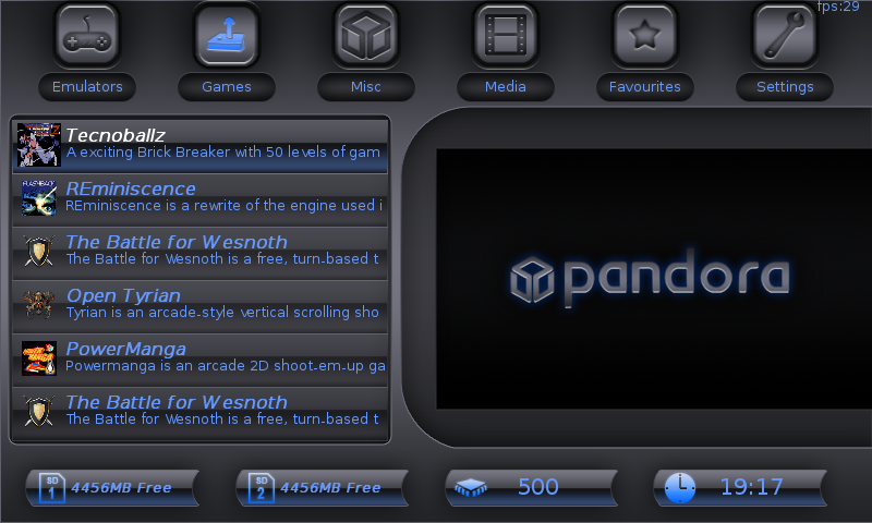
Finished my Shotgun theme  and it's uploaded to the FTP.

The font rendering is a bit shitty :/Paradox said:(naw)mcx said:Thanks to all the guys who offered me help and helped me, you're all awesome
(dflemstr, tripmonkey_uk, trevsweb)

First peak at it actually running in pmenu
font could use some work
dflemstr said:OK thanks for the feedback guys...
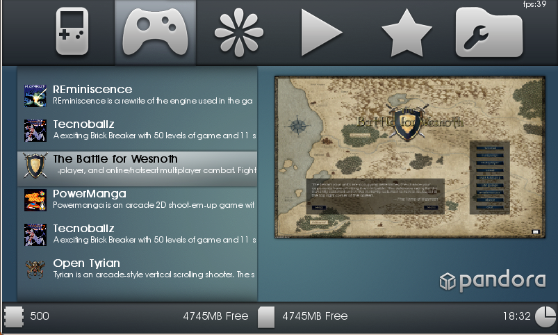
Does this look better? (I can rearrange the bottom widgets if you think it looks better but I prefer to have the clock where it is, because PMenu can't right-align text so the clock would clip outside of the screen if it was to the right)
<imgsnip>
fusion_power said:Hach, an uns denkt mal wieder keine Sau.dflemstr said:Nein, Umlaute scheinen überhaupt nicht zu funktionieren. Ich kriege nicht mal eine Mitteilung auf der Konsole wenn ich eine PND lade, die Umlaute in ihre Beschreibung hat. Ich weiß aber nicht ob das an mein Font liegt oder ob es ein Fehler in PMenu ist.Zumindest das .PND Format sollte Sonderzeichen aber hinbekommen, hoff ich mal.
(naw)mcx said:The font rendering is a bit shitty :/Paradox said:(naw)mcx said:Thanks to all the guys who offered me help and helped me, you're all awesome
(dflemstr, tripmonkey_uk, trevsweb)

First peak at it actually running in pmenu
font could use some work
You can already include a TTF or OTF font inside of the skin, which is better than any bitmap fontmap system out there (you can even take a bitmap ttf font and use that)Paradox said:would it be possible to use images for each number/letter? then you could use whatever font and it would look snazzy, if not maybe this could be a feature on the to-do list?
Well, the text scrolls... 'Nuff said.Paradox said:also, it looks a bit bad where the descriptions of things just get cut off, they should end with a few "..." before they reach the edge of the box so it looks cleaner.
what does it look like if there are more items in the lists than can be displayed, does a scrollbar show up? can that be skinned aswell?
No, PMenu doesn't allow for that.Paradox said:also in pmenu is it possible to display the time in 12 hour as an option? I mean I dunno what kind of features or configuration it has but i'd like 12hour time with AM/PM showing, if possible Cpasjuste
Ich habe das selbst zugesehen. Das PND-Format unterstützt alle Symbole in der Welt, was bedeutet dass Sprachen wie Chinesisch usw auch unterstützt sind.fusion_power said:Hach, an uns denkt mal wieder keine Sau.dflemstr said:Nein, Umlaute scheinen überhaupt nicht zu funktionieren. Ich kriege nicht mal eine Mitteilung auf der Konsole wenn ich eine PND lade, die Umlaute in ihre Beschreibung hat. Ich weiß aber nicht ob das an mein Font liegt oder ob es ein Fehler in PMenu ist.Zumindest das .PND Format sollte Sonderzeichen aber hinbekommen, hoff ich mal.


I'll have a look later! I'll see what I can do for you, babesParadox said:(naw)mcx said:The font rendering is a bit shitty :/Paradox said:(naw)mcx said:Thanks to all the guys who offered me help and helped me, you're all awesome
(dflemstr, tripmonkey_uk, trevsweb)
First peak at it actually running in pmenu
font could use some work
the icons at the top might be a tad big too but maybe i'm just not seeing it as it would be on the pandora.
could you try some smaller icons with maybe text below them for the category names, just for me?
would it be possible to use images for each number/letter? then you could use whatever font and it would look snazzy, if not maybe this could be a feature on the to-do list?
also, it looks a bit bad where the descriptions of things just get cut off, they should end with a few "..." before they reach the edge of the box so it looks cleaner.
what does it look like if there are more items in the lists than can be displayed, does a scrollbar show up? can that be skinned aswell?
also in pmenu is it possible to display the time in 12 hour as an option? I mean I dunno what kind of features or configuration it has but i'd like 12hour time with AM/PM showing, if possible Cpasjuste
monkeyo2 said:I've tweeked the highlights on my Tungsten skin (SlashEMc2k was right, the lens flare looked shit!):
And I've also gone back an tweeked my first skin (that I've also renamed Magnetite as it slightly less bad than the old name), and made a few slight changes. I think fusion_power was right about the confirm box A & B being too dark, so they're white now, I've also made the Infos text a little bigger and have just tweeked the Category icons:
I think I'm happy enough with them that I can leave them alone now (and stop filling up Cpasjuste's FTP server! (you can delete the old ones now)). I'm looking forward to trying them out on the real machine!
Well it was such a good idea, I'm just surprised nobody had come up with it beforeMDave said:Bleh, you're copying me with naming skins after elements
1 - The small font in the application list does not honor the highlight color when selected.
-> Fixed
2 - The icons in the application list start out at the default 32px, even when you specify a different max or min size in the skin.cfg
-> That's "normal". I can't do all dynamic for now, would need a lot more work. For now you can just set the minimal/maximum scaling like the configuration name say ( icon_scale_max ). When pmenu will be "stable", and that i will have cleaned the code, i will work on stuff like that.
3 - Because of bug 2 - You can't specify a icon size of 0 (no icons in app list) because on first load the list displays an icon on the first entry anyways.
-> Same as 2, it will show the "no icon" for code simplicity.
4 - The media list runs off the right side - it does not honor the width specified for the application list.
-> Fixed
5 - The skin preview image does not honor the maximum width for the preview area. It does not scale to match the area requested. If you make the preview area any smaller or larger than the default, the skin preview image does not look right at all.
-> Fixed
6 - The confirm box's confirm_box_x and confirm_box_y attributes are ambiguous. Do they specify the height and width of the confirm box area? Or do they specify the position the confirm box should center on? Either way, they don't appear to affect anything.
-> Fixed ( yes it's the center x/y postition, was not working )
7 - The PND loader does not respect the standard; the categories are read incorrectly.
-> Todo with skeezix
8 - The dialog says "to your favorites applications" instead of "to your favorite applications"
-> Fixed ( favourite )
9 - There's no way to specify the text margin for the dialog box
-> See 2
10 - There's no indicator in the applications menu for that there are more entries if you scroll down
-> Good idea, i leave that in the todo list
11 - You cannot use a mouse/touchscreen.
-> See 2
12 - Fonts aren't aligned properly; glyphs tend to overlap and look misplaced.
-> Partially fixed, fonts will now be correctly rendered, except for the scrolling line.
13 - The scrolling text under applications scrolls once and then disappears
-> Never saw that ! Did someone spot this problem too ?
14 - The scrolling text under applications has a visual glitch when glyphs leave to the left: they disappear one glyph at a time instead of linearly fading away.
-> Fixed in GLES2D
15 - Animations are sequential which makes the UI look and feel slow
-> Not sure what you mean, but i bet it's a problem with the PVR emulator or something like that, nothing i can do.
16 - Things that should fade do instead disappear/reappear instantly e.g. when you go down in the applications menu, the selector moves to the new application instantly. Same for categories.
-> It's a good idea, will try to add that later
17 - Not really a bugs, but featurettes that I hope to see soon:
The confirm box should have it's own font settings, or at the very least it's own color.
If bug 6 specifies height and width. The confirm box should be placeable. I can fudge it by adding blank pixels to the margins, but this is less than ideal.
-> In fact this confirm box should have the width/height i want it to be, because i'm writing information text to it, and don't want to resize it automatically to not loose buttons or something else ratio etc.
Cpasjuste said:Monkeyo, really like your skins, but for Tungsten, you should made it less darker (maybe like magnetic) because on the pandora it's too dark.
Also, would like to get all your skins updated before a week, if possible of course
No problem, I've got the day off work tomorrow, so I should be able to fix everything then (expect another two ZIP files on the FTP server!).Cpasjuste said:Monkeyo, really like your skins, but for Tungsten, you should made it less darker (maybe like magnetic) because on the pandora it's too dark.
Also, would like to get all your skins updated before a week, if possible of course

