You are using an out of date browser. It may not display this or other websites correctly.
You should upgrade or use an alternative browser.
You should upgrade or use an alternative browser.
Artist For Pmenu Skins Wanted
- Thread starter Cpasjuste
- Start date
Near_Kstor
Member
Oh, so you did given up on the background of your skin, Conso? I really liked it... Any chance we could get it with at least a similar bg? =/
Anyway, it is a great work! =]
Anyway, it is a great work! =]
conso
Active Member
- Joined
- Feb 29, 2008
- Messages
- 758
Near-kun said:Oh, so you did given up on the background of your skin, Conso? I really liked it... Any chance we could get it with at least a similar bg? =/
Anyway, it is a great work! =]
Hmm... it obviously needs some tweaking, but should be rather trivial.

Last edited by a moderator:
mindlord
Notices Two Things
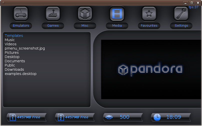
Updated Steampunk to take advantage of the lastest features and I found some open fonts that look pretty good. Someone suggested reversing the orientation of the application and preview areas, and I like it.

Download from cpasjuste's ftp

Download from cpasjuste's ftp
dflemstr
It's a ball.
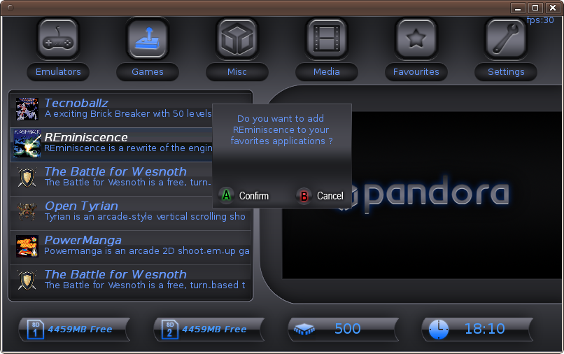
Could someone please fix the application strings so that it doesn't say "favorites applications"? Thanks. 
(Yeah, I know that you say "les applications favorites" but you don't in English)
(Yeah, I know that you say "les applications favorites" but you don't in English)
MDave
ZEQ2 Lite Developer
Nice skins guys! 
I think I'm finished with my Shotgun theme, although I'll listen to comments before I upload it


I think I'm finished with my Shotgun theme, although I'll listen to comments before I upload it
borgqueenx
Well-Known Member
thats a nice one, but needs some more tweaking by my opinion.mindlord said:Updated Steampunk to take advantage of the lastest features and I found some open fonts that look pretty good. Someone suggested reversing the orientation of the application and preview areas, and I like it.

Download from cpasjuste's ftp
Last edited by a moderator:
bzar
A Commando
Cpasjuste, an idea for the next version (when you add features): A layover for the preview box. We could do all sorts of things with that like rounded corners, ripped edges, glassy look... you get the picture 
Oh, also if you add features I think it would be a good idea to make as many skin parameters optional as possible. Most importantly the new features, so old skins don't need to be retrofitted. Smart defaults for the config file.
Mouse control still seems to be missing. Otherwise, I'm mostly good
Oh, also if you add features I think it would be a good idea to make as many skin parameters optional as possible. Most importantly the new features, so old skins don't need to be retrofitted. Smart defaults for the config file.
Mouse control still seems to be missing. Otherwise, I'm mostly good
mindlord
Notices Two Things
Could you be more specific?borgqueenx said:thats a nice one, but needs some more tweaking by my opinion.mindlord said:Updated Steampunk to take advantage of the lastest features and I found some open fonts that look pretty good. Someone suggested reversing the orientation of the application and preview areas, and I like it.
(Image)
Download from cpasjuste's ftp
Last edited by a moderator:
monkeyo2
Member
Hey MDave, that's a good one, you should definitely upload it!MDave said:I think I'm finished with my Shotgun theme, although I'll listen to comments before I upload it
I do have a question though, how do you adjust the width of the the text area on the confirm box? I've tried playing with confirm_box_x, but that doesn't seem to do anything.
Last edited by a moderator:
MDave
ZEQ2 Lite Developer
Thanks! Just going to do a few more tweaks then I'll upload 
In reply to your question; It seems to change depending on the number of letters for the name of the application. Font size and the font itself could screw things up a bit too if the font has weird sizes or letter width.
In reply to your question; It seems to change depending on the number of letters for the name of the application. Font size and the font itself could screw things up a bit too if the font has weird sizes or letter width.
fusion_power
Advanced Member
I like your Steampunk Theme. Yes, the new Font is much better now. Maybe the selected Icon on top could stay out somehow, bigger, or glowing maybe, A Shadow under the Icon... something like this.mindlord said:Could you be more specific?borgqueenx said:thats a nice one, but needs some more tweaking by my opinion.mindlord said:Updated Steampunk to take advantage of the lastest features and I found some open fonts that look pretty good. Someone suggested reversing the orientation of the application and preview areas, and I like it.
(Image)
Download from cpasjuste's ftp
Sadly, the current Menu engine can't do more effects for the bottom line like I suggested some time before, this would fit very well within such a Theme. ^_^
The small "Add to favs" window could look better with a complete (golden?) frame around.
Last edited by a moderator:
mindlord
Notices Two Things
fusion_power said:I like your Steampunk Theme. Yes, the new Font is much better now. Maybe the selected Icon on top could stay out somehow, bigger, or glowing maybe, A Shadow under the Icon... something like this.
Sadly, the current Menu engine can't do more effects for the bottom line like I suggested some time before, this would fit very well within such a Theme. ^_^
The small "Add to favs" window could look better with a complete (golden?) frame around.
Shadows? No problem. I agree a complete border will make the dialog box stand out better. I'll put this advice to use in the next revision. I think I might have a possible compromise on the time and cpu speed. Unfortunately I can't control precisely the location of the SD card sizes, so no hope there. I kinda wish cpasjuste has left the option for bitmapped fonts in. I could do some nice stuff with that.
Last edited by a moderator:
mindlord
Notices Two Things
fusion_power said:I like your Steampunk Theme. Yes, the new Font is much better now. Maybe the selected Icon on top could stay out somehow, bigger, or glowing maybe, A Shadow under the Icon... something like this.
Sadly, the current Menu engine can't do more effects for the bottom line like I suggested some time before, this would fit very well within such a Theme. ^_^
The small "Add to favs" window could look better with a complete (golden?) frame around.
Shadows? No problem. I agree a complete border will make the dialog box stand out better. I'll put this advice to use in the next revision. I think I might have a possible compromise on the time and cpu speed. Unfortunately I can't control precisely the location of the SD card sizes, so no hope there. I kinda wish cpasjuste has left the option for bitmapped fonts in. I could do some nice stuff with that.
Last edited by a moderator:
borgqueenx
Well-Known Member
the square that shows the image of the game, is not filled by the image of the game. Also, the box that asks yes/no doesnt have edges.mindlord said:Could you be more specific?borgqueenx said:thats a nice one, but needs some more tweaking by my opinion.mindlord said:Updated Steampunk to take advantage of the lastest features and I found some open fonts that look pretty good. Someone suggested reversing the orientation of the application and preview areas, and I like it.
(Image)
Download from cpasjuste's ftp
and finally the red color on the status bar aint really fitting well with the maya theme.
Ofcource everything's a matter of opinion.
Last edited by a moderator:
monkeyo2
Member
Ain't that the truthMDave said:It seems to change depending on the number of letters for the name of the application. Font size and the font itself could screw things up a bit too if the font has weird sizes or letter width.
Anyway, I wasn't really happy with my Tungsten skin, so I went back and did a bit of tweeking myself (sorry for uploading all the previous versions Cpasjuste, I kept thinking it was finished, and then not liking it the next day! Half of them are versions I'd forgotten to deleate stuff from before uploading).


monkeyo2_Tungsten_v006.zip
Also, this is my 100th Post! WooHoo!
(I'd like to thank God, my router, Eddie Murphy, etc. etc.)
Last edited by a moderator:
Trip
Sorry, but I suck at explaining stuff :P
Very, very nice Monkeyo2 
mindlord
Notices Two Things
This can't be fixed, since the engine has no way to allow the skin to appear over the preview. So the outside edge of the preview can't be larger than the inside edge of the circular flourishes.borgqueenx said:the square that shows the image of the game, is not filled by the image of the game.
Someone else mentioned this already, and I plan on adding edges in the next revisionAlso, the box that asks yes/no doesnt have edges.
and finally the red color on the status bar aint really fitting well with the maya theme.
Ofcource everything's a matter of opinion.
Crushed red velvet appears frequently in Steampunk.
Last edited by a moderator:
SlashEMc2k
Still Fresh
New skin by Monkey02 is awesome!
I love the highlight of the selected app/game great idea..
Only one thing I dislike is the lens flare over the highlighted section the rest is great!
I need to find some time to complete my skins.. sigh not enough time in the day...
I love the highlight of the selected app/game great idea..
Only one thing I dislike is the lens flare over the highlighted section the rest is great!
I need to find some time to complete my skins.. sigh not enough time in the day...
monkeyo2
Member
Thanks Slash (& Trip), I only hope Cpasjuste re-emerges to make use of all these skins!SlashEMc2k said:Only one thing I dislike is the lens flare over the highlighted section the rest is great!
I know lens flares are a bit clichéd, but in my defence I would say that I did construct it myself rather than using filters, and it looks better when it's pulsing in the application. I couldn't think of a better idea that would work behind all the different icons, but I'll have another look at it next week with a fresh set of eyes and see if it annoys me or if I can think of anything better.
I ended up doing the app_highlight like that to fill the big space under each item that was created by having the game icons so big. Initially I would have preferred to have been able to move the text down, but Cpasjuste has probably had enough feature requests, and I've always admired Jack White's philosophy that limitation breeds creativity!
Last edited by a moderator:
Similar threads
- Replies
- 46
- Views
- 10K
- Replies
- 21
- Views
- 7K


