Appstore Look


stustaff said:
So how are we going to use the pandora to browse normal websites? one of the MAIN reasons why I bought it!

Fennec.
 
Last edited by a moderator:
iBrew said:
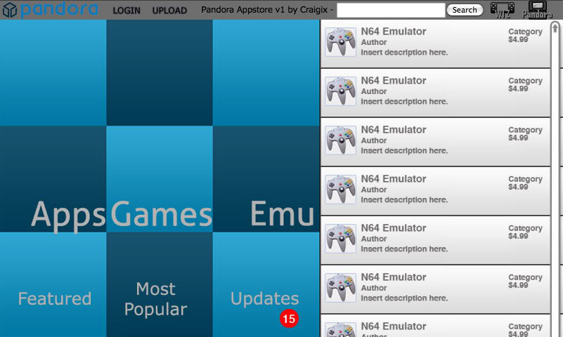
I could definitely live with this design. Although reducing the size of the text of "Apps, Games, and Emu" area and centering it would make it look better. Just my two cents. One more thing - the updates counter in the bottom right doesn't look right - how about a red triangle in the bottom right hand corner of the box instead?
Yeah, I've just slapped everything in really. I'm reluctant to put too much energy into fine tuning a visual concept before we know if it's going to be practical for Craig to implement. On the other hand, I do feel like playing some more. Stay tuned. :p
 
Last edited by a moderator:
When I first read about the appstore, I assumed it would be more or less like this:

appstore.png
 
Very nice, conso =] I would be great to have matching skins for the App Store and the pmenu =D
 
dschroeter said:
I slapped together a (barely) functional version with just HTML and CSS here. I've minimally tested it in FF and IE; I'd love to know how it renders on The Device. I'm going for super-simple here; people should remember that rollover effects aren't that important on a touchscreen. Yes, I stole the graphics from greendots. Let me know how it renders on other OSs and browsers!
With the new changes, it looks great!

Here's a screenshot using WebKit:

 
Last edited by a moderator:
Gruso said:
I've mashed up some of the ideas from craigix, naw(mcx) and ibrew. It's a photoshop hack only, done without any regard for the coding side of things.
appstoremashup.jpg
Gruso wins!
Though I might add a little bit to the header to make it more readable at Pandora-size. And since there is that extra space at the bottom where you see only half of the next app there should be some room. Also, all of these need a 'My Account' type button where you can look at the apps you own, check your balance, add to your balance, and whatever other stuff you might do.
 
Last edited by a moderator:
Here's my take on it. It's already coded in HTML/CSS, about 15kb all in all. The text title would of course be replaced with the nice Pandora logo.

screenshot.png


It seems usable zoomed out to 10cm, the screen is deceptively small due to its incredibly high resolution :)

Feedback appreciated!
 
Another excellent one Alex. One thing I'd like to see added is easier access to categories.

Any chance of a live link at some stage?


[edit] General question for Craig. Do you plan to go ahead with the app rating feature? As I understand it, ratings were removed from the file archive because they were too easily skewed by idiots. Beta releases with known bugs, or emus that "won't run Goldeneye", are going to be downrated into the ground by people who don't understand WIP software.

Maybe ratings could be applied to paid-for software only?
 
Gruso said:
[edit] General question for Craig. Do you plan to go ahead with the app rating feature? As I understand it, ratings were removed from the file archive because they were too easily skewed by idiots. Beta releases with known bugs, or emus that "won't run Goldeneye", are going to be downrated into the ground by people who don't understand WIP software.

Maybe ratings could be applied to paid-for software only?
How about replacing them with "Guru Picks"?
 
Last edited by a moderator:
conso said:
When I first read about the appstore, I assumed it would be more or less like this:

appstore.png

i vote for this one. Big Icon's at the top and clean lines and easy navigation if you mimic it on your screen using your finger =P
 
Last edited by a moderator:
2j3p4k7.png


I've listed categories down the left, and treated the generated groups (most popular etc) much the same as regular categories.
At the bottom is a tabbed pane showcasing a subset of the selected item (random/most recent/highest rated, as appropriate; depending on Javascript support it could dynamically update). Clicking on the arrow shows the full listing.

I'd try to support a collapsing category list, so you can space things out more for easier stylus/fingertip navigation.

2cqcleg.png


Category view, also showing some example logged-in features. (It doesn't make much sense to have an Upload link without being logged in.)

There's more to add to the header row (News, Help/About etc) so I'd shrink the logo a fair bit to make room for more buttons.
 
Here's another. I actually had to redo it blowing everything up about 20% after measuring the preview screen to 4.3 inches to see how it would look like. Shouldn't be too small for fingers, just perfect for the stylus.

BiggerMenu.jpg
 
darien said:
Here's another. I actually had to redo it blowing everything up about 20% after measuring the preview screen to 4.3 inches to see how it would look like. Shouldn't be too small for fingers, just perfect for the stylus.

ladies and gentlemen, we have a winner.
 
Last edited by a moderator:
I like conso's and darien's the best. Though, wouldn't it be possible to put more than one theme up and let the person using the site choose which one they want to use? I've seen it on a lot of sites (especially forums).
 
Here is mine:
http://jefe.comxa.com/Apppand/

Its really early, but I only just figured out how to implement the drilldown in browser, so it won't take long for me to fix it up to a much nicer version
I made it in dashcode, I will add a bar at the top with a home screen button for a "featured" page and I will continue adding categories until it reaches the actual selection of program level
also, its extremely flexible, dashcode makes it for iphone, so it will have no trouble fitting on pandora.
edit: forgot to mention, it takes all the lists in json format, so its easy to add and manipulate the lists
 
Damn, I really wish I had more free time because I would love to give this a go. Is there any sort of timeframe we're looking at here for template submissions?
 
Back
Top