ekianjo
Hardcore Member
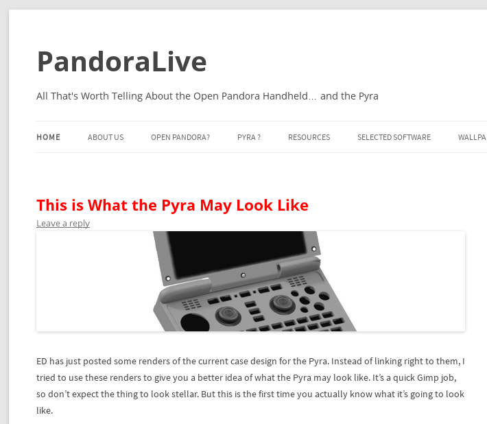
I did some quick and dirty work based on ED's renders to imagine what the Pyra may actually look like... 
--> Continue Reading

--> Continue Reading

Last edited by a moderator:


You don't say...It looks like Pandora.
To be fair, it's an early prototype. I'm pretty sure this will be improved upon, at least a little. One thing that worries me, though, is the keyboard. It seems that the keys are all going to be smaller than the ones we have currently, and for thumb typing this is not ideal...It looks like Pandora.
Thanks, glad this was useful for other people tooyou sure are a neat guy ekianjo. Thanks so much for the picture. I actually am quite pleased with the way this prototype is. My concern was the exact same thing, the size of the keys. At least this is just a prototype and I believe ED said that he was going to make some changes once the chips are ready to go
Yeah ... that's true...maybe it just looks bad in the pic but it might not be so bad once it's in your hand. He did say he was working on the keymat so this maybe be what we will be stuck with for now, but I am sure if he feels it doesn't work he will change it for the best. Let us wait and see. I have my faith in ED.The reason why I am concerned with the size of the keys is that it does not sound that it's something that can change later down the road -> ED mentioned he will get a prototype case and then contact the keyboards mat manufacturers for quotations... means he probably has some specs already fixed, I assume ? I really hope he confirms it's really oK even with reduced key size. This is a super important aspect of the device.
It does occur to me that the smaller size keys is less likely to be an issue if the amount of travel required to fully press each key is also reduced, but I'm also hoping that less travel was one of the design criteria anyway.
I see... Didn't pay attention to you wanting to reduce the space.
The plastic between the buttons is going to be prone to breaking in your layout. Not much material, close to places where people press stuff -> that's probably not acceptable from a material strength standpoint.
It's hard to show it at an angle, but the amount of plastic between the buttons should be at least as much as is vertically between the keys on the keyboard. If we can get a top-down image of the layout, I could illustrate this much easier.The plastic between the buttons is going to be prone to breaking in your layout. Not much material, close to places where people press stuff -> that's probably not acceptable from a material strength standpoint.

