This is What the Pyra May Look Like...


The plastic between the buttons is going to be prone to breaking in your layout. Not much material, close to places where people press stuff -> that's probably not acceptable from a material strength standpoint.
It's hard to show it at an angle, but the amount of plastic between the buttons should be at least as much as is vertically between the keys on the keyboard. If we can get a top-down image of the layout, I could illustrate this much easier.

-God Ginrai
Would you feel near satisfied if the two 5th and 6th buttons were shrunken like in ED's layout proposal, so long as they're in the right places like in Natsu's pictures a few posts back?  I know that your preference seems coolest, but something more like Natsu's picture seems easier to talk in.  I would still feel comfortable if two of the buttons were shrunken, I would still feel comfortable if all six were shrunken, it's just the placement that effects me personally.
 
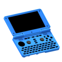
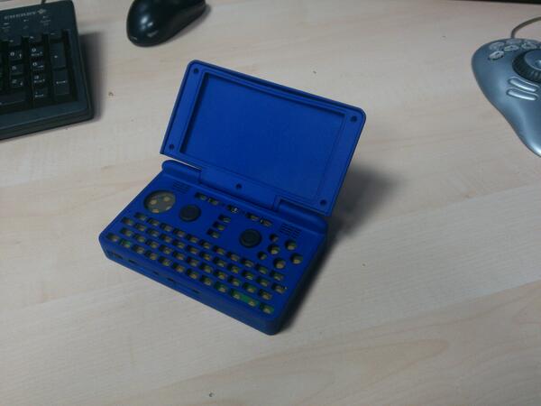
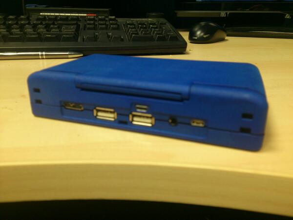
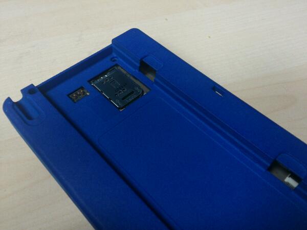
I did some quick and dirty work based on ED's renders to imagine what the Pyra may actually look like... :)


--> Continue Reading

attachicon.gif
pyrapromo.png
Isn't that lid pushed too far down?  I see the inside of the right hinge - which should be where the bottom edge of the lid covers...?
 
Last edited by a moderator:
Personally, if we're going with 6 buttons with two shrunken ones, I'd rather have them on the left as per ED's design than on the right as per Natsu's. I'd rather light punch/kick be disadvantaged than hard punch/kick. And it seems to me that N64 emulation is as disadvantaged by a Sega-style layout as it is by ED's design (I posted my mapping in the other thread). Those are my two use cases for six face buttons, and to be honest in both of them I'd be happy to use two of the new shoulder buttons so we'd only need four face buttons. Meh.
 
 
It's hard to show it at an angle, but the amount of plastic between the buttons should be at least as much as is vertically between the keys on the keyboard. If we can get a top-down image of the layout, I could illustrate this much easier.

-God Ginrai
What about the screw?

Personally, if we're going with 6 buttons with two shrunken ones, I'd rather have them on the left as per ED's design than on the right as per Natsu's. I'd rather light punch/kick be disadvantaged than hard punch/kick.
How would hard punch/kick be disadvantaged?
 
What about the screw?
That would be up and right from the upper-right buttons. There would be no conflict. The actual spot of the screw is right near the right edge of the case just below that gap next to the speaker grates.

-God Ginrai
 
Last edited by a moderator:
My attempt at putting the pieces together (included back piece of lid also):

pyra-pieces.png

Also attached gimp file in case someone wants to use it.

pyra-pieces.zip
 

Attachments

  • pyra-pieces.zip
    357.3 KB · Views: 150
Last edited by a moderator:
Natsu said:
Personally, if we're going with 6 buttons with two shrunken ones, I'd rather have them on the left as per ED's design than on the right as per Natsu's. I'd rather light punch/kick be disadvantaged than hard punch/kick.
How would hard punch/kick be disadvantaged?
Primarily through being smaller buttons. Yours at least have free space on two sides, while EDs are hemmed in on three sides with the other side being the right nub, but a button that close to the edge might have it's rubber support skirt compromised, resulting in an uneven press. I'm assuming in both cases the small buttons will be less well off than the big buttons.
 
Last edited by a moderator:
Yea, his version puts the far right button closer to the edge and the far left button closer to the nub than the 6-button design I proposed.

-God Ginrai
 
The ED and God Ginrai layouts both seem like they would work ok, but only a thorough play test can verify that.  I just tried to simulate both, and even Natsu's 2nd version should be fine for playing games.  ED's version seems the best structurally, but I can't really tell with the other 2 I mentioned.

As for the keyboard, unless you have thumbtips like small fists I don't think they should be a problem, but then keys and the 2 row button layouts might be an issue.  I just did some test typing on a Zipit Z2, which has smaller keys (can we get some clickiness or something like that?), and on that you would need some beefy thumbs to have a problem.  Small older style mobile phones sometimes have little keys touching each other.  Are those difficult for some people to push individual keys on?  
 
To me the two extra buttons somehow look... I don't know.. wrong? We already have 4 (!) shoulder buttons. Why two additional front buttons?

Was there ever a gaming console with more than 8 action buttons?
 
Last edited by a moderator:
To me the two extra buttons somehow look... I don't know.. wrong?
Honestly, that's how many people who grew up w/ the SNES or Playstation see it. However, anyone who played a lot of Megadrive, Saturn, N64, or fighters will see it as completely natural. It only seems wrong to you because you are not used to it.

We already have 4 (!) shoulder buttons. Why two additional front buttons?
 A second row of shoulders is not as efficient as 6 face buttons. I have no problems with their inclusion, but most 6-button games will be harder to play with that layout. Not to mention, logically, this really screws things up for things like N64 emulation, where the C buttons often needed to be in a cross due to their use for strafing, camera look, etc.

Was there ever a gaming console with more than 8 action buttons?
The first one that comes to mind is the Atari Jaguar.

-God Ginrai
 
And the shoulder buttons aren't any easier to use as face buttons than the keyboard is.  Them just being "action buttons" doesn't help any of the six face button games.  Speaking of the keyboard, the Pyra renders so far have the O and P keys further right in comparison to the X button than on the Pandora.  This'll make it less comfortable to use them as extra face buttons should the face button layout do that little buttons on the left thing.
 
Yea, his version puts the far right button closer to the edge and the far left button closer to the nub than the 6-button design I proposed.

-God Ginrai
I tried to put the left button as close as the small buttons were.

 
I tried to put the left button as close as the small buttons were.

The top button in that proposal is too high. Even though there is no speaker grill there, I'm pretty sure that will conflict either w/ the speaker circuitry or the tact switch for the shoulder button. Also, your far right button still seems too close to the edge. And as Levi mentioned, smaller buttons are less preferable.

-God Ginrai
 
And as Levi mentioned, smaller buttons are less preferable.

-God Ginrai
As long as we can get the Sega layout, I'm willing to compromise.
Yes, but what you have been proposing offers more problems than my proposal. Even if it is the same distance from the nub as the smaller buttons from ED's design, your left button is still closer than the one from my proposal that EvilDragon is trying to suggest would conflict with the nub.

-God Ginrai
 
To me the two extra buttons somehow look... I don't know.. wrong?
Honestly, that's how many people who grew up w/ the SNES or Playstation see it. However, anyone who played a lot of Megadrive, Saturn, N64, or fighters will see it as completely natural. It only seems wrong to you because you are not used to it.

We already have 4 (!) shoulder buttons. Why two additional front buttons?
 
A second row of shoulders is not as efficient as 6 face buttons. I have no problems with their inclusion, but most 6-button games will be harder to play with that layout. Not to mention, logically, this really screws things up for things like N64 emulation, where the C buttons often needed to be in a cross due to their use for strafing, camera look, etc.

Was there ever a gaming console with more than 8 action buttons?
The first one that comes to mind is the Atari Jaguar.

-God Ginrai
I have played a lot of Street Fighter II on my SNES back in the day and also emulated it on Pandora a few times and never had any problems by using the shoulder buttons. But you're right, it's the way I got used to it. I grew up with SNES, so 4 face buttons and two/four shoulder buttons meet my gaming habits. I also had the N64 though. But for me the C buttons are replaceable with a second analog stick/nub. As long as those two extra buttons don't get in the way while I'm using the four main buttons I'm fine with it. It just looks weird to me.
 
But for me the C buttons are replaceable with a second analog stick/nub.
Trying to emulate digital input with analog input never goes well, IMHO. :\ Especially if you need to press the buttons fast.

As long as those two extra buttons don't get in the way while I'm using the four main buttons I'm fine with it. It just looks weird to me.
That's why my proposal still keeps the cross-pattern within it, so that it will not be a problem for those who are used to the 4-button cross.

-God Ginrai
 
Back
Top