craigix
Mega GP Mania
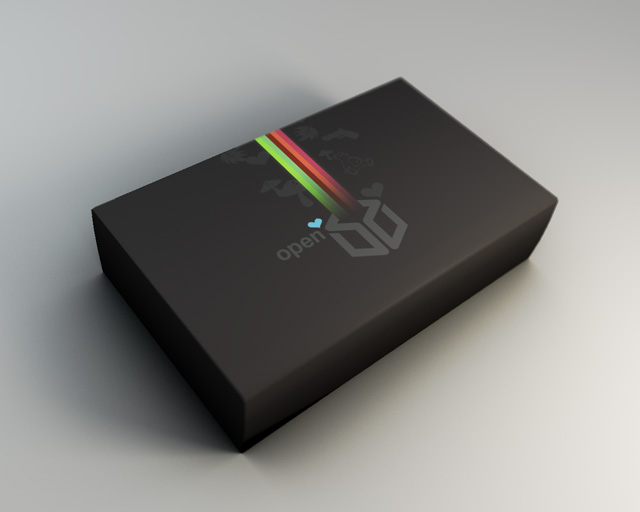
Maybe the only heart should be after 'open' and the others changed to minimal symbols for what the unit can do? Icons for Web, Email, Games etc.
I think id like thatcraigix said:Maybe the only heart should be after 'open' and the others changed to minimal symbols for what the unit can do? Icons for Web, Email, Games etc.
And risk all the Pandora users turning into a bunch of fags? (Don't fucking make the stick joke or anything else you know full well what I mean.)devhace said:I absolutely LOVE TraylorParks design. It's incredible.
I don't honestly think the box art represents what the Pandora is all about, unless it's a box that shoots hearts and rainbows, you are way off.TJFBryant said:It should just vaguely, creatively show what its all about....and I think that box art is perfect.
CandidStan said:And risk all the Pandora users turning into a bunch of fags? (Don't fucking make the stick joke or anything else you know full well what I mean.)devhace said:I absolutely LOVE TraylorParks design. It's incredible.
Vehement avoidance of anything that could, by any stretch of the imagination, be associated with 'faggotry' is a telltale sign of a closeted homosexual.
The boxart is awesome. The people who think it's gay are the real faggots here.
(LOL, JK- as candidstan and I both know, there are no PILES OF STICKS here!
Lol, thats just what I was thinking. I like the design too.PoisonedV said:Vehement avoidance of anything that could, by any stretch of the imagination, be associated with 'faggotry' is a telltale sign of a closeted homosexual.
The boxart is awesome. The people who think it's gay are the real faggots here.
(LOL, JK- as candidstan and I both know, there are no PILES OF STICKS here!
To those who don't "get" the colour scheme, or any of it, go and browse some design mags, fffound.com, maybe even deviantart. It can all get a bit wanky but you'll get a feel for the world of graphic design / digital art. Then, go digging for some of the advertising and product packaging from the 70s and 80s. Games and computers in particular. I'm not saying you'll suddenly love traylorpark's work, but a few things might fall into place.craigix said:Maybe the only heart should be after 'open' and the others changed to minimal symbols for what the unit can do? Icons for Web, Email, Games etc.
Something like that would be cool. A little while back I suggested some chunky pixel art characters, drawn by someone like Mr Gonzo. A combination of all of the above would be excellent. [edit] For the record though, I love the hearts.
it looks worse. the asthetic isnt the same when the icons are different, furthermore they are icons but they aren't 'iconic'. nice mushrooms though.cappuchok said:traylorpark's designs certainly stand out, I'd use one of them if I were the OP team. I especially like his slightly updated box design (which replaces most of the hearts with icons like craigix suggested):

PoisonedV said:it looks worse. the asthetic isnt the same when the icons are different, furthermore they are icons but they aren't 'iconic'. nice mushrooms though.
A suggestion, then: Maybe a row of 'iconic' icons (representing the capabilities of the Pandora) could be placed along one edge of the original box design?
I like that idea. Box art should be pleasing to the eye as well as indicative of the content. It's not that the Hearts are "gay" it's that it's overly sugary. You almost expect there to be a MyLittlePony inside... Like I said I dont think there's anything wrong with a couple of hearts here and there but make the iconagraphy mean something where you can even if you use them to put negative space images of the icons on top of them at least make them more functional. Design is balancing function and style.craigix said:Maybe the only heart should be after 'open' and the others changed to minimal symbols for what the unit can do? Icons for Web, Email, Games etc.
"Pandora" usualy suggests something evil. So, please no hearts! Devil Horns are OK.craigix said:I'd like something friendly and fun.

