Release PNDstore


Argh, I just found a bug in the version comparison function. The fix is uploaded to the repo, but it means that beta versions of 0.2 might not be able to update themselves. Anyone on 0.1 will still get the automatic update, but my lovely beta testers will need to update PNDstore manually. Just this once, I promise.
 
Last edited by a moderator:
Got it working with the pnd_run_installer update. Thank you.


It did not find anything to update but that does make sense as I just manually checked everything and updated some before I got this working.


Cheers,
 
I guess I just look at things from another angle then. *wry smile*
Indeed we are seeing things from very different perspectives. If I browse a list of things which I don't know anything about it is faster for me if I don'thave to take my eyes from that list. Having an info area is a must but interrupts the "browse through the list" process. Because of that I came up with the second line per list Element idea. Having the first words of a pnds descriptions, gives me the possibility of deciding wether my eyes should wander to the info area to see more, or not.


I also don't see the need for the exact version number of the local/repo pnd. What benefits do you gain from knowing the exact numbers ? I still think one column with the graphical or textual info about the version relation (like repo is newer, local is newer, same version, not in the repo, etc.) would be suffice. The information about the exact version should be located in the info area.


Finding arguments for setting the location of the info area a certain "side" is rather hard, as it is matter of taste. The only one I can come up with is the afformentioned "we have more - not really used - horizontal space than vertical". So I think we can savely say the only good solution here would be to have it configurable. Quite nice to sit on the other side of the table for once - bringing up ideas, and someone else has to struggle to realize it :p

It should be already! By default, it looks in all directories that libpnd looks; when installing, it should give the same list of directories. The second SD should be included in that list, as long as it has at least one of pandora/menu, pandora/desktop, or pandora/apps directories on it. Let me know if it's not working that way.
Silly me, I only use the first sd-card so, the second one has no proper directory structure, hence the lack of options in the destination - combo box - sorry about that

I've kept it in mind, don't worry. You should be able to use the dpad to move through the list, and the Enter button will install/upgrade the selected package. I intend to make the face and shoulder buttons useful for control too, but I don't know what a good control scheme would be. Any suggestions?
It would be nice for me to have a more "standard" control scheme like


press ALT +


I for install


R for remove


U for upgrade packages


L for Update list


Including the shoulder buttons can get tricky because currently they are mapped (in xfce) to ALT and STRG by default, so this could cut functionality for a certain part of the target audience.


Apart from that, maybe it could be used to filter the list by category having the all categorys as default

Well, it stores your PNDs, so that's what I called it. I considered using a clever name, but instead decided on something that makes it immediately obvious what it does.
oh, don't limit your applications potential by its name :D It already does more then just store pnds it manages them


EDIT:

This would indicate a situation where if I uninstall PND I can't necessarily just reinstall it from the repo. I feel it important to be able to take that into consideration when I am looking at the package list.
That's a pretty good reason. Rather than a separate icon to indicate this, I was thinking of modifying the columns. Currently, there are "Latest" and "Installed" version columns; perhaps I could change those to "Remote" and "Installed" (or something), where "Remote" would show the most recent version available from repos, being blank if not available. Would this suffice?
I'd like to direct you to my "version relation" column - idea


BTW. its harder than I thought it would be to take a screenshot, but thanks to the wiki it won't be in the future

screen110411-223142.png
 
is it in the pipeline for the client to show more detail information about the app i.e. icon,preview pics, description etc before downloading/installing... or does this already exist?


also maybe you have have a download progress bar? the filesize is sent in header of the download link is it not possible to check that against amount downloaded? and provide a progress bar?
 
Last edited by a moderator:
is it in the pipeline for the client to show more detail information about the app i.e. icon,preview pics, description etc before downloading/installing... or does this already exist?


also maybe you have have a download progress bar? the filesize is sent in header of the download link is it not possible to check that against amount downloaded? and provide a progress bar?
The problem here is that he has to implement multi - threading in the app first, before he is able to keep the user informed. For (single threaded -)now the interface isn't updated as long as the file is downloaded. In a single threaded program, execution can't continue till the current operation is complete.
 
I also don't see the need for the exact version number of the local/repo pnd. What benefits do you gain from knowing the exact numbers ? I still think one column with the graphical or textual info about the version relation (like repo is newer, local is newer, same version, not in the repo, etc.) would be suffice. The information about the exact version should be located in the info area.

Sorry for taking this out of order, but I wanted to respond to this point on its own. Actually I have two responses, one very general, the other very specific. I hope you'll appreciate both, but for the TL;DR version skip down a couple of paragraphs. :)


The approach you suggest might work, if you could always be sure that the latest version is the best for every purpose, but in software development its not uncommon for features to change between versions. Sometimes this means that a later version of a program no longer does what you want. In this case you'll want to make sure you have the specific version that *does* do what you want. If the version numbers aren't displayed how can you tell if its the right one?


An example of this is firefox. Someone on the firefox dev team had the bright idea that in firefox 4 they should remove the option to have a status bar at the bottom of the screen, opting to display status bar stuff in the right hand end of the location bar instead. Of course given the Pandora's screen size and the fact that there is a a lot of other stuff sharing the same horizontal space, this means that there is no longer enough room to display most URLs when you mouse over them. That makes the new version less useful to me. It wouldn't have been a problem had they kept the original feature, but noooo... Luckily for me, in this case there is an extension available that restores this functionality, but not every piece of software is so extensible.


More specifically, and perhaps more relevantly there are several cases where there are multiple versions of the same software with different application IDs. Take the Apple ][ PND for example. I downloaded it yesterday. Today I noticed that a new version had been released, but as far as the PNDstore was concerned it was a completely separate app. (and the original had been removed from the repo) If we were only using your relational method for version control, all the store would be able to tell me, is that there was one version in the repo and one installed, but since it had no way of knowing they were the same app, it would not be able to compare them and I would not be able to identify which was the newer version.

I guess I just look at things from another angle then. *wry smile*
Indeed we are seeing things from very different perspectives. If I browse a list of things which I don't know anything about it is faster for me if I don'thave to take my eyes from that list. Having an info area is a must but interrupts the "browse through the list" process. Because of that I came up with the second line per list Element idea. Having the first words of a pnds descriptions, gives me the possibility of deciding wether my eyes should wander to the info area to see more, or not.

AHA it comes down to shopping style! :)


So if I understand you correctly, you want to be able to window shop. Browse around until something catches your eye, then go in for a closer look if you see something you like. To my mind that works well only if specifics don't matter. If you are looking for the perfect compliment to your living room to display on your coffee table for example that would be the best approach.


On the other hand, I'm the type of person who normally only goes shopping when I want to get something specific. Say I'm working on for a project and I determine that I need a 2" bolt. When I go to the hardware store I really don't want to have to browse through a single bin containing all bolts looking for one that is 2" - I want to go to the bin labelled 2" bolts, and grab one.


For my intended usage, I'm afraid I would find your preferred layout quite cumbersome *wry smile*

Finding arguments for setting the location of the info area a certain "side" is rather hard, as it is matter of taste. The only one I can come up with is the afformentioned "we have more - not really used - horizontal space than vertical". So I think we can savely say the only good solution here would be to have it configurable. Quite nice to sit on the other side of the table for once - bringing up ideas, and someone else has to struggle to realize it :p

You are correct of course that it does come down to personal preference, For me the focus is on management of my PND files, and the more specifics I can see at a glance the more useful I will find it. Here's hoping Tempel can find a way to accommodate us both. :)


- Neelix
 
More specifically, and perhaps more relevantly there are several cases where there are multiple versions of the same software with different application IDs. Take the Apple ][ PND for example. I downloaded it yesterday. Today I noticed that a new version had been released, but as far as the PNDstore was concerned it was a completely separate app. (and the original had been removed from the repo) If we were only using your relational method for version control, all the store would be able to tell me, is that there was one version in the repo and one installed, but since it had no way of knowing they were the same app, it would not be able to compare them and I would not be able to identify which was the newer version.

this is because the app maintainer deleted the app and uploaded a new version (with a better PXML file), however he did not use the same id for the package which he used before which meant it shows as a unique app but with the same name.
 
Ahh, you two are confusing me! I can't say how exactly the GUI will go in the future, but please keep discussing it. If you can manage to come to an agreement, then I'll know it's a winning design. Be aware that nothing about the GUI is set in stone; all of the real logic is separate from it, so it can be completely torn down and rebuilt. The GUI is less than 200 lines of simple code and a Glade file, so don't be afraid to throw it all away.


milkshake: more detail and progress bars are certainly on the roadmap. I'm just trying to get out basic functionality as quickly as possible, and that's nearly done I think. Now to wrap my head around threading in GTK.
 
An evil idea .. have (say) minimenu run commandline pnd-store-thingy to return a list of apps where updates are available. ie: User hits 'cheeck for updates' in minimenu menu, and then all the apps with updates are highlighted in yellow, or something. Then the context menu for an app could be brought up and hit 'update', or 'update all', which would in turn just invoke pnd-store to do its thing.


Hmmmm..


jeff
 
That's a pretty cool idea, Jeff. There is a command-line interface already, though it's designed for interactive use rather than automated use. I know too little of C to feel comfortable jumping into minimenu's source myself, but if you or someone else wants to make it happen, I can easily put together an interface to PNDstore to make it easy on you.
 
I could do the minimenu code, just publish the command line options needed.. ie:


- how to know its available? ie: if pnd-store is a pnd, it should be in the searchpath and runnable by minimenu; so I guess I could search by appname for 'stanrrd name' (pnd-store or whatever it is), and then invoke it with the -a or whatever to pass arguments in... and inhale the stdout to get the output? (hrm, I bet stdout is all set to /tmp/pndrun-bleh, so I'd have to raid through there to find it.. sucks, but okay.)


- option to run the app and find out if its usable (ie: configured to a repo, repo is up and responding..)


--> maybe unecessary, since anyh real operation could have a simple standard error return, thus implying something is not right


--> erro standard.. some text or errno that implies error, with all stdoit to be shown to user as log?


- operation: scan the system for active pnds (in the configured searchpaths) and return a list of all that are updatable (the return is a list of 'keys' that can be fed into pnd-store to perform the update .. is that the pnd-filename, or the full pand-including-path, the pnd package name, or what?)


- operation: update all


- operation: update the specified pnd by key as returned from a previous scan operation


Given those 3, should be addable to minimenu I guess :p
 
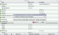
The upgrade function is broken in PNDstore. When I click "Upgrade packages" a dialog box pops up and asks me if I want to update. I click Yes but then the dialog box still remains open even after waiting for 10 minutes. Pressing No doesn't do anything and I have to click the close button in the upper right corner to exit.


Edit: I was trying to upgrade PNDstore from 2.1 to 2.2 within PNDstore. It was probably not letting me do that on purpose or the bug is fixed in the new version.
 
Last edited by a moderator:
I also don't see the need for the exact version number of the local/repo pnd...
...


The approach you suggest might work, if you could always be sure that the latest version is the best for every purpose, but in software development its not uncommon for features to change between versions. Sometimes this means that a later version of a program no longer does what you want. In this case you'll want to make sure you have the specific version that *does* do what you want. If the version numbers aren't displayed how can you tell if its the right one?


...

I tend to disagree or at least have to admit that I don't get your point in this matter:


As far as I know there a two ways of dealing with multiple application versions in the repo (in the future). The author sticks to the plan, and just increases the Version number of the pnd (instead of altering the application id). After uploading the repo recognizes that fact, and will 'archive' the old Version keeping it available via the apps detail webpage. I don't know how it is handled in the file list a repo client requests and how tempel plans to implement it. What he shouldn't do is create one list entry for every Version available, this will make the list to long in the future, to use in an ergonomic way. My conclusion is, if he implements the support for archived Version he has to move this to the info pane.


So my approach will still work, but needs a little tweak like an 'more/older Version available" addendum.


The second case would be that the uploader alters - due to whatever reasons - the application id, to make clear that this is a new/old/special Versions. In that case this is (or at least should be in my opinion) handled as a seperate application, so there is no real relation between those two Versions (in a how to store / make available way). Except you do it the "hacky" way and begin to parse package ids to pool different pnds of the same application - which should be avoided.


In this case my approch will also work. It still don't see the benefit of having both (repo + local) versions shown, it just wastes space in my opinion.

...


So if I understand you correctly, you want to be able to window shop. Browse around until something catches your eye, then go in for a closer look if you see something you like. To my mind that works well only if specifics don't matter. If you are looking for the perfect compliment to your living room to display on your coffee table for example that would be the best approach.


For my intended usage, I'm afraid I would find your preferred layout quite cumbersome *wry smile*

This is exactly the point, we both have completly different usage scenarios. That we're Tempel or the majority has to come in to decide which scenario he / the anonymus mass want's to follow. Or he can just please us all by making it an option :rolleyes:


If I understand you correctly you would the PNDStore be like synaptic with little functional/ pnd tailored extensions.


I would like to have a culmination of synaptic and the ubuntu software center. Don't get me wrong on this one, I don't like the software center. For me it puts you in the situation of child in a toy store, a lot of fancy pictures and colors and with no information what so ever where to start the shopping rampage. As a kid you don't realize that this just wastes time and space, and if I look at the positive response to the software center a lot adults seem not to realize this either: just a good looking gui, whichs fails in give you a fluid/economic/efficient way to browse trough all the "toys". I defense of the accused - I haven't started the software center for at least six months, so this may have changed.


This is very categorys or filters could come in very handy. Maybe a filter to just show you the new apps of the last x days ?
 
I tend to disagree or at least have to admit that I don't get your point in this matter:

Given your response I would agree that you missed my point. Suffice it to say that from a package management point of view, I think its important to show the version numbers. Given my next suggestion however, I think we should just leave this issue alone. :)

This is exactly the point, we both have completly different usage scenarios. That we're Tempel or the majority has to come in to decide which scenario he / the anonymus mass want's to follow. Or he can just please us all by making it an option :rolleyes:


If I understand you correctly you would the PNDStore be like synaptic with little functional/ pnd tailored extensions.


I would like to have a culmination of synaptic and the ubuntu software center. Don't get me wrong on this one, I don't like the software center. For me it puts you in the situation of child in a toy store, a lot of fancy pictures and colors and with no information what so ever where to start the shopping rampage. As a kid you don't realize that this just wastes time and space, and if I look at the positive response to the software center a lot adults seem not to realize this either: just a good looking gui, whichs fails in give you a fluid/economic/efficient way to browse trough all the "toys". I defense of the accused - I haven't started the software center for at least six months, so this may have changed.


This is very categorys or filters could come in very handy. Maybe a filter to just show you the new apps of the last x days ?


Its funny you should say that actually. I've been giving this a lot of thought, and I too was drawing mental comparisons to both the ubuntu software centre and synaptic. You seem to have a good grasp on what I'm looking for and I think I've got a handle now on what you are looking for. I came to two conclusions:

  1. We need an interface that meets all the requirements of both usage scenarios.
  2. Since there is a conflict in the requirements we need more than one interface.


Given Tempel's comments on the gui construction I get the impression this won't actually pose much of a problem. (please correct me if I'm wrong)


I propose having two different layouts, each with a button to easily switch to the other one. The current buttons would remain common to both layouts.


The PND Finder layout would be optimised for finding an application for a given purpose, and would largely follow your suggested design above, with most of the more specific info being displayed in the description box upon selection. I'd suggest using a categorised tree view for this and would also suggest using the application description (as opposed to the package description) for the in-list text. I expect this would also be home to any advanced search function.


The PND management layout would optimised for PND management functions and would be closer to what I proposed with more specific information in the list view, and the majority of the management functions linked to this layout. (eg moving a PND between installation folders)


Then one would just switch to whichever mode best suited their current purpose.


Ideally when switching between views you could then maintain the current selection and/or search list.


thoughts?


-Neelix


EDIT: yes... I really am suggesting that we each have our cake and eat it too ;)
 
Last edited by a moderator:
instead of writing descriptions which could be hard to imagine why dont you create some mockups on how you would like itwith maybe small mini descriptions on what you want each bit to do / show, this IMO is the best way to get your ideas accross and tempel would be able to implement those easier.
 
The upgrade function is broken in PNDstore. When I click "Upgrade packages" a dialog box pops up and asks me if I want to update. I click Yes but then the dialog box still remains open even after waiting for 10 minutes. Pressing No doesn't do anything and I have to click the close button in the upper right corner to exit.


Edit: I was trying to upgrade PNDstore from 2.1 to 2.2 within PNDstore. It was probably not letting me do that on purpose or the bug is fixed in the new version.
That's normal, depending on how large the packages are that you were upgrading. The upgrade box will stay in place as long as the packages are downloading; watch the wifi and SD lights to see if it's working. PNDstore should be able to upgrade itself just fine.

instead of writing descriptions which could be hard to imagine why dont you create some mockups on how you would like itwith maybe small mini descriptions on what you want each bit to do / show, this IMO is the best way to get your ideas accross and tempel would be able to implement those easier.
Mockups would be very nice. I'm surprised I haven't even seen one yet! Still, I've read all your comments and am considering. Decisions will come once they have to and no sooner :p .
 
... I came to two conclusions:

  1. We need an interface that meets all the requirements of both usage scenarios.
  2. Since there is a conflict in the requirements we need more than one interface.
I don't think this would be wise, because even if you do such things for a living there's little motivation to update/debug/modify functions in both interfaces.


No 'Mockup' but !maybe! a nice idea. Since space is limited what about hideable 'sidepanes':


After Startup you only see the list that is already there. Then you push the left trigger and on the left side a tree/list of categorys appears (and the list/tree also gets the focus), where you can alter the main lists category or filters to that. After pushing the left trigger again it dissapears (while keeping the made alterations to the main lists content active). The same mechanism could be used on the right side, for the info pane.


A small alteration could be that the sidepanes are only visible while the shoulder buttons are pressed. Or that a double click with the left shoulder button would automatically select the next category/filter in the list. But I'm a little concerned that these two control scheme additons don't work very well in a real usage scenario


There is still the problem tough, that the shoulder buttons are already mapped to ALT and STRG by default
 
Last edited by a moderator:
After Startup you only see the list that is already there. Then you push the left trigger and on the left side a tree/list of categorys appears (and the list/tree also gets the focus), where you can alter the main lists category or filters to that. After pushing the left trigger again it dissapears (while keeping the made alterations to the main lists content active). The same mechanism could be used on the right side, for the info pane.
What about a panel/drawer that contains a list of buttons which can be used to sort all PNDs by freedesktop categories, only that these buttons actually represent a list of regex filters that can be edited via the GUI? This would combine ease of use with power user features.


Fast access to a particular PND could be implemented through a rapid search function that automatically starts once the user presses any alphanumeric button on the Pandora. To quickly review or manage specific kinds of PNDs, the aforementioned list of regex filter buttons could be used. Also, by making the user experience screenshot centric, "embedded PND description"-induced clutter as well as excessive waste of screen real estate could be minimized, while still respecting thatgui's wish for a "shopping experience" by offering a lot of information through visual representation. In addition, information that is essential for management could be included within the list (or the screenshots).


------


Thus, the combination of the aforementioned measures would allow for a swift managing experience while still allowing users to "browse" for interesting content.


Like in the non-finished image that can be found in this post, just with a more condensed list. The purple bar is the filter button drawer. After all, human beings are not able to look at several PNDs at once, so the problem is basically "smooth navigation for faster management" (i.e. separate details pane) vs. "few clicks for shopping experience" (i.e. embedded information), which is resolved:

Any problems with a PND are indicated by a huge warning symbol overlay on the PND's list entry, with a text next to it that explains the issue in short. Thorough information as well as possible solutions are then displayed when you open the detailed view. While installing an application, you can choose whether or not it should be automatically updated in the future. If an installed application can be manually updated, a text is being displayed at upper right hand corner of its list entry that says "New version."
Source: http://boards.openpandora.org/index.php?/topic/2731-pndstore/page__p__47295#entry47295


I might now be seen as being pushy about this, for which I'm sorry, but I do believe that it is a good way of combining the needs that have been mentioned. Long-term, several GUIs would most likely just potentialize problems and thus increase the number of problems to a level that would exceed the number of solutions you can get by implementing several GUI modes. In case it gets annoying, simply tell me to shut my dense mouth, thank you. :)
 
Last edited by a moderator:
My app, an Apple ][ Emulator ported from linapple is showing up in the "L's" and not the "A's" in the sort. This is probably because the package ID starts with linapple while the App name is "Apple ][". This completely makes sense. I see the logic, but it just looks strange having "Apple ][" sandwiched between "Lightweight2" and "Linphone". There are some others that do this like Super Methane Bros. and Battle for Wesnoth. Have you considered sorting by the Title instead of the ID?
 
Last edited by a moderator:
What about a panel/drawer that contains a list of buttons which can be used to sort all PNDs by freedesktop categories, only that these buttons actually represent a list of regex filters that can be edited via the GUI? This would combine ease of use with power user features.
This was just an idea I had when tempel brought up the idea to utilize the shoulder buttons

Fast access to a particular PND could be implemented through a rapid search function that automatically starts once the user presses any alphanumeric button on the Pandora.
This is already implemented in the standard Gtk list control

To quickly review or manage specific kinds of PNDs, the aforementioned list of regex filter buttons could be used. Also, by making the user experience screenshot centric, "embedded PND description"-induced clutter as well as excessive waste of screen real estate could be minimized, while still respecting thatgui's wish for a "shopping experience" by offering a lot of information through visual representation. In addition, information that is essential for management could be included within the list (or the screenshots).


...
Oh my god I created a monster :blink:


Please, I beg you, please don't do this, this exactly describes my horror vision of a gui destroing any last remnant of usability by including fancy styles, graphics and a lot of unused space.


I do not want any real "shopping experience". I simply want a list of available pnds with a little more information than just the title - hence the idea of having two lines per list item -> title, and the first x characters of the description.


Making the user more screenshot centric, will surely slow down the applications performance, because:


a) This will be really, really hard to realize unless tempel switches to another gui - framework. GTK was ment/developed to create applications which are intended to help people in their "real" work, not fancy livestyle apps.


B) The possibility that most of the users will have a slow connection to the repo is very high for various reasons (3G Connection, the currently not so performant built in WLAN, lousy internet connection in general, etc.), so tempel has to deal with high loading times, and cacheing mechanisms to reduce that.
 
Back
Top