You are using an out of date browser. It may not display this or other websites correctly.
You should upgrade or use an alternative browser.
You should upgrade or use an alternative browser.
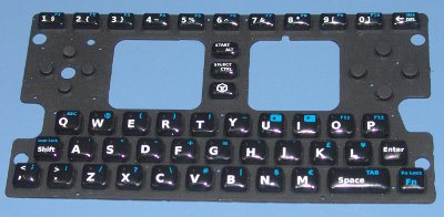
Picture Of The Final Keymat?
- Thread starter Vorporeal
- Start date
Bosbeetle
Terminally lost
Yigguth said:looks black to me
to me too
Last edited by a moderator:
gruso
thunderbox
Not compared to this one. 

Monk
Caveman Ninja
The bits that poke thorugh the case - the actual keys (which would presumably be the bits one would want to light) look pretty black to me. Maybe we need to consult a Pantone chart?
BackAssward
Active Member
- Joined
- Apr 3, 2008
- Messages
- 985
Right, we were never talking about the buttons glowing (or atleast I never was), I was talking about the area around the buttons glowing. From previous topics, I thought every one was. The buttons are black, but the rest looks at least semi translucent.
Edit: Something like:

Edit: Something like:

gruso
thunderbox
You can't argue with the fact that transparent rubber lets more light through than black rubber.
Actually, wait. This forum can.
Actually, wait. This forum can.
Bosbeetle
Terminally lost
Gruso said:You can't argue with the fact that transparent rubber lets more light through than black rubber.
Actually, wait. This forum can.
Maybe its me but I dont see transparent rubber. It looks just as black to me as the previous one. Albeit the previous one was lying on a blue background this on a black one.
Last edited by a moderator:
-Tj-
Active Member
- Joined
- Sep 2, 2009
- Messages
- 842
BackAssward said:The buttons are black, but the rest looks at least semi translucent.
That's an interesting point, I never thought about how the new rubber looked till BackAssward mentioned it. I thought it was just a similar gray tone with the surface it was sitting on. But even still, I don't think a backlight would be of much use unless the lettering was translucent. Even if the outline's lit up, all the keys are going to look equally like black dots, making a backlight mod only cosmetic.
That made me lol, thanks! :lol:worzyl said:-Tj- said:I can almost type with my thumbs without looking, mainly because they're not flat.
LIIIIEEEES!!! T J HAS FLAT THUMBS!!!!!
Last edited by a moderator:
Yigguth
Member
- Joined
- Oct 3, 2008
- Messages
- 222
If that's the way you planned it to look wouldn't it be easier to just stick the LEDs next to the keys instead of under the mat? I would imagine more light would seep through the case that way tooBackAssward said:Right, we were never talking about the buttons glowing (or atleast I never was), I was talking about the area around the buttons glowing. From previous topics, I thought every one was. The buttons are black, but the rest looks at least semi translucent.
Edit: Something like:

Last edited by a moderator:
kuru
Sadly, again: Je suis Charlie
There's nothing translucent, not even semi. Maybe the shade of black
is a little lighter than that of the previous mats.
Those considering the quality of typing, I recall reading it would
be similar to the feeling a good calculator would give since the tech
is about the same. (Citation needed)
is a little lighter than that of the previous mats.
Those considering the quality of typing, I recall reading it would
be similar to the feeling a good calculator would give since the tech
is about the same. (Citation needed)
Loon
Member
- Joined
- Jul 25, 2006
- Messages
- 357
A minor question regarding aesthetics : Why not centrally justify start / alt, select / control? Whilst you're tweaking the positions of the letters that is.
One other thing, how do you select the start and select keys? Are they the defaults? If so the perhaps they should be on the bottom of the keys.
Wonder what cosurgi thinks of this layout?
One other thing, how do you select the start and select keys? Are they the defaults? If so the perhaps they should be on the bottom of the keys.
Wonder what cosurgi thinks of this layout?
Bosbeetle
Terminally lost
Last edited by a moderator:
Monk
Caveman Ninja
Gruso said:You can't argue with the fact that transparent rubber lets more light through than black rubber.
Actually, wait. This forum can.
Just for a second I thought you were going to underestimate us...
Last edited by a moderator:
Vorporeal
Yes, no, I, this is.
Gruso said:You can't argue with the fact that transparent rubber lets more light through than black rubber.
Actually, wait. This forum can.
While I agree that this prototype seems to have semi-translucent rubber, the issue still preventing (or hampering) backlight mods is the fact that there is printing fully covering the tops of the keys (as far as I can tell). The letters/symbols/text would have to be printed in semi-translucent ink for the backlight to really be effective. The way it is now, the keys might glow very slightly, but it won't look the way one would expect a backlight mod to look.
Last edited by a moderator:
droneb
Well-Known Member
- Joined
- Aug 28, 2009
- Messages
- 1,072
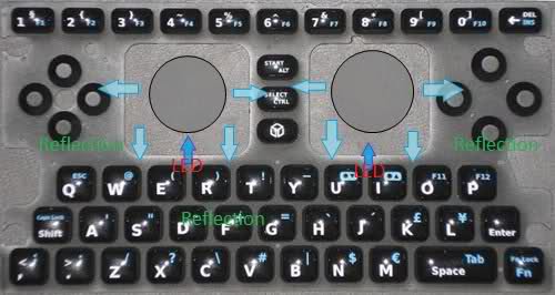
hmm, how is the keymat rubber rating in reflections?
if it had some good specular reflection, the option of leds above the mat would be nice, specially on the resin blobs.
a mod could be worked so at least the Nubs underneath get lighted and from the form factor this glow makes the key color-ish on the blob.
something like this

hmm as for my choice would end up using clear blu leds.
if it had some good specular reflection, the option of leds above the mat would be nice, specially on the resin blobs.
a mod could be worked so at least the Nubs underneath get lighted and from the form factor this glow makes the key color-ish on the blob.
something like this
hmm as for my choice would end up using clear blu leds.
MonkeyChops
NO! I don't play basketball
hmm, I thought I read somewhere that it would have glow in the dark keys, but I can't find it. However I did find where craig said that it was easy to type in the dark with just the lcd light.
http://www.gp32x.de...post__p__725015
http://www.gp32x.de...post__p__725015
Last edited by a moderator:
mindlord
Notices Two Things
MonkeyChops said:hmm, I thought I read somewhere that it would have glow in the dark keys, but I can't find it. However I did find where craig said that it was easy to type in the dark with just the lcd light.
http://www.gp32x.de...post__p__725015
As I understand it, the idea for glow in the dark keys was cut almost as soon as it was proposed. The community reaction to the idea was pretty negative, as I recall.
Last edited by a moderator:
Monk
Caveman Ninja
Vorporeal said:Gruso said:You can't argue with the fact that transparent rubber lets more light through than black rubber.
Actually, wait. This forum can.
While I agree that this prototype seems to have semi-translucent rubber, the issue still preventing (or hampering) backlight mods is the fact that there is printing fully covering the tops of the keys (as far as I can tell). The letters/symbols/text would have to be printed in semi-translucent ink for the backlight to really be effective. The way it is now, the keys might glow very slightly, but it won't look the way one would expect a backlight mod to look.
Apparently some people think that a light will be able to shine BETWEEN the keys. Presumably through the black plastic that the case is going to be made of.
mindlord said:MonkeyChops said:hmm, I thought I read somewhere that it would have glow in the dark keys, but I can't find it. However I did find where craig said that it was easy to type in the dark with just the lcd light.
http://www.gp32x.de...post__p__725015
As I understand it, the idea for glow in the dark keys was cut almost as soon as it was proposed. The community reaction to the idea was pretty negative, as I recall.
Yup, IIRC it got dropped within a matter of days. I hope not JUST because of the forum reaction - I hope there was a cost or technical reason as well, becuase to lose a feature just because people gripe might be a shame.
IIRC the main concern was that it would not be very effective. The screen would not cast enough light to effectively "charge" the buttons in the dark, and much of the time the case would be closed and so sunlight couldn't charge up the luminous paint. Of course it COULD be charged up while being used in daylight, but then they would start losing their luminosity immediately rather than wait for an opportune moment to shine. As it were.
As I say, I HOPE that when OP looked into it they found it just wasn't cost effective for the amount of benefit it MIGHT offer, or that the benefit was just too unlikely to ever be seen. I'd hate to lose a feature that would only help 1/10th of users because it wouldn't help 90/10 of the rest of us.
Last edited by a moderator:
j.pickens
Member
They could use clear UV fluorescent DayGlo dyes in the keymat fonts, and modders could mount UV LED's on the case lid pointing down at the keyboard.
Voila', glowing keys.
Voila', glowing keys.
iprice
Certified Guru
Surely the reflection of any glowing keys/nubs on the screen will annoy once the novelty wears off?
Personally I'd rather have a longer battery life than to be able to see the keys in the dark, even if they probably would look cool.
Personally I'd rather have a longer battery life than to be able to see the keys in the dark, even if they probably would look cool.
Similar threads
- Replies
- 38
- Views
- 7K
- Replies
- 250
- Views
- 82K
- Replies
- 242
- Views
- 56K

