Paper Wars


OMG, how embarrassing for me! Thanks for your help.


Learnings for me as a user: If you don't know how to operate a PND, try pressing all buttons AND touch the screen at all possible positions.


Learnings for developers: Touch-control-only is rather unexpected for Pandora apps, possibly give some hint in the UI. If one day more PNDs use touch controls, then this won't be necessary anymore.
 
Super giant apologies for being silent for a while. This did not mean work was not being done ... oh no ... rather, I was fighting through an artist's dilemma.


Some of you might have seen that I have the new map "tiny forest" all laid out. While it is "playable" that does not mean it is near completed. The art probably takes the most time.


I have started with an art style ... and then scrapped it, about 3 times. It's frustrating, and there are days when I don't want to do anything because I'm a bit at a loss as how to continue. The key at that time is just keep pushing at it in the little ways that you can, and eventually the ideas will flood in.


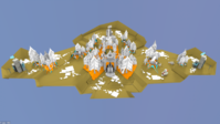
So that is where I am now. The little map is in a coniferous forest with little animated foxes scattered about. This idea is moving much better. You know when you have a good idea when the map kind of builds itself!


So I'll give you a little test render I did of the foxes in the forest today. Please be aware, these are not the final colors, they are just to help me see where everything is, I'll be coloring once I get the map detailed out.


Click the image to check out the video :lol:


https://vimeo.com/42686836
 
Looks great Traylorpark!


I do understand the art dilemas and it goes pretty much as you have laid out.


It also does help to post progresses so to catch some feedback from people outside it, it may help the struggle.


Heart skips a beat whenever I see a new post on this thread! B)


edit: I´m quite found of the tail!
 
Last edited by a moderator:
This is quite unbelievable. This game and Rainy Day are so incredible nice to the eye :D
 
I like the idea that you put some animated assets in the levels, will make them much more vivid - a great idea!


The design of the fox is nice, I am unsure of the animation of the tail, it has some comedic effect to it though, especially when you are looking at a group ;)


Btw, I was wondering, how do you balance the maps? It seems like quite a task to me, especially as you are creating a asymmetrical level, which in general is way harder to get right and often leaves one team with an advantage. Do you just run a couple of CPU battles and go through the results, do you simply go by experience and hope for the best or ... ?
 
It looks good. I only wonder if these Map animations somehow could disturb the generall gameplay, you usualy look for animations on the map because these are mostly the own or the enemy units. However, the Fox is not a unit so I hope it doesn't cause that we shoot at him accidently. :D


If you have creative problems with the map, it helps to stop for a while and work on something different. ...maybe the AI? ;)


I usualy do real pencil sketches when designing something on the PC, if it is a Blender project or just a Minecraft building. It really helps me alot. :)
 
Last edited by a moderator:
Thanks for the nice words guys


Yeah, normally I do sketch out the whole map as much as I can before I start modeling so I have some idea of what the overall look is going to be. Perhaps I got a little cocky with design on this one. I started with hex layout and went straight to modeling. Skipping the sketching phase is maybe the cause of why I lost artistic direction.


The animation of the fox tail was meant to be fairly basic (fitting with the paper theme) with a little flare on the ends of the tail to give some suggestion of momentum. It could end up being too much overt movement that is distracting from the game. Luckily, changing the animation is incredibly simple. The ultimate goal is the bring some life to the map so it doesn't feel like a static environment. You can't interact with the map, but I want the player to imagine that they could. Maybe some animated foliage would help that too.


Balancing the maps is certainly tough and I won't claim to have it mastered. Generally, for the asymmetrical maps I pay close attention to things like, how many spaces till a unit can reach the next city or helipad, what are the defense opportunities like, what are the best routes taken. I try to give each side an equal amount of oppurtunities. For example, one side might have more open space near their base while the other base has excellent strategic defense locations.


I enjoy making the asymmetrical maps because I try to design each side to require a different skillset that is needed to be effective

I like the idea that you put some animated assets in the levels, will make them much more vivid - a great idea!


The design of the fox is nice, I am unsure of the animation of the tail, it has some comedic effect to it though, especially when you are looking at a group ;)


Btw, I was wondering, how do you balance the maps? It seems like quite a task to me, especially as you are creating a asymmetrical level, which in general is way harder to get right and often leaves one team with an advantage. Do you just run a couple of CPU battles and go through the results, do you simply go by experience and hope for the best or ... ?

Balancing the maps is certainly tough and I won't claim to have it mastered. Generally, for the asymmetrical maps I pay close attention to things like, how many spaces till a unit can reach the next city or helipad, what are the defense opportunities like, what are the best routes taken. I try to give each side an equal amount of oppurtunities. For example, one side might have more open space near their base while the other base has excellent strategic defense locations.


I enjoy making the asymmetrical maps because I try to design each side to require a different skillset that is needed to be effective
 
Progress!


Color's will be the last thing I do. ^_^

fox_forest.png
 
Great!


I was a carboard box engeenier when I was a kid, I will never tire on these visuals!


Now I feel like going out to buy some paper and assemble the map on the living room... :)
 
Looks Ace. To be fair, when I saw the last shot, I thought "Looks a great Winter scene" :p
 
Thanks guys! The colors certainly took multiple iterations till I found something that looked good. I'd like to thank kuler.adobe.com, the artist's secret site for colors.


Geez, I hope you don't have to wait two months to play it!
 
Thank you ! someone who made a game where donations are appreciated but pay not necsairy yippee !
 
Last edited by a moderator:
hey guys,


we're still working hard (sometimes more, sometimes less) to get a first release out in the next weeks (two months?).


my first child will be born somewhen in october, so i try hard to get everything done until then.


traylorpark is working hard on getting everything animated, redesigned and finalized which we considered to be "test stuff" or that was just there that the game is playable.


I've restarted the AI from scratch (the fifth time?), having redesigned a lot internals to have more control of what the AI considers good or bad.


The AI is now finally able to play out some moves in advance and pick the one that it considers best. this is the very core of the AI.


As a next step i'll very likely implement a BehaviourTree that will hopefully help to get an overall strategy in.


This is really the toughest part for me to write - I've never done any real AI previously. So I've kept it for the very last :)


I've also created a GLES2 backend in the meantime for my engine, so that I'm able to do some "fancy" shader stuff.


For the iOS port i've already created a Tiltshift shader (which only works at reasonable framerates on my iPhone 4S, though).


Never got around to actually test this on my pandora, though.
 
Back
Top