Panjoust - A New Simple Platformer


So do I, but remember that in-game it wont have antialiasing, so it might look a bit jagged.

I'll dredge up an example, hold on
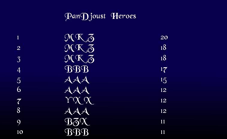
it would look something like this, although on the pandora screen, the jagged edges would be MUCH less pronounced.
ilanv9.jpg


there are, however, some issues with capital letters, such as when you complete a level, the text that appears says N ice. Because I would like to replace the texts for "nice" and "ouch" with animated images that say "failure" or "level complete" this won't be much of an issue in the long run.
 
Amigo Bandito Crujiente said:
So do I, but remember that in-game it wont have antialiasing, so it might look a bit jagged.

I'll dredge up an example, hold on
it would look something like this, although on the pandora screen, the jagged edges would be MUCH less pronounced.

<image>

there are, however, some issues with capital letters, such as when you complete a level, the text that appears says N ice. Because I would like to replace the texts for "nice" and "ouch" with animated images that say "failure" or "level complete" this won't be much of an issue in the long run.

How about applying a simple subtle mean value blur effect to the text? It could make the text a little less jagged. Something like a 3x3 mean value filter which assumes transparent pixels as black.
 
Last edited by a moderator:
That would be Marko's department, but I'm pretty sure transparency on the text isn't delineated by color, so I don't know if applying a blur in that manner would work. Besides, from a purely design standpoint, any blur on text makes readability go to all hell. Its better to have jagged text than blurry text.
 
Amigo Bandito Crujiente said:
That would be Marko's department, but I'm pretty sure transparency on the text isn't delineated by color, so I don't know if applying a blur in that manner would work. Besides, from a purely design standpoint, any blur on text makes readability go to all hell. Its better to have jagged text than blurry text.

I don't mean a typical blur, but only blurring the pixels inside the letters.
aliasedblur.png


In the above picture I've applied gaussian blur to the text while keeping the outer edges (shape of the letters) the same. The kind of effect I'm proposing is even less noticeable (couldn't quickly reproduce in GIMP). It kinda just darkens the edge pixels a little (depending on how near the edge they are) while keeping the base color same. I'm not sure how well this would work, I'll have to try it when I have the time. Right now I should be working :p

EDIT: Well... yeah. Looking at that picture again it still looks a lot less readable. Disregard this for now :)
 
Last edited by a moderator:
Amigo Bandito Crujiente said:
So do I, but remember that in-game it wont have antialiasing, so it might look a bit jagged.

Well you can make the text anti-aliased, that is no problem. It is just disabled by default as it is a very slow procedure in SDL, but I guess there should be no problem activating in menus like the highscore one (I doubt anyone needs 30fps there ;) ).
It just might be too slow when showing text in-game, so it should be disabled for that (you can do it on a text-by-text basis, so again this should be no problem).

Bottom line is, don't worry about it, also if you plan to replace all in-game text with images.

foxblock out
 
Last edited by a moderator:
Basically to add to what foxblock said... The jaggy text was a decision to go for performance more than looks as default.
The Text rendering has three modes(thanks to SDL_ttf) I think I called them different identifiers in code.
  • Blended
  • Boxed
  • Jaggy

Anyway the anti-aliased one uses per pixel alpha-blending which in SDL will cause a certain amount of slow-down. The boxed version is a compromise since the characters are rendered once with alpha-blend to a background colour, and from this point they are quick to render - This is why MarkoeZ placeholder looked a little funny... using BOXED text but hadn't matched the brown colour to the brow of the images for the Menu.
The Jaggy fonts are fast since they are rendered as a simple surface.

Anyway for further issues like this, remember to ask your coders. :lol:
 
Hmm, if you want to keep the bar, I think it should go across the bottom of the screen, and it should look more metallic, instead of yellow, something that looks like gold.
Also, perhaps it should be filled with a more subdued color, maybe dark green?
 
PokeParadox said:
Basically to add to what foxblock said... The jaggy text was a decision to go for performance more than looks as default.
The Text rendering has three modes(thanks to SDL_ttf) I think I called them different identifiers in code.
  • Blended
  • Boxed
  • Jaggy

Anyway the anti-aliased one uses per pixel alpha-blending which in SDL will cause a certain amount of slow-down. The boxed version is a compromise since the characters are rendered once with alpha-blend to a background colour, and from this point they are quick to render - This is why MarkoeZ placeholder looked a little funny... using BOXED text but hadn't matched the brown colour to the brow of the images for the Menu.
The Jaggy fonts are fast since they are rendered as a simple surface.

Anyway for further issues like this, remember to ask your coders. :lol:
So with SDL there is no way to have smooth text without performance loss? Is there no hardware-thingy that automaticly smoothes text? I thought today every Chip can do such a simple task?
 
Last edited by a moderator:
fusion_power said:
So with SDL there is no way to have smooth text without performance loss? Is there no hardware-thingy that automaticly smoothes text? I thought today every Chip can do such a simple task?

Heh, I guess not. Here is how this "simple" task has to be done:
  • Text by default will be rendered either opaque or transparent (100% each), I guess based on a threshold.
  • To make text anti-aliased, SDL has to get the colour of the background pixel behind the semi-transparent pixel of the text and blend the two together (= some simple floating point operations, but floating points nevertheless)
  • A pixel with the resulting colour will then be drawn
  • This has to be done for every pixel of the text area rectangle.
  • I guess you can implement some algorithms which can quickly detect areas of pixels which don't need blending (100% opaque or transparent), but still you get a good amount of operations needed rising with the amount of chars/glyphs and the size of them
I hope I got this kind of right, but the point is, (semi-)transparency is always a tricky operation to do as the engine nearly has to do the double amount of operations (for the transparent image and for the background behind it).

Though as I said the impact on menus will not be game-breaking.

foxblock out
 
Last edited by a moderator:
Well, since we are not doing console stuff, there is no such thing as "general text" ;) . It's still a font (series of bitmaps or vectors) that needs to be scaled, positioned, rendered, etc. Just another graphis layer that you can apply an effect to. And effects take processing time.

About the great job and ouch messages, just leftovers from the minigame really. And useful when programming to see if goals ar reached, or the sprite just suddenly drops because of a bug (it happened ; ) The sprites are probably going to change enough on win or lose to make death or win clear. Also a fade out will be added on level completion. But a small message could be made.

A good font would be great. I think the font in the mockup by bandito is a bit too swirly, but the general direction is good.

Cheers!

MarkoeZ

Edit: Ahwwww, i can answer some technical stuff for once, and i get ninja'd :p
 
For the record, its hard as balls to find public domain fonts that aren't boring or ugly as shit

I also don't think I have the kind of skill to make a good-looking font. I have the technical knowledge, but the kind of consistency that is required to make 80+ vector characters is simply beyond me.

I'll keep looking of course, but no promises about anything better than this.

Personally, I think a few of the functions that we currently use text for (Completed level, level end requirements, death) could be vastly improved by using static images instead of dynamic text. Of course, this, I imagine, makes the programming a bit more messy, and it is significantly harder to go back and change things. So before I get all gung-ho and make 100 thousand images that will take hours of unnecessary implementation, I'd like to find a font that will either work as a final product, or at least make a better filler while we wait for a final release.

I just had a thought.


Because the font that Marko thinks is 'too swirly' is public domain, I MIGHT be able to edit it. This would take quite a bit of time and effort on my part, but if no other solution is found, just remember that it is an option, if only a last resort.
 
OK, I'm getting to work fixing up the bird, should I keep the sloped neck for the Frankenbird effect?
 
It's now possible to pick up rocks and drop them on enemies. Lifting a rock limits your flight power: more flaps are needed to lift off. Pressing B drops the rock and kills any enemies in it's path.

Cheers!
 
Just wanted to say this: This is a beautiful project. I loved Joust in the arcades, and Joust2 in MAME, and I'm going to really enjoy this project when its on my Pandora .. nice one guys!
 
Back
Top