Pandora Interface Design Concept(s).


Megagun

Member
Joined
Jun 15, 2006
Messages
214
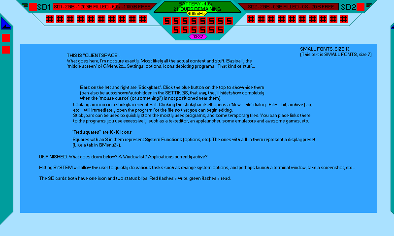
I've been having this idea for quite a while now, and just now decided to fire up MSpaint and draw it out a bit..
And here it is (the image itself should give quite enough information already about what is what):
pandora.png


There are some things I am not completely satisfied with (16x16 icons instead of 32x32, for instance, aswell as some pretty damn tiny text at some parts) and some things I forgot (Volume bar 'behind' the bottom part of the MHZ indicator, for example).. But generally speaking, the design of my little UI should look a bit like this.

Actual functionality should be quite a bit like GMenu2x, but with extra additions such as the Stickybars on both sides of the screen...

Also, since I did the entire (yet unfinished, by the way!) thing in MSpaint, it's rough and very unfinished. Ofcourse 'the finished thing' would have neat glassy-looking finishes on most of the panels you see... :)

Some functionality things:
Whenever the user presses SYSTEM (or HOME or START, forgot what the Pandora has. :/) he/she should be able to quickly edit some settings (mHz? Just click the yellow mHz indicator. Eject SD card? Just hit that indicator (this actually works everywhere, even when not playing a game)) and the user should be able to quickly launch programs such as a terminal client, or a screenshot grabber, things like that. The general design philosophy is that the user should 'feel' as if he can fullscreen into a game, and then 'alttab' back to the main system to do some tasks, and then 'fullscreen in' back into the game.

There is obviously stuff I have not thought about, and things I might have overlooked. Feel free to comment or even edit the GUI I made up. It'd be great if -together- we can come up with an awesomely working and greatly looking GUI. Got your own GUI concept? Feel free to throw it in here, too.. :)

Apologies for the semi-rushed post; it's getting rather late and I need to get up early again tomorrow, but I just wanted to get this post out to 'get the ball rolling', so to speak.. :)


This one is not the gui menu, but instead the window manager.

Windows (apps, games, emulators) run in fullscreen and pressing a special key or touching the corners of the screen, that frame shown on the mockup will be visible. Here you can switch betwen applications, close the actual or launch what you want.

There is no way to run any application in windowed mode. I don't see that a good idea on such a tiny screen.

Of course needs to be improved. Feel free to comment :)

(this mockup is very old, I had it lost on my hard disk)


<----------->


craiginatorhomemockupfolt6.png


And this one is an old mockup I did for the main menu. It works with python plugins. I have to improve it a lot.

Please dont make comments about the tiny fonts and icons and the wasted space. I KNOW THAT. It was a quick and dirty mockup, not the definitive interface... I will do a new one with big icons and fonts and without wasted space........
 
fonts would probably need to be a bit bigger considering the size of the screen..
 
Just in general, efegea I read that you know it already:

Please people, if you wanna design a UI do the following:
- Make a mockup of the actual screen size, so that you get an impression how tiny it is
- read my post over here: http://www.gp32x.de/board/index.php?s=&am...st&p=584288
this way, you get an impression too, read the whole post to see what is flawed about doing it this way (not as sharp as on the pandora).

Megagun: For example, a 16pixel wide icon on the pandora is 1,92mm wide. even a 32pixel icon is only 3,84mm wide.
General rule: Everything is at least half as long in both directions than on your average monitor. If you use a 19" TFT with 1280*1024 it's even 2.5*
I don't want to discourage anyone, but If you do hard work (and UI design IS hard work) I think it makes you happier to get it right the first time.
 
Last edited by a moderator:
Sorry efegea but I don't like that idea. It assumes that everyone will be constantly logged on to some kind of internet always. Some may do that but not everyone will.

I also think those menus with sequential lists and/or a single row of icons that must be scrolled through one by one to get to what we need is a waste of time and is tedious.

It should be a SIMPLE and small default launcher/interface much like Gmenu2X that doesn't eat up alot of RAM or CPU time. It should be able to completely get out of the way when a game or emu is run. It would suck to get stuttery/choppy games or emus just to have some foo foo pretty interface that you will only need to load an app.

It should have some kind of tabs that can isolate types of apps too. Like Gmenu has catagories (games, utilities, emulators, etc) this should also have something similar. It sucks to require everything to be in one huge pile of unrelated things. Games, emulators, text readers, internet browsers, utilities should not all be thrown into one messy screen unless you configure it like that. People seem to always propose pretty GUIs that assume that we will only have like 10 things on the SD cards(s) This thing will have two slots. There is a possibility that some of us will have HUNDREDS of apps games etc. It should be organized and easy to get to those and be very configurable.

If a more complex desktop PC type interface with all kinds of windows and fluff is wanted then that should be an option that could be installed only if wanted. That should not be default.
 
So why don't we just port/recreate gmenu2x and size it appropriately for the pandora?
Then we add an extra status icon for wifi.
And a row of icons for active programs too for task switching along the bottom.

Maybe permanently link it to the menu button. And make a few standards so you can bring this up on top of ANY game/program. So you can look up a walkthough, instant message, change music that's playing and then switch back to your game. :)

Maybe I'll do a picture when I'm home from work.
 
Balzac2m said:
Just in general, efegea I read that you know it already:

Please people, if you wanna design a UI do the following:
- Make a mockup of the actual screen size, so that you get an impression how tiny it is
- read my post over here: http://www.gp32x.de/board/index.php?s=&am...st&p=584288
this way, you get an impression too, read the whole post to see what is flawed about doing it this way (not as sharp as on the pandora).

Megagun: For example, a 16pixel wide icon on the pandora is 1,92mm wide. even a 32pixel icon is only 3,84mm wide.
General rule: Everything is at least half as long in both directions than on your average monitor. If you use a 19" TFT with 1280*1024 it's even 2.5*
I don't want to discourage anyone, but If you do hard work (and UI design IS hard work) I think it makes you happier to get it right the first time.


I don't think there will be too much of a problem with smaller fonts. As you said in the linked post, the important thing is dot pitch, the Pandora should be much sharper than your monitor.

I have a much lower tech method of estimating readability:
  • Make your mockup image at 800x480 - I guess everyone is doing that anyway
  • Make a frame - cut a hole the size of the Pandora screen in some card
  • Hold the card at a comfortable distance from your eyes for using a handheld, like 2/3 arm length
  • Hold it at that distance in front of your monitor and move away from the screen until the mockup fits into the frame.
  • Remember the distance that your head is from the monitor
Sorry for the drunk-monkey level of detail in that, but the point is just this, if you can read the screen from that distance, it will read ok on the Pandora.

Then it just becomes about personal preference and eyesight. My personal limit is 8 point, so Megagun's 7 point is a little small, ok for a mid-morning with no hangover :rolleyes:. efegea's fonts look great to me, any bigger and I'd start to feel like it was wasting valuable space.

Now could you accurately select text that small with a round ended stylus? That's another question...
 
Last edited by a moderator:
Karel Jansens said:
Is there any remote possibility Linpus could get ported to the OMAP? It seems like a nice, not too resource-heavy distro and the dual-mode UI is appealing.


Porting the whole distro is not really necessary. As "lite" as it is, it would still take up too much RAM. However, I see nothing wrong with stealing the UI layout (the one on the left):
ll94l03.jpg


That is exactly what we need. A tabbed UI with a small status bar.

Ideally it should work like the Xbox360 UI, where you can hit a button in any game, the game will pause, and the UI appears over top of it. There should be a tab for the current application, one for system settings, and one for a file browser built in. The user should be able to add additional tabs to sort their applications and media.

That is all you need. All applications and settings can be easily selected with a minimum of button presses. Those wanting to use the touchscreen can do so.
 
Last edited by a moderator:
Chip said:
That is exactly what we need. A tabbed UI with a small status bar.

Ideally it should work like the Xbox360 UI, where you can hit a button in any game, the game will pause, and the UI appears over top of it. There should be a tab for the current application, one for system settings, and one for a file browser built in. The user should be able to add additional tabs to sort their applications and media.

That is all you need. All applications and settings can be easily selected with a minimum of button presses. Those wanting to use the touchscreen can do so.
Seconded. Most people don't need or want a full Linux distro, just a simple way to run and switch between applications.
And I don't want to have to constantly break out the stylus whenever I want to switch applications. It should be fully navigable with just the buttons.
 
Last edited by a moderator:
Chip said:
That is exactly what we need. A tabbed UI with a small status bar.

Ideally it should work like the Xbox360 UI, where you can hit a button in any game, the game will pause, and the UI appears over top of it. There should be a tab for the current application, one for system settings, and one for a file browser built in. The user should be able to add additional tabs to sort their applications and media.

That is all you need. All applications and settings can be easily selected with a minimum of button presses. Those wanting to use the touchscreen can do so.
I was indeed mostly referring to the UI; hopefully it's just an open-source window manager. I'd still like to make a case for keeping the "dummy" part of the UI, and in fact making that opening by default. As has been pointed out, many prospective buyers of the Pandora aren't in the least interested in fiddling with Linux, or even making their Pandora do much more than playing games and some of the basic computer stuff. A lot of the Eee's selling power lies (surprisingly) in that "User Interface For Dummies".

Shiny said:
Seconded. Most people don't need or want a full Linux distro, just a simple way to run and switch between applications.
And I don't want to have to constantly break out the stylus whenever I want to switch applications. It should be fully navigable with just the buttons.
Agreed. Although I am, for those who know me, an avid tablet and HWR freak, it's quite obvious that the Pandora's main interface will never be the touch screen.

I'm still going to install CellWriter on mine though (mostly because there isn't any decent HWR for Linux anyway -- pining for my Newton, or even PenOffice).
 
Last edited by a moderator:
I'm glad there is another thread like the one I have. ;)

But seriously, what do you guys think of maybe some type of media center type interface?
 
DaveC said:
Sorry efegea but I don't like that idea. It assumes that everyone will be constantly logged on to some kind of internet always. Some may do that but not everyone will.
No, it doesn't assume that. These are plugins that you can configure as you want. You can have plugins that use internet or not. You can have as many plugins as you want. You can have only one big "my favourites" plugin or whatever you want.

Also, none of the plugins on the mockup requires a constant internet connection, only for updating themselves.

DaveC said:
I also think those menus with sequential lists and/or a single row of icons that must be scrolled through one by one to get to what we need is a waste of time and is tedious.
Well, you are right. But then? If the list or icons doesn't fit on the screen, then must be scrolled. I don't know another way to do this :huh:


My interface can be configured so you want a simple gmenu2x, you have it. You want something like my mockup, configure it and you'll have it. Well at least it was my original idea..
 
Last edited by a moderator:
I generally agree with DaveC about wanting a gmenu type interface. That could be spruced up by having Xbox 360 style blades along the side instead of the current menu of icons at the top of gmenu.

Also, it may be a good idea to have a customizable 'home' tab/blade. Having a news feed seems to me a waste of real estate, but if people want that they could put it there. Personally I would want my home tab to put my favorite programs and just battery info.
 
But the blades can put craigix into legal troubles with microsoft. What do you think?

I think the blades is a good idea beacuse of the format of the screen (panoramic) but don't know if it's possible..
 
Back
Top