You are using an out of date browser. It may not display this or other websites correctly.
You should upgrade or use an alternative browser.
You should upgrade or use an alternative browser.
New render of the Pyra
- Thread starter Kev2442
- Start date
thatgui
Advanced Member
- Joined
- Apr 2, 2009
- Messages
- 3,048
Don't want this to get just another Keyboard thread, so I leave this with my personal Pandora experience: "F11 was one of the least used F-keys on my Pandora". But if thats your opinion about it, I would not even know how to convince you otherwiseWhat's the problem with that? It's the most used F-Key on my Pandora.
Edit: Ah, what the Heck, make this button "USR2", preconfigure it with [F11] but 'shove' [F11/12] onto the 'main' keyboard area nearer to the other F - keys
Last edited by a moderator:
Yes it does. And it is really a community-designed keyboard. It sure took a lot of discussion threads, polls, hundreds of layout proposals, brainstorming and heated discussions, but the result is worth it. We managed to design a very, very nice keyboard if you ask me.I have to retract my words that renders don't add much at this point, the keyboard render looks fantastic!
It's impossible to trace back who made what suggestion and how exactly it ended up at that, but there's a lot of community input in this one. In particular, the following people have made important contributions to this keyboard layout:
Grench, ible, Saber, comradekingu, Eight Bit, WizardStan, B-Zar, mrpalmtop, rygD, Levi, Urben, _jr_, Neelix, slaeshjag, Fusion_Power, codifies, Glyph Reader, 3xcl4m4t10n, and probably quite a few others I forgot. Also EvilDragon himself, and in all modesty, myself. And a lot of community members who made smaller contributions, or just voted in the polls.
It is a very nice keyboard for the following reasons:
- It has all the symbols you'll find on a standard US-QWERTY keyboard. Moreover, it respects the standard shift-pairs on the number row, and the symbols on the Fn layer respect the convention that the last row (Fn+ZXC...) are the unshifted symbols and while the penultimate row (Fn+ASD...) are the shifted symbols.
- It has all the symbols you'll find on a standard German keyboard: üöäß and ° § € are there, and they're in a location close to where a German would expect them to be.
- It has all the letters needed for French: éèàç are there (relatively close to their expected locations), and there's a dead circumflex / dead diaeresis key to easily type âêîôû and äëïöü (well, for äöü there is of course an even easier way...)
- The keys labeled ` ´ ~ can be configured in software to behave as dead diacritics, for grave (àèìòù), acute (áéíóú) and tilde (ãõñ). For French this is not really needed (except for the ù in "où"), but for Spanish, Portuguese and Italian this is nice.
- Compose is an easy mash-action (like Tab on the Pandora), so all remaining special stuff is covered better than on the Pandora
- Many new dedicated keys compared to the Pandora: Esc, F11, Tab, apostrophe, Ins, Del, Brightness and a user-definable key.
- Thanks to Fn and Alt on shoulder buttons, and the number row in a much more reachable location, it will be much easier to use the F-keys (e.g. Alt-F4)
- There's even room for my hidden dead GREEK and dead MATH keys at Shift+Fn+G and Shift+Fn+M
FaeMinx
Rainbow Liberation Instigation
^ You forgot to say:
*brightness controle on 1 dedicated key! YES!!!!
Edit: Ok, well... you sort of did. But no harm in bringing more attention to the awesomeness!
*brightness controle on 1 dedicated key! YES!!!!

Edit: Ok, well... you sort of did. But no harm in bringing more attention to the awesomeness!

Last edited by a moderator:
Bosbeetle
Terminally lost
Does this mean that the keyboard discussion are done with....  I think it's a major milestone in the project!
Caine
Hardcore Member
Approx. 140 x 84 x 29 mm (if the site is up-to-date).nicenicebtw..what are the dimensions of the case??
levi
Still fresh, damnit!
Does this mean that the keyboard discussion are done with....I think it's a major milestone in the project!
Nope, still WIP.So is this the Final Keyboard Layout?
rygD
Nihilistic Mystic
I agree with FaeMinx on the less bright Fn markings, which was why I mentioned grey.
I am not fond of baby blue, but whatever works will be fine. I am using a keyboard that is nearly identical to the Droid 4 (Photon Q) to type this, and that yellowish color works well.
I am not fond of baby blue, but whatever works will be fine. I am using a keyboard that is nearly identical to the Droid 4 (Photon Q) to type this, and that yellowish color works well.
fusion_power
Advanced Member
What does the guys suggest that do this keymat? I mean they should have experience with such stuff like guiding the light only where it belongs, the labeling in our case and not the surrounding (would look cheap imho).As the printing is on the inside of the printing, they need to be totally clear otherwise you couldn't read them.
It should be pretty accurate - though one thing I'm still working on is the large surroundings (where the keys look blacker right now).
This would also let through the backlight, so you would have huge rectangles around the key. This needs to be solved!
For the rendering, I suggest more contrast in ligtning so we can see more details. Some (decent) glossyness in the mats also can help. And there is an Option in the blender rendering settings which let you choose the Anti Aliasing method. For years I made the mistake to let this at standard which gives only blurry images. Not sure if the new Blender versions still have that filter as default but Blender offers some nice AA filters that automaticly improve the rendering quality. (F10 or F11 were the rendering settings).
Last edited by a moderator:
Like already said, there's something already there and unless the camera is pointing down in the bottom of the case, that would be a awkward place for the camera anyway.People can put cameras and stickers and stuff there. I will usually be looking at the places where all the action takes place, not the front edge. (I can't remember what is going on to the right of the screen but I was thinking the top fake screw might be a good place for a camera for those that want to add one.)
Probably where the whole name should be officially.I like it! I'm gonna put a DragonBox logo decal/vinyl sticker where the blank space is.
Btw, what is that hole next to the SD card again?
Last edited by a moderator:
pmprog
DNF (Did Not Finish)
- Joined
- Apr 25, 2011
- Messages
- 4,150
Volume wheelBtw, what is that hole next to the SD card again?
Well, if we really want the best connection, it would be a solid red. I'm sure we can get a red that isn't really orange, andnot have it light up pink.Oh, I thought ED already was on the reddish/orange color track to reflect the fire connection. In that case I want some sort of yellow
I thought the whole button would light up, maybe that's a bit too much? Also, how strong would these lights be anyway. Like can the Logo be used as an effective flashlight?Yes, thin ones are okay. That's what I'm trying to get as well.
I see.Volume wheel
rygD
Nihilistic Mystic
Cameras can be mounted externally, like the stickers and stuff. I was just offering suggestions for those that are disturbed by an empty spot on the case (I hope they don't look at the bottom, or on the back of the top). Maybe there shouldn't be a camera. Oh, wait...Like already said, there's something already there and unless the camera is pointing down in the bottom of the case, that would be a awkward place for the camera anyway.People can put cameras and stickers and stuff there. I will usually be looking at the places where all the action takes place, not the front edge. (I can't remember what is going on to the right of the screen but I was thinking the top fake screw might be a good place for a camera for those that want to add one.)
fusion_power
Advanced Member
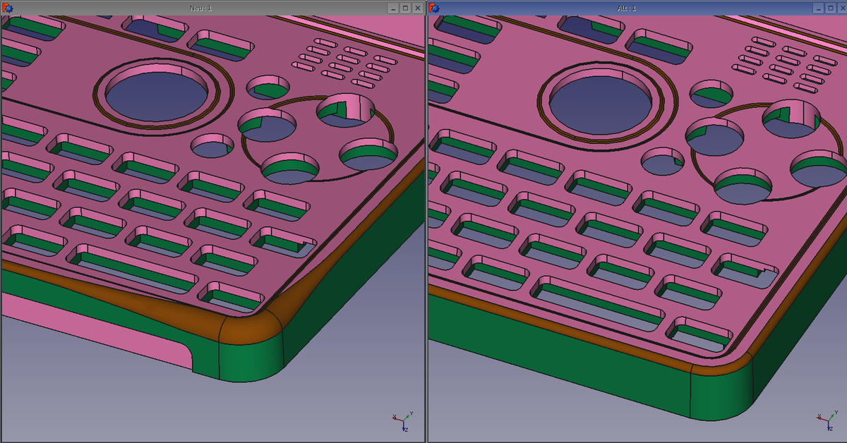
Now that I see more renderers, the case indeed missing the improved edges, I thought they were approved...

What happend?

What happend?
Last edited by a moderator:
ekianjo
Hardcore Member
uh oh, you are right, they are missing.Now that I see more renderers, the case indeed missing the improved edges, I thought they were approved...

What happend?
ED, did you decide against them in the end ? Any particular reason ?
Wrath Of Khan
Soul soother...
I think its just a more subtle effect now. The render may not do it justice.
Similar threads
- Replies
- 12
- Views
- 5K
- Replies
- 101
- Views
- 19K
- Replies
- 11
- Views
- 2K

