New pyra picture for main page


looks like we got a dark red pyra on the main site now.  very exciting!
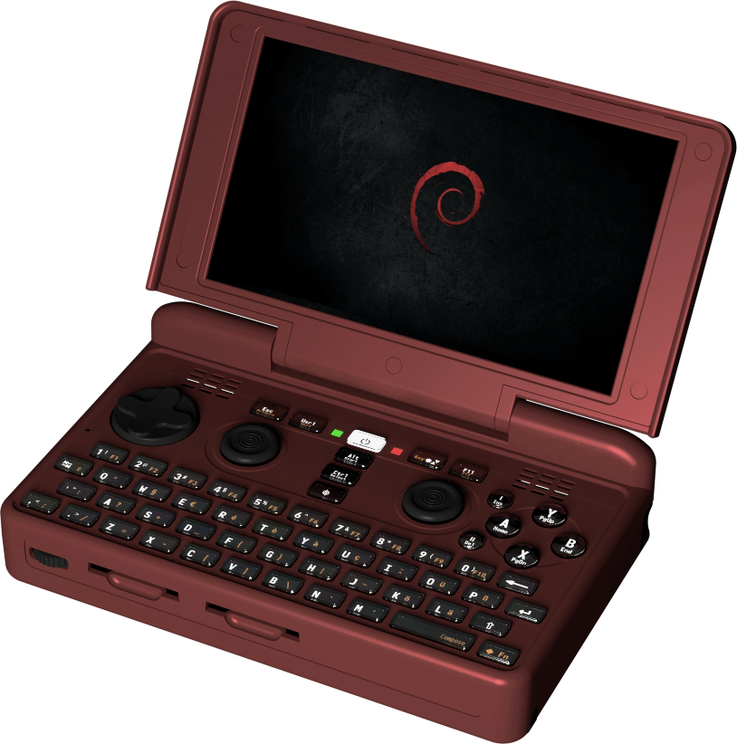

pyrared.png


looks close to Fusion Power's dark red with black controls, though with a little less saturation maybe?
 
Last edited by a moderator:
I suppose it matches the default theme of the site quite well...  I have to say that I find that colour kind of off-putting myself. 


Colour aside, may I recommend making the image smaller?   or perhaps adding some auto-resizing code?  As it stands the text is reduced to a column about an inch and a half wide on my screen,  which reduces readability, and the image itself overflows the right side of the screen.


-Neelix


Edit:  For the record my screen is 1024 pixels wide.
 
Last edited by a moderator:
I think it is still a bit dark, I´d recommend to light up the keyboard area+controls as they are pretty much the highest important factor when one looks at the product in a general way.


edit: you may also want a bit of light on the right, so to show the pen and a bit of the shoulder buttons.
 
Last edited by a moderator:
Well, apparently Levi didn't get the little meaning hiding behind WizardStan's emoticon.

My fault, I forgot that emoticons were case sensitive.


:p


edit: Or maybe they aren't?  Because that one appears as the correct icon in the editor but when I hit save it changes back to text.  It's entirely possible that the forum software is just garbage


edit edit: and now it is an icon again. Weird.
 
Last edited by a moderator:
Back
Top