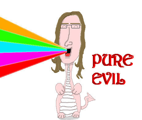
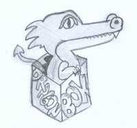
Agree. I really like to dpad idea, but as it is, that logo isn't really memorable or striking - and falls down when scaled:Logo could be bolder,
Given, that the logo will be used as a web banner I think the text should all be on one line, and the letters should be more spaced out:
(quick and dirty modifications)
Last edited by a moderator:


