Finding a proper name and logo :)


That is true. I was only commenting your, as I understood it, statement how these symbols "really are". The base shape is very simple, as with latin alphabet. Fonts make all the decorations.
Yeah, I guess I really didn't express myself clearly.Probably revised the thought behind my statements in the time between them too. :)
 
Last edited by a moderator:
When you're cutting letters into stone slabs with a hammer and chisel, or drawing them in a clay tablet with a stick or nail, you probably want to use a simple sans serif font, regardless of the alphabet :)
 
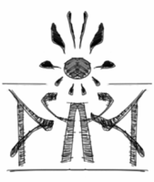
Simple d/p ambigram letters, which could be carved into a stone slab with a chisel fairly easily :)

The ones around it are just what I done on the way to that one

zvevwy.png
 
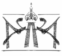
Here's another d/p ambigram one, with a little bit of a mobius strip look about it I think

2q2fz37.png
 
:)

And the one beneath that is a bloke with a fat sovereign
 
Last edited by a moderator:
Simple d/p ambigram letters, which could be carved into a stone slab with a chisel fairly easily :)

The ones around it are just what I done on the way to that one

zvevwy.png
Can you do more with the mid bottom in mind?
 
We could copy and paste favorites which have already been posted some more.
 
Personally, I've just not really played around in pshop to think of new ones now, as ED has already decided his shortlist.

No harm in producing more though, but I think we likely to see one of those shortlisted options be picked and perhaps refined a bit once chosen
 
Personally, I've just not really played around in pshop to think of new ones now, as ED has already decided his shortlist.

No harm in producing more though, but I think we likely to see one of those shortlisted options be picked and perhaps refined a bit once chosen
He has?  I should keep up with the news section too.
 
Yeah there's a thread titled 'Logo Discussion' ...already a fair few pages with discussion also some new ideas in there too, but if you read the first post from ED you'll see his shortlist :)
 
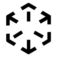
So i drew this, after thinking about it for a little while


Then i redrew it on the com pu tar, which took a much longer while.


hooha.png

View attachment 8657

And now i feel worthless. Digital age permits me to share my shortcomings. Laziness prevents me from just scanning in my sketch.

The idea here is that you can think of the middle section as the farthest away corner, or the closest one.

Edit: the second one is the closest to what i had, but i think the middle section is supposed to be centered moreso than it is in between the corners, so squashed in a bit.
 
Last edited by a moderator:
Back
Top