Banners for the Pandora Rebirth comp. (WIP thread)


Binky

Death's Steed
Staff member
Joined
May 28, 2003
Messages
6,997
Location
16A (TO)
(NOTE: This thread was split out from this news post about the Pandora Rebirth Competition, and then combined with a thread subsequently created by Binky in this section. Please bear this in mind when you encounter the point where this thread makes no sense. :p --Prometheus)


A quick banner:


prcomp.png


Constructive criticism appreciated!


"Entered into" could be replaced with "#th place Winner"


Edit:


And a matching splash-screen:


prcompsplash.png


Again, what don't you like about it? Wrong coulours? Font? Won't go with your entry?
 
Last edited by a moderator:
A quick banner:


prcomp.png


Constructive criticism appreciated!


"Entered into" could be replaced with "#th place Winner"


Edit:


And a matching splash-screen:


prcompsplash.png


Again, what don't you like about it? Wrong coulours? Font? Won't go with your entry?


Your text isn't correctly centered. And I also vote for more Pandora centric colours, I.e. Black - white gradients with Blue highlighting. Perhaps some more layer fx effects on the text - Particularly the 'Pandora's Rebirth'.


Once you have the design down pat, it might be a good idea to do a number of variations in colour scheme (subtle variations mind you), so that there is an optimal choice for everyone.


I have no idea if the text used get's ED's message across - He would have to chime in here.


EDIT: If we are seriously going to do the community clock - I have dibs on number 3!!!!! =3


(unless of course the core team want to reserve it) ...
 
Last edited by a moderator:
As these will be added to community members' games, I think there should be discussion of what they should look like.


I will have a go at producing them unless someone objects.


Here's what I have so far (see the end of this thread for latest):


pandrebcompsplash2.png


How could it be improved?


What sizes should it come in? (Badge/banner/splash screen/?)


EDIT: That's odd, its still reporting 0 views although I jsee someone reading it every time I view this page, It must be a feature!


EDIT2: OK, its registering views now.
 
Last edited by a moderator:
if I can't say something nice, I won't say anything at all. :'(
 
Here come two quick & cheap GIMP'd Pandora pictures, for gold and pearl white, because getting a real picture soon depends on the production of those boards, especially if the winner chooses (thus in March).


The images were simply modified from the PandoraFront photo found here. The pearl white has a black background for better contrast (and trying to set it white makes ugly borders!). Of course, because these were formerly photos, there is no transparency


goldenpandora.jpg


pearlwhitepandora.jpg


Tell me what you think! (I know, I didn't change the SD cards much, but I bet there are golden SD cards somewhere...)


EDIT: I forgot to say I rotated the image so that the screen would fit in a straight rectangle selection, so that the screen content wouldn't change colours. I should have rotated them back to normal, but who cares? Anyone can rotate it to his/her needs!
 
Last edited by a moderator:
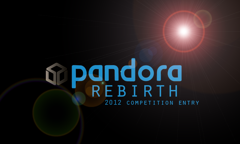
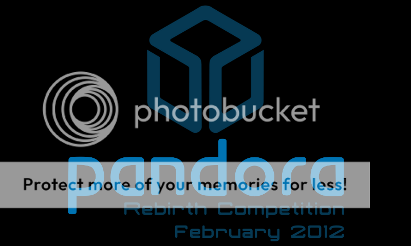
Here are two quite simple splash-screens from me - 800x480, as you'd expect. :p I figured that simple was best, so I went with something in the style of boot-up logo screens from classic consoles and computers - just a logo and some text.


The font used for the "Rebirth Competition"/"February 2012" lines is Classic Robot, as that's always seemed like quite a nice match for the Pandora logo font, to me.


Pandora_Rebirth_Competition_Splash-screen_White.png


White background.


Pandora_Rebirth_Competition_Splash-screen_Black.png


Black background.


I hope someone finds these useful.
 
Last edited by a moderator:
Oh, do I post my splash screen things here, rather than the thread in General Talk? :p Ok, then.


Pandora_Rebirth_Competition_Splash-screen_White.png


White background.


Pandora_Rebirth_Competition_Splash-screen_Black.png


Black background.


I kept it simple, and in the vague style of logo screens from classic consoles and computers - just a logo and some text. The font used for the "Rebirth Competition"/"February 2012" line is Classic Robot, since I figured it went nicely with the Pandora logo font. :p
 
Last edited by a moderator:
Oh, do I post my splash screen things here, rather than the thread in General Talk? :p Ok, then.
Huh? You're a moderator - it doesn't really make sense to put these images here, so why not explain why it would make sense to put them there, and encourage people to do so?
I might be a moderator, but I'm certainly not omnipotent.


I didn't read this thread until rather later than the one I linked to, and it seems that people are mainly posting them here. Quite how am I supposed to know which one is the right one? Being a moderator doesn't magically make me able to know that - I'm only human (or a robot, if you go by the avatar :lol: ). After all, this earlier thread exists, and the activity seems to be focussed here.


By all means, if the one in General Talk is more appropriate, people should be posting there, but it does seem that people are posting them here instead... :p
 
Last edited by a moderator:
Black background.
I think I like this best so far, nice and simple ... allthough it might be a bit too dark. Then again: maybe not, this way it will be very subtle and it does not push the game or application back or interfere with its own color-scheme or general mood and atmosphere.
 
The Pandora Rebirth Competition does not end before Feburary 29th. So, if one first discusses what size would make most sense for the final image, so that developers know what will await them, then there will be plenty of time left for everyone to contribute. The final decision can then be made through a community voting.


In case everyone is okay with the 800x480 splash screen that appears to be the prevalent preference right now (any comments from people taking part in the Pandora Rebirth Competition?), I propose the following deadlines (at end of each respective day, UTC) in request for comments:

  • 15feb2012: Last day that graphics can be submitted.
  • 16feb2012-22feb2012: Final voting.
 
Depending on what is ported, some may prefer to be able to choose between 800x480 and 640x480?


If it's a windowed application probably neither makes sense, so probably one should allow to resize it to whatever is reasonable (as long as it does not bypass the idea of a splash screen).
 
Quite how am I supposed to know which one is the right one?
Ah, okay. Well, it's often better to have several little, dedicated things than to have few huge things that become bloated, and this is especially true in the world of IT where information is easily manipulated (in the sense of 'worked with'). This thread here currently contains at least three different topics: a discussion about banners; a discussion about some entries to the actual software competition; as well as the actual discussion around the Pandora Rebirth Competition news and rules, which to create was the original purpose of this thread. (Not counting the meta-discussion of discussing a good location for the banner discussion as a separate discussion. ;) )


There is nearly no penalty to having several dedicated threads, whereas the more topics a single bloated thread contains, the less useful it will be as following the posts relevant to one of the topics becomes more difficult and every added post becomes an obstacle to the other topics. One could say that paradoxically, if this thread was only used for directly discussing the news and the competition's rules, and all other topics were being discussed in separate threads, then there would likely be *more* discussion with a potentially higher usefulness.
 
Last edited by a moderator:
Back
Top