And now for something completely different (Keyboard Option)


I like Grench's layout the best as well. Here's my spin on it, though:
 
http://www.keyboard-layout-editor.com/#/layouts/5e13b6cd098b746f350f98ce44384c22
 
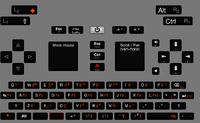
I decided to literally leave two keys blank on the keyboard to allow people to completely customize what they want to appear. My version also has dedicated volume keys (software controlled) as well as dedicated brightness controls.

This is still a work in progress though so it's a little half-baked and has a few duplicated keys. Do we know what the functionality of the Alt key is? It would help us all out a lot if Alt functioned as AltGr for languages with accent marks and diacritics. Then, we would not need nearly so many Function double ups.

mrpalmtop-keys.png
 
Last edited by a moderator:
This is what I like about these discussions: there are several distinct splinters with a few key ideas, and some people see merit in the idea and give it a bit of a shake to come up with something closer to their ideal layout.
 
I like Grench's layout the best as well. Here's my spin on it, though:

http://www.keyboard-layout-editor.com/#/layouts/5e13b6cd098b746f350f98ce44384c22


I decided to literally leave two keys blank on the keyboard to allow people to completely customize what they want to appear. My version also has dedicated volume keys (software controlled) as well as dedicated brightness controls.

This is still a work in progress though so it's a little half-baked and has a few duplicated keys. Do we know what the functionality of the Alt key is? It would help us all out a lot if Alt functioned as AltGr for languages with accent marks and diacritics. Then, we would not need nearly so many Function double ups.
Though not my ideal keyboard I'd give this an extra Fn/Meta key on the bottom right. ;)
 
i wouldn't want dedicated volume buttons (we already have a wheel), especially where you'd want to have gaming buttons.
 
OK, here's my revision:

http://www.keyboard-layout-editor.com/#/layouts/26762fd367a8ed56a08526c135c363a3

I've taken ible's idea to heart and removed the volume keys. I also added in a key labeled as "Compose" to facilitate accented character entry. Think of it as AltGr. Also added in additional Fn key on the right side since that does make sense with all of the Fn combinations.

Speaking of those combinations, I also included an Fn key binding to shut off the backlight (Fn+Spacebar). I'm not sure if that's possible yet but it seems like it could be a great way to save power.

24502.png
 
i like some of the keys better, though i thought some of your other ideas were very interesting (-_ in the lower right on the previous version, though i like how it is now close to =+).  i also like to keep the KB backlight off on my computers (to save power), and since i can type by memory.

last comments:  it doesn't have umlauts, which ED may not approve, and I'm not fond of ;: being so far inward -- this would be hard to type ;Enter or :Enter (for coding).  I might be tempted to move `~ to where \| is currently, and shift those over right one (\| and ; :) .  it's not a huge improvement, but it hopefully moves less used keys towards the very center, while keeping things about where you expect them.
 
Grench, shouldn't the shoulder buttons be swapped? You have shift+Fn on the left-side on the top of the keyboard, by swapping L1/L2 with R1/R2 you get a pair of Fn+shift on the right as well.

This makes it easier to hold the modifiers with one hand and type buttons with the other.
That was actually part of my original design.  A few people hated it and went on about how it MUST have the shift on the left because that is where it is on the Pandora.  I'm good with moving that to the right.  That would be a minor adjustment.

OK, here's my revision:

http://www.keyboard-layout-editor.com/#/layouts/26762fd367a8ed56a08526c135c363a3

I've taken ible's idea to heart and removed the volume keys. I also added in a key labeled as "Compose" to facilitate accented character entry. Think of it as AltGr. Also added in additional Fn key on the right side since that does make sense with all of the Fn combinations.

Speaking of those combinations, I also included an Fn key binding to shut off the backlight (Fn+Spacebar). I'm not sure if that's possible yet but it seems like it could be a great way to save power.

24502.png
Three Fn keys.

Three Shift keys.

Keypairs are broken - not DosBox compliant.

Sorry, that one doesn't get us there.  Some interesting concepts though.

Oh - and 'Comp' is already but not written on the original - it is Fn+↵.

 ;: being so far inward -- this would be hard to type ;Enter or :Enter (for coding).  I might be tempted to move `~ to where \| is currently, and shift those over right one (\| and ; :) .  it's not a huge improvement, but it hopefully moves less used keys towards the very center, while keeping things about where you expect them.
The whole device is less than 6" wide.  There are no keys that are, "hard to type".  The more difficult to reach ones are in the middle, between the nubs.  The entire bottom row is VERY EASY to reach.

Try it out on your Pandora.  If you don't have a Pandora, fold a piece of paper into Pyra dimensions and put a series of markings on it to represent the lower keys.  I think you'll find that the entire row is VERY easy to reach.
 
Last edited by a moderator:
A few of you have done some interesting twists on this layout:

http://www.keyboard-layout-editor.com/#/layouts/ee8d3bc8b446f99c027105d3810f8d07

The numbers seem to be what people dive on, but I consider that a set of beneficial features that they're not understanding.

So, other than the numbers, what is it that you find lacking or in need of improvement?  I.e. what is bothering you about the existing format?  (Other than the numbers on Fn.)
 
So, other than the numbers, what is it that you find lacking or in need of improvement?  I.e. what is bothering you about the existing format?  (Other than the numbers on Fn.)
It is a very strong layout in my opinion, there are some things that bother me a bit, but everything seems to be in place for a reason and I am having a hard time improving on it.
Here is my list of "issues":

  • The ;: and \| are in a too hard to reach place (requires stretching or hand placement change). These are VERY common programming keys (esp ;: ) and deserve a more premium position to me (this is even worse if you don't use the international keys, I do like that they are in German default position)
  • Double modifiers for shifted numbers is not the greatest, but I think the advantages outweigh the downsides, provided the double modifier is easy to hit. I am not convinced that is currently always the case. Pressing shoulder buttons and keyboard keys on the same side of the keyboard feels awkward to me and the double button is harder when typing on tabletop.I prefer to have balanced modifiers on both left and right side (I am fine with one side being on the shoulders). My preference is to move both shift and Fn towards the right on the keyboard to maintain backwards compatibility with the Pandora shoulder buttons (and I also prefer Ctrl+Alt on the right since I use them more often in combination with keys on the left (in Emacs). Easier said then done though.
  • Minor issue, `~ belongs on the left hand, [{ and ]} on the right.
Not an issue, just a question, on which keyboard layouts have you based your zxcvbnm Fn key assignments?
<edit>Following my own issue list, I arrive at something like: http://www.keyboard-layout-editor.com/#/layouts/4a91d1cb719d8e66b6551d826012f2b5. Which ... I'm not sure about yet...

I think I prefer this version: http://www.keyboard-layout-editor.com/#/layouts/31160279c081d072b372ec42703ead71. It feels more familiar.

</edit>
 
Last edited by a moderator:
Here is my list of "issues":

  • The ;: and \| are in a too hard to reach place (requires stretching or hand placement change). These are VERY common programming keys (esp ;: ) and deserve a more premium position to me (this is even worse if you don't use the international keys, I do like that they are in German default position)
I suspect this is a misconception about hand/thumb placement and reach. With the Pyra in the palms of your hands and thumbs on the nubs, your thumb from palm to tip has described a line. That line can describe an arc from the nubs down to the center (actually a bit past center) of the lowest row of the keyboard.
Try this on a Pandora. The natural arc from a thumb pivoting without changing hand placement should land both thumbs directly on the space between the Pandora's V and B keys.

That is the same overlap spot as \| and ;: occupy.

http://www.keyboard-layout-editor.com/#/layouts/ee8d3bc8b446f99c027105d3810f8d07

So, the ;: key on this layout is not only reachable without changing hand position - it's also in one of the easiest to find and reach places on the whole keyboard. It can be reached with the natural arc of the right hand and is also reachable with a very minor stretch of the left thumb. Those two keys, \| and ;: are actually in the most accessible spot on the keyboard - they can be 'reached' or found with BOTH thumbs.

I would have loved to have put the space bar there, but case production moved forward without giving that kind of layout any second thoughts.

  • Double modifiers for shifted numbers is not the greatest, but I think the advantages outweigh the downsides, provided the double modifier is easy to hit. I am not convinced that is currently always the case. Pressing shoulder buttons and keyboard keys on the same side of the keyboard feels awkward to me and the double button is harder when typing on tabletop.
    I prefer to have balanced modifiers on both left and right side (I am fine with one side being on the shoulders). My preference is to move both shift and Fn towards the right on the keyboard to maintain backwards compatibility with the Pandora shoulder buttons (and I also prefer Ctrl+Alt on the right since I use them more often in combination with keys on the left (in Emacs). Easier said then done though.
The right side of a 'normal' keyboard is heavily weighted with 'functional' rather than 'symbol generating' keys. With any Pyra layout you'll wind up with it being tight to incorporate all of the needed keys before even considering shoving Fn and shift into the mix.
From your own experiments you can see what kind of a, "Well - if I put these here then I have to push those to there and those to there and where the hell am I going to put this..." scenario that leads into.

I do agree that it would be good to have the shoulder Fn+shift combination on the opposing side to the keyboard Fn+shift combination. To get there, though, I think it would need to be the shoulder button definitions swapping sides instead of moving the keyboard Fn+shift to the right. There just isn't room for all of that on the right.

  • Minor issue, `~ belongs on the left hand, [{ and ]} on the right.

Not an issue, just a question, on which keyboard layouts have you based your zxcvbnm Fn key assignments?
I combined what ED said he wanted with what had been discussed and in many cases used on other layouts and thought long on what makes sense to put on what keys in which combinations. In many cases their placements were feedback from _wb_.
I put ß on Z because ß is a letter with upper and lower cases and nothing else fit Z better.

The ¡¿ Spanish punctuation symbols made sense to map together. It may make sense to flip them to ¿¡.

C to Ç is a pretty natural mapping.

I put Euro and Pound signs on V for 'Valuation'.

Next to the V I put the international currency symbol on the Fn+shift+B in case someone needed to map a key to an additional 4th currency.

The Fn+B key got the § sign - it needed to go somewhere and I had a symbol without a pair on the B key.

N to Ñ is a natural map.

M to micro µ is a natural map. There is no capital for µ, leaving a spot on Fn+shift+M for °.

You'll notice that there are 3 keys on the lower left that have no Fn or Fn+shift mapping. -_ =+ \|

If there is a need or call for additional symbols - i.e. if I missed anything needed to support a language that should have direct support, those are likely spots to add them on the Fn and Fn+shift layers.

An idea I'm toying with...

One of the issues with having backspace and delete both on the game pad area is that when in 'game mode' all of those buttons will potentially be re-mapped into the game itself. So I'm toying with the idea of adding a second backspace on the Fn layer. I'm not fond of dual-mapping, but in this case it might not be a bad idea.

That lead me to this:

http://www.keyboard-layout-editor.com/#/layouts/bcac3a9de15b01c4b1146b0118a46ea6

Which made me think - how often is Ü<sup>È<sup>Å going to be needed? Can it live on the Fn layer? Like this? Germanic language users could choose which they want 'on top' - the letter key or backspace. Yes, this gives some compromise to the language capabilities, which isn't ideal, but is it an acceptable trade off?

http://www.keyboard-layout-editor.com/#/layouts/b76ffdc065642c07243bad385b4a06a8

At that point that top right corner of the keyboard gets a bit wonky looking, but functionally is pretty awesome. It reunites the Insert key with Delete, Home, End, PgUp, PgDn. It makes the space bar 100% dedicated as space bar under all modes. I explicitly labeled Compose at Fn+↵ on this one, but I don't know if that would be 100% needed as an explicit label on the end product. I also flipped the shoulders on this one. Does that make it 'better'?
 
Last edited by a moderator:
I suspect this is a misconception about hand/thumb placement and reach.

...

Try this on a Pandora.
I did, I think that is the main problem. I avoid the shoulder-pads on the Pandora for modifiers since the shoulder buttons *suck tremendously*. As a consequence, I end up overstretching my right hand to type many keys on the left-side of the unit.
So while this may indeed be an artifact from the broken shoulder buttons of the Pandora, but I do dislike the combination of shoulder-button and thumb action on a single hand and tend to avoid that by typing left-side characters with my right hand instead. The Fn/Shift and Ctrl/Alt swap fixes that.

I would have loved to have put the space bar there, but case production moved forward without giving that kind of layout any second thoughts.
Yes, it was weird to me too that the physical keyboard layout was finalized without serious consideration of the software layout. But that ship has sailed.

From your own experiments you can see what kind of a, "Well - if I put these here then I have to push those to there and those to there and where the hell am I going to put this..." scenario that leads into.
Indeed. I suppose my biggest beef here is the three buttons reserved for international usage, which I cannot think of a good use for (esp. since we already have full multi-button diacritics support, i.e. Fn+"+u for a 'ü'). However, not everyone has the same usage pattern, so those international keys do matter.

I do agree that it would be good to have the shoulder Fn+shift combination on the opposing side to the keyboard Fn+shift combination. To get there, though, I think it would need to be the shoulder button definitions swapping sides instead of moving the keyboard Fn+shift to the right.
I agree, but I suspect that opposition to breaking Pandora backwards compatibility will be strong here.
One of the issues with having backspace and delete both on the game pad area is that when in 'game mode' all of those buttons will potentially be re-mapped into the game itself.
Instead of having dual buttons, I consider this to be a strong argument to prefer the more traditional assignment of both ins and del to the extra gaming buttons.

The downside is this "eliminates" a key as I certainly would NOT put backspace on the Fn layer (I hit backspace way too often :p ).

Does that make it 'better'?
Not sure, I think people who actually use those keys should judge that. It is a bit assymetric, but I do think I personally prefer it.

<edit>Some more experiments. Moved the international symbols entirely into the Fn Layer: http://www.keyboard-layout-editor.com/#/layouts/8e52f192496ab410a8399cc45b0adc8d

The © and ® symbols are placeholders for user-assignable keys (no idea what to put there and/or what symbols to use for them). Perhaps more international keys.

And getting a bit crazy here: http://www.keyboard-layout-editor.com/#/layouts/0f107a8e6f368543d0675766a8466477. If those bottom middle keys are indeed so easy and comfortable to reach, then why not put the modifiers there? Makes it possible to strike them with both hands.

</edit>
 
Last edited by a moderator:
Aren't those Keys on the bottom Row on the Left and Right side very Hard to reach? It's very hard to reach that Place on the original Nintendo DS. Maybe ED should test it on the prototype.
 
Does that make it 'better'?
Not sure, I think people who actually use those keys should judge that. It is a bit assymetric, but I do think I personally prefer it.
We need some native German speakers to pitch in on some of this.
<edit>Some more experiments. Moved the international symbols entirely into the Fn Layer: http://www.keyboard-layout-editor.com/#/layouts/8e52f192496ab410a8399cc45b0adc8d

The © and ® symbols are placeholders for user-assignable keys (no idea what to put there and/or what symbols to use for them). Perhaps more international keys.
I think that's a bit overboard. You're effectively saying that everyone else's randomly mapped miscellaneous keys are more important than the letters of the alphabet of the people who are financing, designing and manufacturing the device... The Ö, Ä, Ü and sometimes ß are all basic letters of the 30 character German alphabet. The keys have a funky label on them so that those same 3 keys can support Germanic and French language bases. Part of the idea in this layout is to give fantastic support to German, French, Spanish and others without compromising English use.
And getting a bit crazy here: http://www.keyboard-layout-editor.com/#/layouts/0f107a8e6f368543d0675766a8466477. If those bottom middle keys are indeed so easy and comfortable to reach, then why not put the modifiers there? Makes it possible to strike them with both hands.

</edit>
I had actually considered that same idea. From a pure function standpoint it's a pretty good thought. However, from a user acceptance standpoint, it makes what I did with the number row seem like a non-issue.

I would like to get some feedback from a native German speaker on this concept:

http://www.keyboard-layout-editor.com/#/layouts/b76ffdc065642c07243bad385b4a06a8

How badly does it compromise German use to have Ü on a different Fn layer from Ö and Ä? Where Fn+shift can be chorded - and are on the opposing corner of the main keyboard, it shouldn't be overly difficult to hit - but is it acceptable to put it there? I imagine there could be a choice in the hardware configuration menu whether ÜÈÅ is Fn/UnFn or ⌫ is Fn/UnFn.

If it DOES badly mess things up to have ÜÈÅ on the Fn layer, then we could still do this:

http://www.keyboard-layout-editor.com/#/layouts/ee8d3bc8b446f99c027105d3810f8d07

Or maybe this (Yes - I know, ⌫ is on the Fn layer.):

http://www.keyboard-layout-editor.com/#/layouts/23802d9513776be92624f1e9213e321a

Would this be too confusing? Dual mapped ⌫ and ⌦ onto the Fn and Fn+Shift layer of the space bar so they're retained somewhere when the game buttons are re-mapped for games.

http://www.keyboard-layout-editor.com/#/layouts/081f730069c9df176e733485bd94080d

It has the advantage of preserving the top right 3 buttons of the keyboard as a 3 key expansion to the game pad keys for a 9 key game pad. Backspace on top right would otherwise potentially get in the way of that.
 
I think that's a bit overboard. You're effectively saying that everyone else's randomly mapped miscellaneous keys are more important than the letters of the alphabet of the people who are financing, designing and manufacturing the device... The Ö, Ä, Ü and sometimes ß are all basic letters of the 30 character German alphabet. The keys have a funky label on them so that those same 3 keys can support Germanic and French language bases. Part of the idea in this layout is to give fantastic support to German, French, Spanish and others without compromising English use.
That is a valid point. Wild experiments are good every once in a while though. They tend to spawn new ideas :)
I had actually considered that same idea. From a pure function standpoint it's a pretty good thought. However, from a user acceptance standpoint, it makes what I did with the number row seem like a non-issue.
From the looks in the other thread, the acceptance standpoint of EvilDragon goes in quite a different direction from the great ideas you've created here.
Would this be too confusing? Dual mapped ⌫ and ⌦ onto the Fn and Fn+Shift layer of the space bar so they're retained somewhere when the game buttons are re-mapped for games.

http://www.keyboard-layout-editor.com/#/layouts/081f730069c9df176e733485bd94080d

It has the advantage of preserving the top right 3 buttons of the keyboard as a 3 key expansion to the game pad keys for a 9 key game pad. Backspace on top right would otherwise potentially get in the way of that.
Don't make the Pandora del is shift+backspace mistake again. Shift+del is a valid key combination typically used in file managers to permanently delete a file.Also, doubled keys are hard to deal with. Behaviour becomes poorly defined if they are both pressed.
 
In light of the ED's reaction to some of the fundamental concepts I had used in previous designs, I withdrew the previous proposals and started over.

The primary idea now is to use what ED showed us he wants, then further simplify and refine that concept.

ED's design:

http://www.keyboard-layout-editor.com/#/layouts/37af15095b2aeedd169b0b5beb3bc9a6

The issues I had with that were redundant controls, excessive use of text/word labels in the main keyboard area and generally wanting to tighten up the symbol collections - as well as get ESC and Backspace the positions they deserve.

Starting with ED's layout from the original post in this thread. I organized a few things and made some tweaks.

http://www.keyboard-layout-editor.com/#/layouts/b766912420e62d3618bb682251e50f5f

Explanation of changes:

Thematically changed so no 'messy word labels' exist on letter/number keys in the main keyboard area.

Simplification wherever possible.

ESC moved top left so it lives much as it does on a normal keyboard. No hunting for it. Pause added as Fn+Esc as it has a dual Pause/Break function (they're one code - 'Break' is Ctrl+pause) similar in nature to Esc.

Brightness control key and label simplified. Pressing the key increases brightness one 'step' at a time to maximum then loops to off and then increases again. Those 'in the know' could use shift+Brightness to progressively dim the display. Fn+Brightness increases keyboard backlight one 'step' at a time to maximum then loops to off and then increases again. Those 'in the know' could use Fn+Shift+Brightness to progressively dim the keyboard. I recommend off+4 levels for each control. Off, minimum, 33%, 66%, maximum. Finer control could be gained in the hardware menu settings.

Power button re-worked to reality. Primary key function is ON and 'Sus' for suspend to disk/nand/SD. Fn layer function is to power off (shut down) the unit. It could still have a 'normal power symbol' on it, but this is the actual functionality that the button needs to cover. Simple 'screen off standby mode' is assumed to be handled with the lid closed sensor.

HWctrl is designed to call up the hardware control/configuration menu. Individual radio and port controls and digitizer calibration and keyboard input tester would be found there and potentially other undreamed of configuration options. ScrLk added on the Fn layer to this key - not that anyone is likely going to need this key on a Pyra other than console emulation, it needed to go somewhere.

Help button added. I envision this pulling up the documentation on Pyra usage. Basically a new user hand holding guide. Experienced users should be able to map this key to other uses - given it's presence near the game pad controls, it could be incorporated into games to generate the game's help menu as well. PrtSc was added as the Fn layer to this key - which should be a good spot for it as it normally has a place on the upper right area of a normal keyboard.

Alt/Start flipped. The key is Alt. Sometimes programs will use this as Start, but it's really the left Alt key. Let's call it what it is, 'Alt' and nickname it Start.

Ctrl/Select flipped. The key is Ctrl. Sometimes programs will use this as Select, but it's really the left Ctrl key. Let's call it what it is, 'Ctrl' and nickname it Select.

Super key needs it's own mapping - no Fn layer. Otherwise it would not be possible to use Super in combination with another key/symbol that is on the Fn layer. The logo graphic looks good there too.

Insert returned to it's rightful home with Delete, Home, end, PgUp and PgDn. They're a set. We don't need to break them up.

Backspace put where it belongs - on the top right of the main keyboard area. That real estate is too important for /? to live on.

<> put back on the shift layer of ,. for compatibility. ;: are already a broken pair and can live on Fn.

Several symbols shifted about a bit to arrange them by type.

\ by /

[ by ]

{ by }

=+- together

_ by |

German letters are all 4 together now.

Direct Spanish support added (needed ¿¡Ñ). Alert: This DOES imply that Fn+shift+N = Ñ as Fn+N would be the lowercase version. We had 3 keys though, and that's all it took to add Spanish.

A few other label tweaks for clarity and neatness.

Overall, the ED primary design and functions are intact.

Thoughts? Is this on track?

http://www.keyboard-layout-editor.com/#/layouts/b766912420e62d3618bb682251e50f5f
 
Note - this is NOT an attempt to revive the keyboard competition discussion.  It is merely anecdotal musings around a recent keyboard product that another manufacturer has displayed (vaporware so far).  I have added it here so those not interested in such things can avoid the conversation entirely.

I found this interesting:

http://www.pcworld.com/article/2976599/phones/lg-rolls-out-rollable-keyboard-without-the-rubbery-feel.html

With a 14 key top row, they had different decisions to make than we did with the Pyra's 11 keys.  But I can see how they encountered and sought solutions to many of the same issues that the lot of us keyboardiots encountered in our collective attempts.

In that the number row is on the QWERTY row and looks somewhat like this, but with less functionality:

http://www.keyboard-layout-editor.com/#/layouts/8dd1e9233859956f9cc9e1294758550c

They used the Fn+Shift convention for the symbols on the number keys, a centered space bar and maintained all US keyboard symbol pairs - which is an interesting choice for a device designed to primarily support Android devices (No F1-F12 keys).

It even has many things in common with this:

http://www.keyboard-layout-editor.com/#/layouts/3909b1ca9e87a590a89d24608b7a5de9

Four row keyboard with embedded numbers, Fn+Shift, on-keyboard dual shifts (no shoulders), etc...

The tech articles I have seen are mostly favorable - and none of them appear to criticize the design and layout choices made.  It's interesting how I now spot the decisions and trade-offs made in the layout designs.  This whole process has given me a new understanding and respect for what goes into it.

Note:  This is not an attempt to re-open debate over keyboard design on the Pyra.  Just a mildly self entertaining observation I had on another company's product announcement.
 
YAY!!! Keyboard threads are back! :p

I think it is pretty interesting.  I didn't read the full article or look into it anymore yet.  Couldn't they have added a fifth row (possibly adding a fifth side, or seventh if counting the side edges, when rolled up)?  I wonder what the rolled dimensions are.  Too lazy to look right now.  I will look into it a bit more in the morning.

I think I would still prefer a clamshell device with a keyboard, or a sturdy slide out keyboard.
 
I stumbled on this and had to buy one:
https://mechanicalkeyboards.com/shop/index.php?l=product_detail&p=2226

Considering it's layout constraints are similar to the Pyra's - both have 4 rows - and the layout choices they made came out similar to some early Pyra proposals, I thought a few of you might be interested in this sort of thing. For those of you who are not, please note that I'm recycling this keyboard thread for the purpose of comparing another 4 row keyboard to the Pyra's. You don't have to read it.

I'm typing on it right now. It is pretty interesting but would take some serious getting used to if I'm going to get much use out of it.

If you look at the way the Fn and Fn1 layers work, it greatly resembles one of my above layouts with the numbers and F keys going horizontal on a Fn layer behind the letters. It even makes the same type of use of the Fn+shift for the symbols off of the numeric keys.

There are several things that could/should have been done differently IMHO.

First up, they completely forgot to print an entire layer of the keyboard:
Regular 'Fn' controls the multimedia and embedded navigation keys. Printed in blue.
Fn1 controls the numeric keys and the F1-F12 layer. Printed in red.
Fn1+shift controls almost all of the symbol keys that are on a common keyboard. Not printed on the keys at all.

Making the above a bit worse, the manual included with the keyboard has the entire Fn1+shift layer printed incorrectly. There is an updated driver and an updated manual that helps quite a bit.

Within the blue Fn layer, they made the strange decision to break up the navigational cluster and invent their own. PgUp, uparrow, PgDn are arranged on UIO. Home and End are over on H and N. IMHO they should have retained the navigational cluster as it exists on the 9 keys of a 10 key pad.

I'm trying to understand the logic in the layout. There are several aspects that fail to make sense. Why did they dedicate the room of 4.5 keys to a split space bar that could have been effectively done in 2 physical keys of 1.5 keywidths each? Why did they decide not to print the Fn1+shift layer to the keys?

The cherry MX brown switches are of course fantastic. They're a bit loud when they bottom out though. I'm going to have to get a set of those rubber silencer o rings for this if I'm going to try to use it in any office settings.
 
My Filco keyboard with MX brown switches is also quite loud when I invariably bottom out the keys when typing in anger (or any emotion really). But it also does that on a soft surface like my bed, so I don't think putting padding on the outside of the case will help much.
 
Back
Top