Yet another pandora-sucessor concept


I really dislike space bars being on one side. I hqve used center, left side, and right side and I really like center the best.
In what situations? For full sized keyboards where both thumbs can easily rest on it while you touch type, and for tiny thumb keyboards where one thumb can stretch the entire span of the keyboard easily, putting it in the center is usually the best course, but for a wider keyboard you want the most commonly used key (ie, the space bar) to be one of the easiest to reach. Open your Pandora and compare the difference between thumb typing B and V against hitting the spacebar where it is now. Unless you have longer thumbs than I do you'll find it much easier to hit it where it is now. Even the N and C, while much more comfortable, still require extension resulting in more required force to push them down. Space bar at the side means your thumb is bent inward slightly giving you more leverage on the button. It seems like only a tiny amount of wasted energy but over a long typing session it can start to wear on you.One thing worth considering I think, instead of a single space bar in the middle four buttons wide how about two individual two button wide keys, one on either side, positioned similarly to where it is now? They can be mapped to space by default completely interchangeably, but remapped to some other function if desired. Anyone see a flaw in that design?
 
Great idea - what about taking it another step?

Break it into 5 parts.

Space - Left Mouse - Middle Mouse - Right Mouse - Space

Maybe that is getting a bit silly though.
 
Interchangeable keyboard would be cool if it were possible, and practical.

Changing the keyboard on the current Pandora is possible, within the confines of the physical buttons, but it just isn't practical: making new keymats for a small subset of an already small niche product doesn't seem like it'd work. I'm sure we could come up with a design that allowed changing the keyboard easily, but could it be made cost effective? Probably not. :(
 
exchange either the power button, or the hold/standby switch with the headphone jack. headphone jack needs to be on the left side because quality headphones tend to have the cable go into the left side first. dont make this simple mistake
 
  • curvy bits that don't hurt your hands
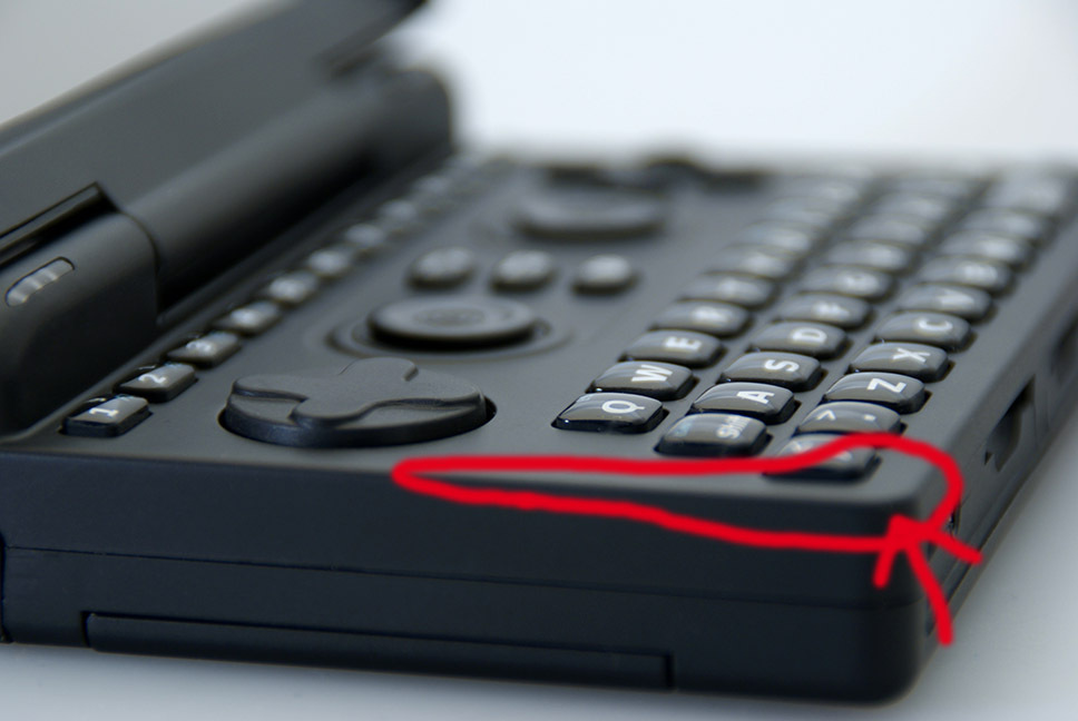
I once had a similar design idea, even with the same colours. ^^ I like the curved corners, because the ones from the Pandora are way to sharp, at least the top sides of each corner, hurts my palms.


The outer dark material could be some kind of rubber or at least rubber coated for the right grip. I also like the 4 Shoulder buttons that are side by side, similar to the Neogeo X Handheld.


Here, I marked my personal "pain area" of the current Pandora, this really should be improved with the next handheld:

sideviewpiscm.jpg


Keep on going with your desin, it mostly covers my own vision of an Pandora sucessor. :)


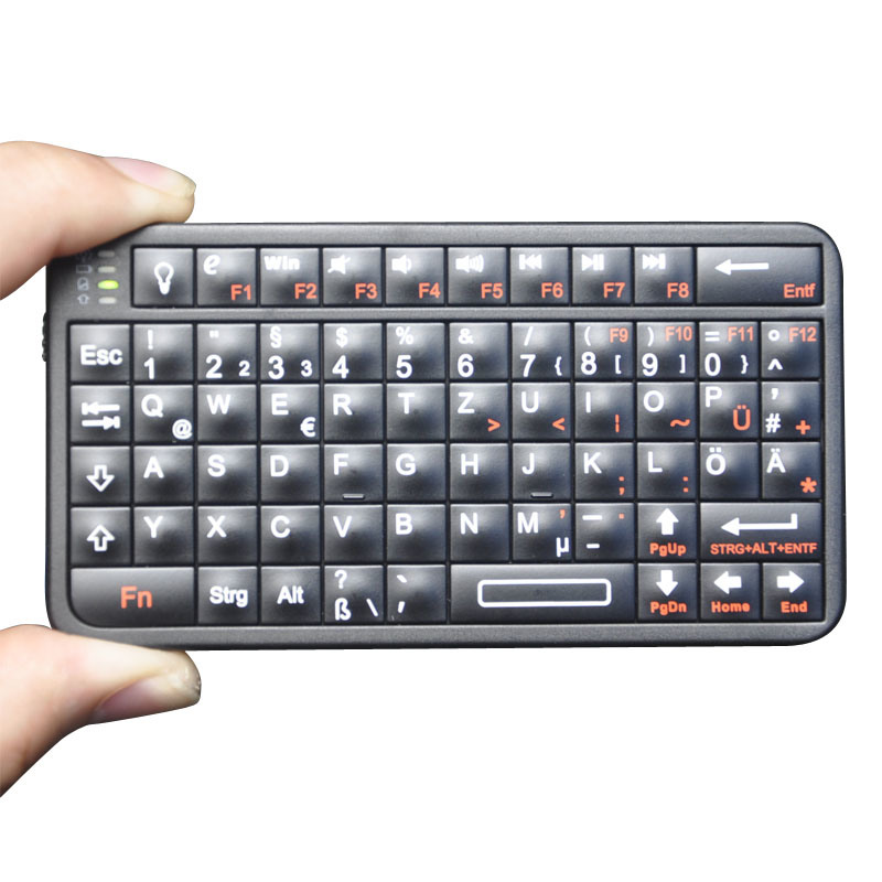
P.S.: I suggest to try an design with an unified keyboard area, because this should make the molding of the case much much easier and cheaper I hope. We all know the stories of the complex Pandora case design, one way to make it better could be an (well designed) big hole for the unified keyboard, like this for example:

Mini-Bluetooth-Keyboard-German-Layout-for-iPad-PC-iPad2-Samsung-Galaxy-Tablet-Smartphone-Motorola-Xoom.jpg
 
Last edited by a moderator:
I have a solution to your 'pain area'.  

Get a wrist strap from something else - I use a black one that came with a USB dongle.  Connect it through the little square hole in the back of the case, loop it around your wrist, release the death grip and hold your Pandora with your finger tips instead of cramming it into the palm of your hand.

As for the continuous rubber sheet keyboard you pictured - those are truly annoying to actually use as they require constantly looking down at the keyboard to figure out what you're typing.  Separating the buttons the way the existing Pandora does makes it much easier to thumb type on.
 
Get a wrist strap from something else - I use a black one that came with a USB dongle. Connect it through the little square hole in the back of the case, loop it around your wrist, release the death grip and hold your Pandora with your finger tips instead of cramming it into the palm of your ha
That's not the problem. It digs into your palm by gravity, not but manual force.
It doesn't weigh enough to dig into anything by gravity - unless you're living on a 'super earth' where gravity is 50m/s^2 or something on that order...  Are you sure you're not an alien chatting on the board through an Ansible?  Yeah - I've been re-reading Card's Ender series.
 
What I really like on this concept is the Menu, home and kill button.

Especially the kill button.

I miss that option for Pandora.
 
FWIW when typing, mine digs into my hands because I need to hold it in such a way that I can reach the shoulder buttons with my fingers. Doing that and reaching the middle of the keyboard forces my palms and the corners to interfere, though not in a painful way (at least at first).


On palmtops without shoulder buttons I tend to hang them from my fingers, rather than clasp them in my hands (if that makes sense). I could not use the shift bumper, but it speeds up typing an awful lot, or I could switch grips apart from capital letters, but personally I don't fancy doing that at least every sentence on a device costing as much as it does.
 
Here's a version with a more conservative keyboard:

dbfj.png


(ignore the extra buttons there, they're just left over from a WIP version)
 
That one is better - though I would still make the wide buttons smaller in order to add more buttons and a dedicated 'alt' key.
 
Not sure what message having a dedicated kill button makes..

Also I wouldn't mind entertaining a 6 button gamepad layout..
 
Last edited by a moderator:
Can the next Pandora have shorter keys? One of the things I really dislike about the current keyboard is how tall and rounded the keys are.
 
On this design, what would you think of this:

keep the top of the lid and the bottom of the console round, but the middle square.

I could be good for the display to reach the borders of the lid and then move the speakers to the top.

That way we keep the screen big and the holding areas round.

It may look ugly, I would have to test draw to check, but it is just some silly ideas.
 
Unless you do something clever with the hinge, you're going to have that dead space at the bottom you can't use anyway. Binky's design is quite clever in using the space left and right of the hinge for speakers.
 
Back
Top