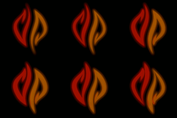
The Pyra-Logo


I agree. But if you're going to connect the Pyra to someone, I'd rather have it be someone fictional, like Lola from Lola Rennt or Lara Croft, preferably the one from after the reboot -- not the original one with the gravity-defying watermelons. And I would focus on the beauty, elegance, brains and power within, not on some strange combination of muscles and makeup.
It's the "strange combination of muscles and makup" which make her surrealist and it's the fact she is surrealist that she isn't even a human but rather "someone fictional" and make her interesting to me as a funny representation of Pyra because of analogies.
Let's use this as a representation of the Pyra then. It is more surrealist, and it is also funny because of analogies:

_53837751_jex_1096020_de27-1.jpg
 
It would be too much wavy/fluide/female to represent and depict a mainly raw/straight/male console brick
It is possible to be strong and feminine. Not the traditional "woman strong" but the raw-power-bend-rebar-with-her-bare-hands strong.I'll just leave this here
That just looks scary and ugly to me. If that picture is real, it manages to look like a photoshop.

For me, strong and feminine is more like this:

lola_rennt.jpg


Also, like the Pyra, she is German and has red hair :)

I have this on DVD, called 'Run Lola Run' here though with the English subs :)

Love this film, think it's very good
 
Love this film, think it's very good

I have this on DVD, called 'Run Lola Run' here though with the English subs :)
I hate that translation of the title, it sounds silly to me -- it reminds me of Forrest Gump. The German title is just "Lola runs", which sounds much better to me, also in English.

But yes, it's a very good film. In fact, that film was one of the reasons why our youngest daughter is called Lola :)
 
Nice :)

I like the name Lola too.

Yeah I guess the translated title does sound a bit silly, but could be fitting in that it repeats the word 'run', which is related to the film eh as it contains some repeating as a main thing about it.

...but that's clutching at straws a bit
 
Love this film, think it's very good

I have this on DVD, called 'Run Lola Run' here though with the English subs :)
I hate that translation of the title, it sounds silly to me -- it reminds me of Forrest Gump. The German title is just "Lola runs", which sounds much better to me, also in English.

But yes, it's a very good film. In fact, that film was one of the reasons why our youngest daughter is called Lola :)
I tend to like almost any movie with moritz bleibtreu in it.. don't know why though I guess he picks nice movies or the people that make nice movies pick him...
 
Is quite trippy, I like it :)

Would be nicer I think if it melted back on itself too, reversing the animation rather than restart
 
Nice Animation. I would add the actual name in the first part of the animation like:

Dragonbox

Pyra

and then the first letters join side by side and shape the logo. :)
 
Nice animation.

I wonder if another animation might be able to express the flame-like-ness of the logo more.  Probably not at the same time as emphasising the D P-ness like this one does so well, but it might be a nice alternative.
 
Is quite trippy, I like it :)

Would be nicer I think if it melted back on itself too, reversing the animation rather than restart
here you are: (looped + better materials/compositing)

post-7796-0-22578600-1398860110.gif


Nice animation.

I wonder if another animation might be able to express the flame-like-ness of the logo more.  Probably not at the same time as emphasising the D P-ness like this one does so well, but it might be a nice alternative.
I guess it mainly depends on the compositing/colors/materials, to give that flame-like-ness ... maybe one of the newer ones is better in that aspect? Otherwise it shouldn't be to complicated to make an animation where it wobbles like a flame (I guess I will try this the next time ...).

Nice Animation. I would add the actual name in the first part of the animation like:

Dragonbox

Pyra

and then the first letters join side by side and shape the logo. :)
Hmm nice idea ... in order to make that look nice I would need a good reference ... is there something like that logo + text in fitting font around already?

But this will be way more complex then what I did so far I guess ...

Also I tried to make a less trippy animation:

post-7796-0-84716700-1398860592.gif


Blender can be really addictive :D


trippy_pyra_logo2_lowc.gif

pyralogo_anim2_16c.gif
 
Last edited by a moderator:
I think flames need to flicker and move up, which is one way the extra tag FayMinx added can come about.  The animation can go slow mo and then stop as the flames form the logo.
 
Very nice, I like the loop one over the original, and that spinning one is great looking for a loading/booting anim
 
 
Also I tried to make a less trippy animation:

post-7796-0-84716700-1398860592.gif


Blender can be really addictive :D
Maybe make it spin horizontally?
like this? :

post-7796-0-41275800-1398887661.gif


Also made an attempt to create a more flamy one ... can't tell if that hypnotizing campfire effect is just me having done to much stuff in front of a screen today or if I succeeded ...

post-7796-0-73273600-1398887839.gif


pyralogo_anim3_16c.gif

flamy_pyra_logo_16c.gif
 
Last edited by a moderator:
oh, you meant the other horizontal.

I guess that wont need any new renders, just taking the first frame and rotating it should be enough to do that (At least with the 16Color Versions I uploaded there shouldn't be to much of a difference since shading and reflections are nearly invisible with them).

But since I'm tired I won't do that now ...
 
Also made an attempt to create a more flamy one ... can't tell if that hypnotizing campfire effect is just me having done to much stuff in front of a screen today or if I succeeded ...

post-7796-0-73273600-1398887839.gif
Now that's an effect that I like. I think the colour looks too dark though.

- Neelix
 
Back
Top