The Keyboard


greendots

Its finally here!
Joined
Mar 11, 2008
Messages
610
Since we dont have the other forums at the moment I must create a new topic here...
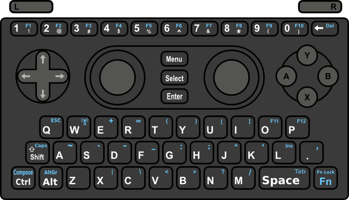
pandora_kb_greendot6.png

In this layout I got merged the start and Enter keys because they often have the same functionality.
Also as you can see ctrl and alt in lower, left location and '.' and ',' are still on the keyboard.

What do people think about having enter moved?

Another thing I noticed was that I never really use '~' or '`' on the keyboard. it is used in several games, but we are using opensource and can map these to other keys.

Can any one think of any reasons to keep those two keys on the keyboard?
 
it wouldve been nice if we had a big enter key somewhere...


anyways, i hope the keys are remappable via software for those unprinted keys and sticks. (like being able to choose which analogue stick you'll use as a mouse)
 
I use '~' and '`' all the time. '~' is a convenient abbreviation for $HOME and is prefixed on a C++ class name to refer to its destructor. '`' is important when I want to specify output of a command as an argument in makefiles such as `sdl-config --cflags`. I do plan on trying to program directly on the Pandora.
 
I wish I had links for Kagato's layouts to post them here too...
EDIT: Added Kagato layout below.

cosurgi's layout, "." and "," are Fn keys.
This layout was in the final voting and got 55%:
cosurgi_keyboard.png


The same but NON-PRINTED stuff is not shown here:
cosurgi_keyboard_clean.png


Layout merged with Kagato's design, which allows switching between "," and "." and "Alt" and "Ctrl"
cosurgi_keyboard_merged.png


Different mapping on 1..0 row:
cosurgi_upper_swapped.png


Kagatos's layout, "." and "," are base keys.
This one was in the final voting and got 45%:
pandora_keyboard.png


The same but without NON-PRINTED symbols:
pandora_keyboard_plain.png


Alternative symbols layout - more optimized for typing, but less similar with traditional QWERTY:
pandora_keyboard_v2_plain.png


Last version of Kagato's layout - Shift isn't used to obtain F1-F10 keys anymore.
pandora_keyboard_v3_plain.png


EDIT: changed text order :)

Both '~' and '`' are useful for linux hacking. ~ is home directory, ` means "execute what's enclosed in `...` and paste as string". You wouldn't imagine how useful it is in day-to-day bash operation.
 
Ewww...

Keep in mind there are lots of us who plan to use this for a lot more than games. Please keep the high use keys big and easy to get to without a shift/function/alt/etc... key to use first.

I see where you're going by having the keyboard taper into the game controls. That makes the diagonals on the sides 'thumb real estate'.

IMHO...
1. Keep the TAB key as it's own as a skinny key (like the # keys) on top of the W. Otherwise filling in web forms is going to be a PITA if we have to function-key every time we want to tab to the next form slot.
2. Move the . key up beside the M key and put an ENTER key where it should be right next to the L key.
3. By giving TAB it's own key, that frees up the space bar to stay a space bar regardless of fn/shift/etc... mode. Speaking of space, move it to where the Fn key is now as a normal size key.
4. Put in a , key next to the . key.
5. Move the Fn key as a skinny one to the spot over the top of the 'O' key. Give it 4 modes. All keys normal. All keys Fn shifted. Top row keys Fn shifted (for games that require Fn keys and keyboard (see Neverwinter Nights)). Top row keys un- Fn shifted keyboard Fn-shifted. Moving it over the 'O' key has the added benefit of not constantly getting hit by the palm of your hand in the middle of defeating level 37 of (pick your game).

Again, IMHO. This late in the game I doubt if 3 more keys could be put on the board. (splitting the physical key used as Space and adding the two over keyboard keys for TAB and Fn over the W and O.
 
spliting the space key into two parts would solve a couple problems but it has been brought up before and its too late to change the hardware.

other then that i cant tell if you are serious
 
I like the Cosurgi design better of the ones pictured. And YES to having the orange text printed too.

cosurgi_keyboard_merged.png


Without being able to mod the hardware and only the mappings, most of my ideas above are worthless.

The main idea though is to keep the keys that are used the most in surfing, texting, typing, bashing, etc... EASY to get to.

Think about it. What keys (non-letter) do you use most on your keyboard?
Space
Enter
Backspace
Shift
Tab

I would love to find someplace else for the Fn key to live rather than on the outside edge corner of the keyboard. I have a Thinkpad T61p. Great machine. My #1 complaint? Some designer put the Fn key on the outside lower left corner of the keyboard where it gets bumped by the palm of my left hand sending the keyboard into 'weird mode'.

I know this is going to sound kind of crazy, but draw it out in your mind before you judge...

From the existing picture linked in this post...
Move the Space key to where the Fn key is.
Move the Fn key to where the Shift key is.
Move the Shift key to where the Space key is.

Shift isn't used more than space BUT it is used in conjunction with other keys more than any other combination sequence. having it on a big edge button would make the combos easier. An added advantage to putting the Fn key out of the way on the left side is the sequence to hitting TAB becomes a left-thumb to right-thumb action instead of all on one hand.

Also, I'm not sold on having F11 and F12 this way... What about putting ( and ) on Fn-9 and Fn-10 respectively and then putting F11 and F12 on Fn-O and Fn-P? This tracks closer to the QWERTY layout for numeric shifts. I would also be inclined to make all of the F-1 through F-10 be Fn controlled and have the symbols all be shift controlled. I.e. make the symbols white lettering and the F1 through F10 (F11 and F12 on O and P too) blue on the rendering.

I know I'm new to this scene, but I take my interface devices (keyboards, etc...) seriously.

If I can find time tonight I'll make an edited version of the image with my suggestions so you can see what it would feel like (yeah yeah...).
 
Grench said:
I like the Cosurgi design better of the ones pictured.
....
I know I'm new to this scene, but I take my interface devices (keyboards, etc...) seriously.
Thank you. I have already won voting on previous forums, it was roughly: 55% for my design and 45% for Kagato's design. That's why I really wish I had the links for his design somewhere.

And also it was me who started all this keyboard discussion few months ago, and I did this just because I also take seriously the device interface.

Grench said:
If I can find time tonight I'll make an edited version of the image with my suggestions so you can see what it would feel like (yeah yeah...).
You can work with Inkscape SVG source file: http://cosurgi.googlepages.com/cosurgi_final_merged.svg
That will be easier'n'faster for you.
 
A device of this size uses sticky keys for all meta buttons which is probably what you where talking about with "weird mode."

Pressing two keys for tab isnt that bad and should be expected from a device of this size.

Also If you look at cosurgi's post the last one has normal shift+# and (fn+# = f#)

@cosurgi I really hope we didnt lose those several dozen pages of keyboard discussion...

Again though, what do people think about moving enter to the start button position?

edit: and do we really need fn lock?
 
greendots said:
Again though, what do people think about moving enter to the start button position?
Not to discourage you, but I don't like this. People of course could get used to this tradeoff. But for starters who are coming from off-the-scene this would be plain weird.

greendots said:
edit: and do we really need fn lock?
The only purpose for it is to make cyryllic (and maybe kanji) people happy. They would put stickers with their own letters on each key and toggle fn lock to type in their own alphabet.
Fn lock is not for typing all those Fn symbols that are on each key. That's explained in point 10. on the keyboard image.
 
greendots said:
Again though, what do people think about moving enter to the start button position?

My contributions to the previous keyboard layout threads basically amounted to an "I'll adapt" stance. Even so, I couldn't see myself ever getting used to enter being where you've suggested it.

Then again, I'll adapt. ;)
 
greendots said:
Again though, what do people think about moving enter to the start button position?

Personally, I do not like it. But I'm a newcomer here (hello) ;)
 
This dead horse has been beaten into a fine powder.

Can't wait for the motherforum to come back up. :(
 
Moving enter there is defiantly a trade off. But its the only way to have period , ctrl and alt on the keyboard.

If anything moving the enter key to the center make it easier to press with either finger.
 
I can't believe that people would want to allow period and comma to be removed from the 'white keys'!

Do you people not type in web addresses and emails? Not use punctuation in IMs?

Edit : Not to mention file names. Do people not type filenames?

What happened to putting CTRL and ALT on the shoulders? CTRL and ALT need to be somewhere where they can be held down while pressing another key, This keyboard is on a thumb-typing scale.

-Andy
 
Heres another that I like a bit better:
pandora_kb_greendot7.png


If space is available media controls would be great to have. Listen to music while playing an emulator and have complete control of the music at all times.

VRAndy- sticky keys fixes the problem of buttons needing to be held down while pressing other buttons
 
VRAndy said:
This keyboard is on a thumb-typing scale.

Thats the problem... To many people see the rendering, but forget to imagine it in there hands. It's a blowup, so the illusion is there that you can use multiple fingers on each hand ( fat change unless your a woman with small fingers ). With this taken in account, ctrl / alt on the keyboard is a bad idea, even more so, is the loss of the point & comma as a direct input device.

For me, its basic logic. Look at the keys / function that are used most, and those are your primary keys. Yet, ctrl / alt have never been the focus ( in my daily usage anyway ). Sure, its interesting if your using Nano ( use vi grrrr! ) maybe or some other program, but for the basic desktop access, i only see alt-tab are a returning key. All the rest is shift [A-Z] or [a-z][0-9][.,] or mouse based...

There is one thing i know for sure, if the Pandora is released with the point & comma as function keys, we are going to be seeing a lot ( more! ) posts with no points / comma usage.

The only people who will know for sure, are those ED, craigix etc. Those who have prototype's of the case's in front of them. If i had my way, you have one key for alt-tab, and ctrl/alt go the way of the dodo ;)
 
Not sure whether this will have been mentioned in the other thread, but it is well worth remembering that the keyboard only has a 2-character buffer. If you press more than 2 keys, then basically it doesn't recognize what's going on.

That's one of the main reasons for wanting modifier keys aside from Shift and FN (i.e. ctrl and alt) to be on action buttons by default.

To be fair, most combinations would still be fine - CTRL-X/C/V in particular. But any CTRL-ALT-whatever ones would fail, as would CTRL/ALT-SHIFT-whatever.

This may already have been considered and discounted in these designs (e.g. if the presence of CTRL and ALT on the keyboard at all is prefereable to their being hidden, but more functional, with 'lesser' keys taking their place), but I figured I'd remind people, given that there *are* hardware limitations in place...
 
Back
Top