NeoStuey
Active Member
It's just with you having a broken spacebar, I was worried another of your keys had failed, how is it going on the keyboard sourcing front?
Edit: removed quotes
This happened to my sig. Rico raped it. He won't get away with it... *Shakes fist at sky*PSyMastR posted on Feb 27 2006 at 11:49 PM said:ROFL at what the hell happened to your sig?
PSyMastR posted on Feb 27 2006 at 10:49 PM said:ROFL, what the hell happened to your sig?
Haha who cares about a bannage.NeoStuey posted on Feb 27 2006 at 11:59 PM said:PSyMastR posted on Feb 27 2006 at 10:49 PM said:ROFL, what the hell happened to your sig?
There were about 5 users banned in the off topic section, and this was the 6 and got his sig changed as well, I guessed they pushed too far. I'm glad I don't post there.
Mine were both temporary. And it is not the end of the world, new usernames are easy to fixup and proxies easy to use.NeoStuey posted on Feb 28 2006 at 12:03 AM said:lhnz posted on Feb 27 2006 at 10:59 PM said:Haha who cares about a bannage.NeoStuey posted on Feb 27 2006 at 11:59 PM said:PSyMastR posted on Feb 27 2006 at 10:49 PM said:ROFL, what the hell happened to your sig?
There were about 5 users banned in the off topic section, and this was the 6 and got his sig changed as well, I guessed they pushed too far. I'm glad I don't post there.
I do a couple of the users are regular posters who usually give sound advice and are coding for the GP2X. I take it the they are tempory bans then?
Well parag0n said he would make it, and it was actually mine/DaveCs interface originally. Although he has added a fair bit to it.Paradox posted on Feb 28 2006 at 12:18 AM said:wayyyyyyyyyyyy......off.topic.here.
wasnt.someone.making.the.parag0n.style/dave.interface?
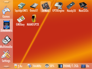
Javacat posted on Feb 27 2006 at 01:39 PM said:And this is my favourite design so far:

You should easily be able to fit 24 icons on screen at once, and that should be more than enough for me.
Having said that I can see where DaveC is coming from. A gui like the one shown below would remove the need for scrolling, which takes so long it's not worth playing the game you were wanting to play.


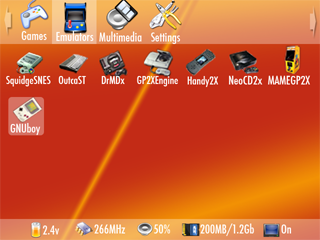
Shirohagen posted on Feb 28 2006 at 05:22 PM said:I'm a graphic designer and so have always got quite obsessive about the menus in anything I use. I'm always having to explain GUI principles to clients and I must say that I think this is by far the best concept here:

DaveC was on the money, a horizontal bar with more categories and a grid of icons below.
I'd like to see options for the bar being top or bottom (or at the side for people who prefer that) and also any folder on the SD card can become a category. The icon for each category could then be a icon.png file in that folder or a default one if none is present. People can then organise their cards however they like.
I'd also like the system to be fully skinnable for us all to exercise our creative talents on it!
The status info at the bottom is genius, very useful! I think any file manager or music player functions etc should be in dedicated apps, so casually lending the GP2X to a mate is less likely to result in accidentally erased apps or browsing of your music collection and lots of functionality can be packed in where its needed. The launcher itself should be as efficiently streamlined and simple as possible.
Just my opinion, but I'm not a fan of the overload of onscreen info and screenshots etc either, just keep it simple and put things as few moves/clicks away as possible.
®
My old GP32 Windups "Themes":


The thing I liked about that was I could place the icons exactly where I liked, line them up or decide what went next to what etc etc, but it was obviously primitive...
If you do that you need to make sure that there is a list view for Multimedia (And personally 2 seperate Film and Music categories).Shirohagen posted on Feb 28 2006 at 06:22 PM said:I'm a graphic designer and so have always got quite obsessive about the menus in anything I use. I'm always having to explain GUI principles to clients and I must say that I think this is by far the best concept here:

On this I agree. Only change that needs to be made to that interface, and it would be perfect (to me)lhnz posted on Feb 28 2006 at 12:38 PM said:If you do that you need to make sure that there is a list view for Multimedia (And personally 2 seperate Film and Music categories).
Do you mean something like this? (Pretend multimedia says Movies and that there are a couple more icons for Music and Pictures).lhnz posted on Feb 28 2006 at 06:38 PM said:If you do that you need to make sure that there is a list view for Multimedia (And personally 2 seperate Film and Music categories).
Reason being an icon view would be pointless as all of the icons would be the same, and MP3s and AVIs often have very long names (aka. "a.random.movie.name.dvdrip.cd1.xvid-deity" which would not fit in the space given, unless the icons were shifted right apart which would look very unsightly).
Personally while I like this interface I would not use its only pro.
I prefer my interfaces to be more coherent/seamless and not to need an icon view and a list view.

Lol.Javacat posted on Feb 28 2006 at 10:05 PM said:Do you mean something like this? (Pretend multimedia says Movies and that there are a couple more icons for Music and Pictures).lhnz posted on Feb 28 2006 at 06:38 PM said:If you do that you need to make sure that there is a list view for Multimedia (And personally 2 seperate Film and Music categories).
Reason being an icon view would be pointless as all of the icons would be the same, and MP3s and AVIs often have very long names (aka. "a.random.movie.name.dvdrip.cd1.xvid-deity" which would not fit in the space given, unless the icons were shifted right apart which would look very unsightly).
Personally while I like this interface I would not use its only pro.
I prefer my interfaces to be more coherent/seamless and not to need an icon view and a list view.

ps, hope you like my 1337 picture h4x1ng skillzh34r:

