GregorR
Still Fresh
- Joined
- Dec 10, 2008
- Messages
- 31
PandAura you say?sverm said:A Panda's Aura?
(Not as goodstupid as the last one, but *eh*
Last edited by a moderator:
PandAura you say?sverm said:A Panda's Aura?
Yes, you can never be too careful. You wouldn't want to catch the gay from your wallpaper :rolleyes:conso said:Sorry, but rainbows and hearts together let my homophobic gay-sensor go nuts.
It's openPandora not open Rosetta.
PoisonedV said:Awesome designs, can't wait for the booth at the festival
I don't even see how you guys see it as gay. It's an overall dark picture, and the colors in the rainbow aren't the standard fare that is recognized as gay. If anything other than retro, it should just look tacky.
-God Ginrai
God Ginrai said:PoisonedV said:Awesome designs, can't wait for the booth at the festival
I don't even see how you guys see it as gay. It's an overall dark picture, and the colors in the rainbow aren't the standard fare that is recognized as gay. If anything other than retro, it should just look tacky.
-God Ginrai
actually i enjoy the picture. i just cant help but take a shot every time something like this or spectrum is posted, after all, I'm an american first and foremost and if I don't make everyone different than me feel like shit, then I'm not a patriot
PoisonedV said:God Ginrai said:PoisonedV said:Awesome designs, can't wait for the booth at the festival
I don't even see how you guys see it as gay. It's an overall dark picture, and the colors in the rainbow aren't the standard fare that is recognized as gay. If anything other than retro, it should just look tacky.
-God Ginrai
actually i enjoy the picture. i just cant help but take a shot every time something like this or spectrum is posted, after all, I'm an american first and foremost and if I don't make everyone different than me feel like shit, then I'm not a patriot
Note to all people who are not from America: Not all Americans are like him.
-God Ginrai
Agreed - looks great but I'm not a 17 year old girl so I'd appreciate being heartless.dosteridge said:Reminds me of the speccy, I like it, but I think they should lose the hearts.
I like everything about your designs, I think you've got some serious talent. The retro-chic look works perfectly for the Pandora and embodies what the Pandora really _is_. The rainbow doesn't look gay because it is not in the gay colours, those complaining about the colours must be mental! And I completely agree with your sentiments about the Pandora needing good branding; if I was Craig, I'd be offereing you a position or asking for your help right now. With branding like this you're making the Pandora look so trendy you'll give apple a run for their money. This would be a great logo for the pandora case. (the only suggestion I have is that I'd move the logo to one side, not in the middle, but hey). Love the not-quite-black browny colour too.traylorpark said:See, this is all part of the Pandora's evil façade. It's trying to present itself in the most endearing and enticing way possible – just to get you to open it.

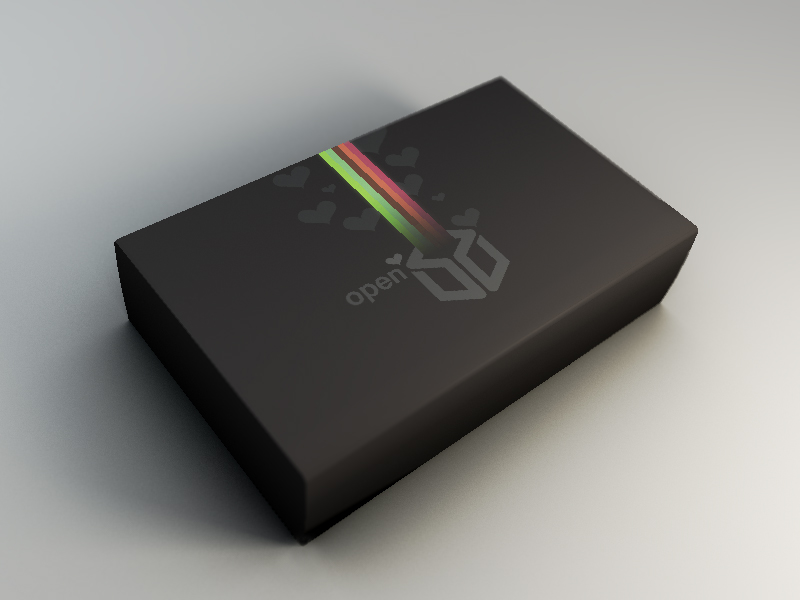
Concept box art for a later batch.
Luckily, many of you are macho enough to withstand its charm.
Chock said:How about some small characters (like a bubble bobble dragon, a pac-man, a mario..a spaceship from a shoot them up, a sword, a joystick, some console shapes, a monkey from Monkey Island... anything that reminds retro-games).traylorpark said:I like the hearts too ... for this particular design, they provide a nice balance and some texture. Plus... what else do you want coming out of your Pandora? Death?
If you want to show that the pandora can do more, you could also put a music note, an antenna (for wifi), a computer screen...etc...
Chock
That would be ideal, but I suspect the copyright holders wouldn't be over-joyed about that. And its sailing close enough to the wind on the emulation front without including in the logo.
However, what makes the pandora most obviously different to any number of netbooks - the gaming controls! So how about an outline of an old school joystick? Atari or Competition Pro etc??
Edit - something like this... link to simple joystick outline image
Not sure if its 'simple enough' image though, but you get the idea.
I think it looks lovely, but it's a rainbow with hearts floating around it, and I'm not willing to raise my literacy level enough on a forum to describe that in any other way than "gay."EdCa22 said:The rainbow doesn't look gay because it is not in the gay colours, those complaining about the colours must be mental!
WoD said:I think it looks lovely, but it's a rainbow with hearts floating around it, and I'm not willing to raise my literacy level enough on a forum to describe that in any other way than "gay."EdCa22 said:The rainbow doesn't look gay because it is not in the gay colours, those complaining about the colours must be mental!
I don't necessarily mean it in a bad way.
Well yeah, I do see your point. Maybe the hearts could be exchanged for something else. Or there could be a few less of them. But the rainbow is very cool afaik

