Mithrildor
I Haz Custom Title
ok that.
'Username' said:Seems pointless. How long will it really take to start up?
Startup time isn't really the issue, seeing as most people will just be using suspend mode instead of switching it off. The point of Pmenu is that not everyone wants to run a full desktop environment. Many people are coming from the GP2X, which had Gmenu2x. Gmenu was originally intended for Pandora, but didn't work out for various reasons, so Pmenu was built from scratch.
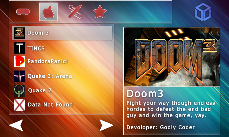
(naw)mcx posted on Apr 5 2009 at 08:03 PM said:This took a while
Background is by pkarwowski.deviantart.com, so if this is used, I'll have to ask for permission.
I have all the separate parts saved on their own.

To add to that, I don't like the layout 100% either.
Looks good. My only comments are that the more complex category icons (like the joystick) need internal outlines, and that you need to cut the white outlines a bit better, especially for that third icon.
'Vorporeal' said:Looks good. My only comments are that the more complex category icons (like the joystick) need internal outlines, and that you need to cut the white outlines a bit better, especially for that third icon.(naw)mcx posted on ) This took a while : said:Background is by pkarwowski.deviantart.com, so if this is used, I'll have to ask for permission.
I have all the separate parts saved on their own.

To add to that, I don't like the layout 100% either.
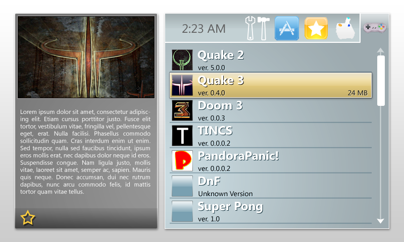
Here's my quick mockup. I went with a totally different layout, but I feel it gives it a more professional look.
Obviously, non of the icons are finished/nice-looking.

I figure you press left/right to switch tabs. Once you choose a game/application, it goes into a sub-menu with more choices. Like run, edit info, delete, favorite; that sort of thing.
'Tiptup300' said:'Vorporeal' said:Looks good. My only comments are that the more complex category icons (like the joystick) need internal outlines, and that you need to cut the white outlines a bit better, especially for that third icon.(naw)mcx posted on ) This took a while : said:Background is by pkarwowski.deviantart.com, so if this is used, I'll have to ask for permission.
I have all the separate parts saved on their own.

To add to that, I don't like the layout 100% either.
Here's my quick mockup. I went with a totally different layout, but I feel it gives it a more professional look.
Obviously, non of the icons are finished/nice-looking.

I figure you press left/right to switch tabs. Once you choose a game/application, it goes into a sub-menu with more choices. Like run, edit info, delete, favorite; that sort of thing.
There is no problem with your skin, like i said, we can move each part (app listing, category icons, preview pic, description) where we want so it's ok .
(naw)mcx posted on Apr 6 2009 at 02:03 AM said:This took a while
Background is by pkarwowski.deviantart.com, so if this is used, I'll have to ask for permission.
I have all the separate parts saved on their own.

To add to that, I don't like the layout 100% either.
Great, you can post the zipped files here if you want.
I understand what you all mean, but for now it's a part of the background, and external background/wallpaper is not supported. I do not have the time to focus on that for now, i have a lot of work to do. It could be something added in the future.'giovanni' said:Shall the borders of the panels be present in the background?
I understood they must, but thats a problem with external backgrounds (like simple photos) and the change of the layout (as aleady stated)...
What can we do?
(naw)mcx posted on Apr 6 2009 at 12:11 PM said:Here it is, I'll make a version with an improved layout when I get back. Along with better icons.
http://drop.io/openpandora
Thanks mcx
In fact there still a problem with your skin, your "main.png" background looks like "backg.bmp" background, but it should look like the "backg_new.png". I mean you should have the RED box size.
Anyway, we should all wait a little that i do a proper linux executable so you can test your skins.
'Cpasjuste' said:(naw)mcx said:Here it is, I'll make a version with an improved layout when I get back. Along with better icons.
http://drop.io/openpandora
Thanks mcx
In fact there still a problem with your skin, your "main.png" background looks like "backg.bmp" background, but it should look like the "backg_new.png". I mean you should have the RED box size.
Anyway, we should all wait a little that i do a proper linux executable so you can test your skins.
Whoops!
I'll fix that too


