Exophase
Nothing good will ever come of Exophase.
How is that "the original"? That's clearly not a picture of displayed on a TV.
DaveC said:
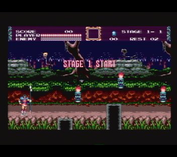
Hardly "anal" unless you are looking at on a bad monitor and can't see the significant difference. Look at the rock area, the brownish shades are almost gone. That is allot of information lost. This is an example, other games with darker shades have the same problem. It is not about "exactly right" it isn't just a shade off it is several. If it was never mentioned there would be no chance it would ever be fixed.TitanUranus said:DaveC said:
Don't get me wrong, I know how important it can feel to have things exactly right, but that is stunningly anal! I fear people moaning about minor niggles like this may be why notaz was reluctant to release this until it was "perfect". I'm personally glad it's released as it is, even though I don't have my pandora yet it's nice to see works in progress.
Exophase said:I still want to know what you're actually comparing it with. Because it appears to be either a previous version of Picodrive for another platform or another Genesis emulator. notaz clearly intentionally changed the color gamut to more closely match what a Genesis would look like on a TV, which is what game developers will have designed for. This might be a less ideal color space but that isn't really the point. You can't actually expect him to change it back just because you think it looked better in some game the old way. You have to offer something more tangible than that.
DaveC said:Hardly "anal" unless you are looking at on a bad monitor and can't see the significant difference. Look at the rock area, the brownish shades are almost gone. That is allot of information lost. This is an example, other games with darker shades have the same problem. It is not about "exactly right" it isn't just a shade off it is several. If it was never mentioned there would be no chance it would ever be fixed.
DaveC said:I am comparing it to how it looked on the hardware on a properly adjusted TV or RGB nonitor, plus various screenshots and PC based emu. What it is adjusted to now does not look like a "TV" unless it was poorly adjusted or broken.
It isn't just "some game I think looked better" it is all of them you just won't notice as much on cartoony stuff like Sonic where most of the colors are bright. I can't obviously post screenshots of every game that is effected, I just picked one.
DaveC said:If in doubt at all I suggest going with what is logically better (shows more of the graphics) and what looks better. You can't reasonably say that the screenshot on the right looks better nor does it make sense that they would draw graphics in all games where shades on the lower end are almost gone (they didn't, I remember and also have some experience with doing pixel art).
DaveC said:Even if the levels theoretically match hardware we aren't displaying on a CRT we are displaying on an LCD and tweaks need to be made to make it look right on that. Further the Pandora LCD tends to ghost more with darker colors so the way it is now makes that problem even worse with colors that are darker than they should be. Then there is the fact that Notaz himself said that the colors weren't right in the emulator.
DaveC said:
notaz said:Ok I took my time and plugged my MegaDrive to a TV card.
Sure, it was very popular here (it never surpassed NES clones though) and I (mis)spent good portion of my childhood playing one. That's the main reason I work on PicoDrive these days.TitanUranus said:Wow, Lithuania has real megadrives!
Exophase said:I haven't gotten complaints (actually haven't gotten any comments at all strangely enough)
Well the newest build looks the darkest of the lot, and futher from the top picture than the rest. The previous one at least had the shades a bit closer and you could see the brown on the rocks better, but they are close to the same. The frame dumps have the shadow detail crushed too. Even that purple bar at the top is almost pulled to black. The text for the score has a bright spot in the center but then falls off to the point you can't see the edges. It is not just a dark LCD as you say or ALL shades would be dark together, but smooth. If you look at the rocks in the example the tan highlights are as bright as the other builds/example but the shadow detail is crushed. This is because the gamma curve is suppressing darker shades for some reason.notaz said:Ok I took my time and plugged my MegaDrive to a TV card. I'd love to make use of RGB capture card instead but those are prohibitively expensive.

Your comparison again, for reference:
DaveC said:
Except of seeing that both old and new builds are wrong (that makes all PC emus wrong too I guess) I don't really know how to calibrate this. The reference image heavily depends on TV card settings. I haven't seen anyone doing RGB captures from the real thing either. The old build might look better to you but it's levels are wrong compared to levels of pixels with shadow/hilight operators applied.
DaveC said:

