Open... and close... and open...


Regarding Wifi+Antennae: we want/have to change the ceramic chips antennas and have to find out first which one (out of 3 candidates) is the best one. It was difficult to even find some which are small enough, easy to buy, cheap to buy and are not too critical how they are mounted (goal: reproducible mass production). But now we have selected 3 models waiting for being measured and tested.

I'm curious but didn't want to bug HNS directly - though he's welcome to reply if he stumbles on this.

The 4G antenna is gigantic and easy to spot. However, in the previously released board pictures, where IS the WiFi antenna?

In the Pandora it was a wire snaked up into the lid. I understand it will be on the main board of the Pyra - but where?
 
@Askarus, I doubt I need to say this, but please make/share a usable dark theme that isn't an eyesore to be included in the OS. I have my own stuff I will probably use, but it really sucks that almost any DE or OS I use lacks a decent theme for use in the dark. Sure, some of those ugly ones are made for high contrast, so it kinda makes sense. Still, something that won't blind you and actually feels like you can do work using it is nice.
I only use dark themes
If someone asks me I'll include a nice dark theme for XFCE.
Mate doesn't need one, as it comes with one by default and is easy to customize.
 
Just wanted to say thanks for the update. Waiting is becoming pretty frustrating for me, my pandora really has too many limitations for me at this point, and still I use it everyday, which makes me desire even more a Pyra.
 
I only use dark themes
If someone asks me I'll include a nice dark theme for XFCE.
Mate doesn't need one, as it comes with one by default and is easy to customize.
All DEs I have tried made it easy to customize themes, as I recall, it is just a headache that I need to spend so much time seeing things up, usually after an install, and in the case of the Pyra, after I get it, before I can get down to business. I know, probably a stupid complaint. I know I am not alone, though, as dark themes have been present for a long time, even on Windows in the 90s.

Anyway, yeah, if Xfce is going to be the default, I would appreciate a decent dark theme be included. It needn't be anything that you spend much time on, just one that you use that ED approves or whatever. If I have used Mate it was a VM or someone else's install, and was rather brief, so not one I am familiar with. What will be the default upon shipping? Regardless of what else I add (KDE possibly) or change (need to declutter the desktop, make things a bit more minimalist in general, move the bar to the right side), I plan to have whatever it ships with around so I can help people troubleshoot. I also expect to put the micro SD slot to use to run other distros, so if go with something other than Debian as my main distro, Debian will remain mostly stock and only really used when I need to boot into it to help others. That is when it will be especially nice not to burn my eyes while trying to help out others. All I am looking for is something that isn't headache inducing which allows me to seeasily see everything...not sure if I am being clear enough.

TLDR, if Xfce is the default DE, yes, please include a decent dark theme.

If I need to contact ED to make an official request, lemme know. I wish this forum had a dark theme, too.
 
maybe the whining is just because these pyras are all little baby-pyras at this time, so here is hope it will get better when they grow up. ;-)
nevertheless thanks for all this, mainly good, news ed!
and special kudos to all the prototype-devs, love the progress!
 
All DEs I have tried made it easy to customize themes, as I recall, it is just a headache that I need to spend so much time seeing things up, usually after an install, and in the case of the Pyra, after I get it, before I can get down to business. I know, probably a stupid complaint. I know I am not alone, though, as dark themes have been present for a long time, even on Windows in the 90s.

Anyway, yeah, if Xfce is going to be the default, I would appreciate a decent dark theme be included. It needn't be anything that you spend much time on, just one that you use that ED approves or whatever. If I have used Mate it was a VM or someone else's install, and was rather brief, so not one I am familiar with. What will be the default upon shipping? Regardless of what else I add (KDE possibly) or change (need to declutter the desktop, make things a bit more minimalist in general, move the bar to the right side), I plan to have whatever it ships with around so I can help people troubleshoot. I also expect to put the micro SD slot to use to run other distros, so if go with something other than Debian as my main distro, Debian will remain mostly stock and only really used when I need to boot into it to help others. That is when it will be especially nice not to burn my eyes while trying to help out others. All I am looking for is something that isn't headache inducing which allows me to seeasily see everything...not sure if I am being clear enough.

TLDR, if Xfce is the default DE, yes, please include a decent dark theme.

If I need to contact ED to make an official request, lemme know. I wish this forum had a dark theme, too.

For now Mate is the default. I like Xfce better.
But that's a matter of preference.
And yes, a DE is not usable for me as long as it does not have a dark theme. I've tried a lot a know one that doesn't mess up other apps.

I might post a screenshot when I have time to do so.
Will try out different things at Gamescom maybe

BTW; that's the one I use.
It has a red, green and Blue version I think: https://www.xfce-look.org/p/1157147/
 
Further to what I said earlier about RF interference, my pandora also seems to cause trouble for DAB (225MHz) receivers.

Can anyone else reproduce this? Is it just me?
 
darktheme9mret.jpg


MY Pyra Forum has a dark theme. ;) Actualy, my entire Firefox has one because of an plugin. ^^
Pandora had various Dark Themes for the Desktop pre-installed, I'm sure most Linux GUI have one included by default, at least they should have.
 
Further to what I said earlier about RF interference, my pandora also seems to cause trouble for DAB (225MHz) receivers.

Can anyone else reproduce this? Is it just me?

I can't replicate it, but I know my pandora caused audible interference when charging and left by a radio. Heck I may or not have used that as a feature at work if somebody was blaring a radio station I was getting sick of. :p

Still the audible interference was a bit alarming. o_O
 
My Pandora charging port is by my DAB radio, and I've not noticed it interfering either sitting there idle or being on charge. It does cause an audible hum on the headphone out when it's on charge, but no noticable RF interference that I've noticed.
 
Still the audible interference was a bit alarming. o_O
It's a common issue with switching power supplies, that's not something that's being controlled very often. Some devices will jam certain radio frequencies in your whole house.
 
What about this for a dark theme? It's GTK so it should work on both MATE and XFCE: https://pyra-handheld.com/boards/threads/verteron-a-custom-theme.77631/
I haven't used that one, but based on the look it is probably good enough for me (I throw a lot of green in mine, especially the one I have on my Pandora, although some people may find that tacky...I also prefer serif fonts, especially in smaller screens,, but I know many people hate those, so I would never request one).


I've tried a lot a know one that doesn't mess up other apps.
That is a very important thing to consider, as interfering with other things will make it a problem for new users, and can drastically reduce usability if we have to stop what we are in the middle of to deal with that. I think this is why I started using greys instead of black and white.

BTW; that's the one I use.
It has a red, green and Blue version I think: https://www.xfce-look.org/p/1157147/
I will take a closer look later, maybe giving it a test run. My guess is that the blue one would be preferable to most people, while the red seems to fit the Pyra idea better, and green might appeal to a handful of us.


darktheme9mret.jpg


MY Pyra Forum has a dark theme. ;) Actualy, my entire Firefox has one because of an plugin. ^^
Pandora had various Dark Themes for the Desktop pre-installed, I'm sure most Linux GUI have one included by default, at least they should have.
I suspected this (regarding the forum theme) would come up. What about using a computer that hasn't been customized to fit our preferences? Some of us use a variety of computers throughout the day, and we may not have permission or be able to make changes.

The problem with the included dark ones it's they almost always suck and can be literally headache inducing. Sure, they have been included with OSs for 20+ years, but they usually feel like someone trying to check a box (dark theme, yep) rather than increase usability. I would have to go look at what was included on the Pandora to give specific issues, and maybe there are even done that would have been ok, although I know I spent so much time working everything out that I eventually copied my stuff over to one of my SD cards so that I could save time later.

I remembered Askarus preferred dark themes, like me, so I figured he would appreciate something better than a half-assed one, and he is in a position to ask for a decent one to be included, maybe even as the default (I can dream).
 
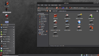
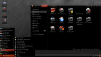
I've taken two screenshots of my Pyra.

To be honest, I like Mate more now an it's much better for default. At least the look. It's no custom theme, but a default one.
Only disadvantage: it's not red, but blue and I like red so much more.

The icon pack is the same for both and a custom one. I like it a lot.
 

Attachments

  • Mate default dark.png
    Mate default dark.png
    507 KB · Views: 629
  • Slick Red XFCE.png
    Slick Red XFCE.png
    447.5 KB · Views: 654
That default Mate one should be good enough for me. A bit light for my tastes, but not tons of white to stare into, and it should be fine to work with. Kinda looks like a lighter version of what I have on my laptop. Only major things I would need to do are hide the desktop icons and free up the space at the bottom. Not bad for a default.

The other one is fine for me. I usually avoid straight black, just in case, but I think that is a lot closer to my taste. Possibly a bit too much for that to be what people get the first time they turn it on. On the other hand, this looks like what I expect the Pyra to look like.

I am fine with the icons. I usually go with basic old school ones, or sleek and kinda flashy (like these). As long as I can easily tell things apart, and it doesn't clash with everything else and cause usability problems, most are fine.

I've taken two screenshots of my Pyra.
One day I want to be able to say that.
 
Coil whining, maybe not a solution and not a help here but we had 5 from 10 Dell XPS 13 with this coil whining. (People older than fourty can't hear it) Sound comes when connecting an USB dev. Support hell, (they said we can change the board but no garantie it will be better, but if they come with a replacement board the swap it, regardless the problem is better or not). At the end it was a newer Intel Graphics driver which silenced the noise to an acceptable level.
 
Back
Top