You are using an out of date browser. It may not display this or other websites correctly.
You should upgrade or use an alternative browser.
You should upgrade or use an alternative browser.
logo idea by comradekingu is logo idea
- Thread starter comradekingu
- Start date
comradekingu
Glowing ember
Meanwhile mediocre talent and feedback is what we have to work with ^^
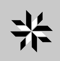
Edit: Some of the best talent on dragon-ornamentation i could consult in my city, but then again thats very detailed, and its very period, so its hard to make it fit.
This is the easiest dragon i could do:
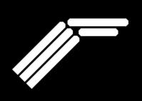
Drager in norwegian is the load bearing main beam of a house going across, it was in elder times finished off with a dragons head at either end, thats the inspiration.

Edit: Some of the best talent on dragon-ornamentation i could consult in my city, but then again thats very detailed, and its very period, so its hard to make it fit.
This is the easiest dragon i could do:

Drager in norwegian is the load bearing main beam of a house going across, it was in elder times finished off with a dragons head at either end, thats the inspiration.
Last edited by a moderator:
comradekingu
Glowing ember
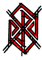
The hand drawn dragon
http://boards.openpandora.org/topic/14915-finding-a-proper-name-and-logo/page-45#entry300599/URL]
Last edited by a moderator:
comradekingu
Glowing ember
Neelix
Insecticidal Maniac
That would look better if it looked less like a rough sketch... Could you clean it up a bit?
- Neelix
- Neelix
FaeMinx
Rainbow Liberation Instigation
Better. If that were neat and crisp I would say it has a shot. 
Sent from my GT-N5100 using Tapatalk 4
Sent from my GT-N5100 using Tapatalk 4
comradekingu
Glowing ember
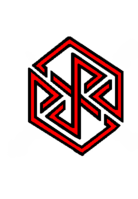
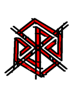
The red one. ↑(15)
Its more vulgar in my view, but maybe thats half of what a good logo is. It doesnt throw away the attention it craves, as it is still interesting.
I made it in the most convoluted way possible, but that gives time for reflection.
Edit:
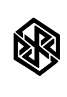
Bold halfcut↑ (16)
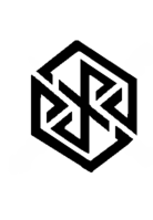
Halfcut↑ (17)
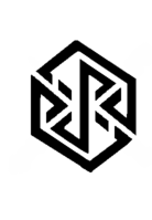
Line and dots↑ (18)
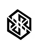
Dots and dots↑ (19)

Tiny centre dot and dots↑ (20)
That wasnt it, will look at other options another time.
Edit: I lied, that bugged me.
View attachment 8288
Mix and match↑ (21)
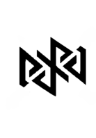
Without borders↑ (22)
Going to make another one tomorrow, think i figured out what it is
Last edited by a moderator:
levi
Still fresh, damnit!
I like the second one most. The extra space makes it look less cluttered than the first, and unlike the other ones I can make out the letters of PYRA in it.
Edit: Actually, I think I prefer the first of your second edit of two. Previously I was finding the P out of the loop of the R, but with those serrations in it makes it more obvious the letters are there in order.
Edit: Actually, I think I prefer the first of your second edit of two. Previously I was finding the P out of the loop of the R, but with those serrations in it makes it more obvious the letters are there in order.
Last edited by a moderator:
God Ginrai
Godmaster
Congratulations comradekingu, you have succeeded where countless others have failed. You have made an ambigram of "Pyra" that doesn't read as "Eyra", "Eyrd", or "Pyrd".
I like the Red one, the first black one, and the two from the second edit. However. Is it possible to make the edges of the P and A extend a little further before banking? That way, the P has a little more of a stem, so it looks a little more like a P. Just a little further should make the P more defined, and if you make it do so by a small enough amount, the A should still read just fine as an A. (Edit: Kind of like the first iteration of the logo you posted)
If we had to have an ambigram for a logo, this is an ambigram I could be fine with.
-God Ginrai
Last edited by a moderator:
FaeMinx
Rainbow Liberation Instigation
Who would have thought? When you first started making logos I was completely unimpressed... Now you've just risen to the top of the pile. I commend you. Your latest works honestly are the first logos out of everything I've seen I would be proud to have embossed on the lid.
Well done.
You've captured almost exactly what I envisioned when I thought the ambigrams should be in a cube shape.
Could you squash/transform your latest logos to fit exactly the shape of the Pandora logo? I.e. a perfect cube.
It's almost there.
P.s. I was getting frustrated watching everyone else miss the mark and felt I may just have to force myself to do another logo, but I believe the logo is now in good hands.
bzar
A Commando
comradekingu: Now those actually look good 
The first three are my favorites (counting the one with some red)
The first three are my favorites (counting the one with some red)
Hồng Thất Công
Đả Cẩu Bổng Pháp
@comradekingu: Very good! Now you're really smoking brother! 
Last edited by a moderator:
Fzero
Advanced Member
- Joined
- Mar 9, 2010
- Messages
- 4,702
Not too keen on the red one myself, though perhaps just because it has the black outline... on its own might be different.
This one is the best for me:

This looks really nice.
Not too obvious that it reads 'Pyra', not to the uninitiated anyway, but that's no bad thing at all.
But when you know that it does, it works.
The fact it's a cube shape is a bonus for me, harking to the Pandora logo. Like Levi said, the spacing on this one is good, with the lines being same thickness as the spaces.
And it looks decent even at that small thumb image size which is a good thing
This one is the best for me:

This looks really nice.
Not too obvious that it reads 'Pyra', not to the uninitiated anyway, but that's no bad thing at all.
But when you know that it does, it works.
The fact it's a cube shape is a bonus for me, harking to the Pandora logo. Like Levi said, the spacing on this one is good, with the lines being same thickness as the spaces.
And it looks decent even at that small thumb image size which is a good thing
Hồng Thất Công
Đả Cẩu Bổng Pháp
Good for splash screen
comradekingu
Glowing ember
Love the animation, it has that magic from seeing the animations when starting a game. Needs a little jingle too, fond memories.
Ive given names so that everyone can share their opinion, and be on the same page in doing so.
View attachment 8291
In lines↑ (24)
View attachment 8295
Out lines↑ (34)
View attachment 8292
No lines↑ (27)
View attachment 8293
Angle cutout.↑ (30)
View attachment 8294
Across↑ (32)
View attachment 8296
Straight↑ (35)
Last edited by a moderator:
bzar
A Commando
favorites: 27, 32, 35 (numbering from filenames that show up in tooltip)
levi
Still fresh, damnit!
I think the shapes of the P and A are most clear in number 32 ('across'). What appears as a little pig's ear on a lower case round A does not detract from the stalk of the P and even adds a little style to it.


