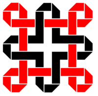
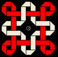
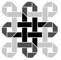
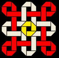
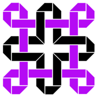
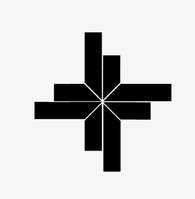
logo idea by comradekingu is logo idea


FZERO, what has been seen cannot be unseen. And with the added simplicity, it couldnt be tricolor, so i went to this
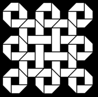
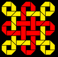
 

dragonin.png

dragonin2.png


Edit: Inspired by the logos over at binkys thread
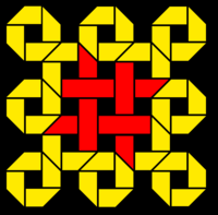

dragonin3.png

I think that illustrates why i dont like the shape, alone or as a bigger picture.


And it loses out completely on what this is the essence of ( i like this one)


View attachment 7957
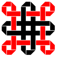

dragonaged2.png

dragonaged3.png


But what if ?


dragonodin.png


View attachment 7962
 
Last edited by a moderator:
Think the last one, without the red section, so is just a dpad looking pattern
 
The d-pad pattern, while a good suggestion, will strip away almost completely the structure of theoriginal design and leave little to be viewed. The edit of the third logo here incorporating # from binky, is another good possible version.
 
Yeah I guess does lose that original look and feel of it...

I agree with Levi though about the colour choice, I prefer something toned down a little, like this;

mbite0.png


With some effect for a non-embossed use

k3xcwp.png
 
Last edited by a moderator:
It looks tolerable with those colours, but it needs to lose the mesh on the outer sections.

Could be the same colourscheme, but along the lines of

dragonaged7.png


It fades out in the same way, dont know if that was an intentional effect, but i built on that.

With the separate ball in the middle i thought of it as a joystick, but d-pad works, and its more in line with what its about.

dragonaid5.png

The buttons were aligned that way back in the day too.

I dont really like that, as its too easy to connotate to something else, and its a bit cheezy if it doesnt connect with the logo as a whole.

Made this too

dragonodin6.png
 
Last edited by a moderator:
Took out the outside square shape.

Moved the inner dpad/cross inward a little so just little gap there.

Then done a more squared shape based off those dpad shapes

2rd9qvr.png
 
ha! I did actually ask a mate at work here if he thought it looked a bit ... wrong.

I think you must be right. Scrap that idea then.

Perhaps the octagonal one ... or is it a bit too Robocop OCP?
 
Every outer corner of the folded ribbon logos looks like the logo for Chase Bank. Especially when in blue, or embossed.
 
Yeah called that one already a couple page back :)

So long as not on its own, I think could get away with it, as it does just look like folds too
 
Personally, I like that.

Just that much more simpler than the original.

The original has just struck me as looking a bit portcullis like too, like on our one pence coins.

fault.jpg

I like this latest one just there though a lot, simple, works well as a small image, works well in single colour ... could be done in multicolour too for more elaborate usage.

In the words of Borat, "Is niiice"
 
some tweaks

246a0c4.png


2nk5076.png


...though perhaps would be better to keep the simplicity factor it has already
 
That's starting to look a lot more like a logo now. :)    

That said,  I have to say it's still far to abstract for my taste...  It looks good,  but I don't see any relevance to either DragonBox or to Pyra.

- Neelix 
 
Back
Top