You are using an out of date browser. It may not display this or other websites correctly.
You should upgrade or use an alternative browser.
You should upgrade or use an alternative browser.
logo idea by comradekingu is logo idea
- Thread starter comradekingu
- Start date
slaeshjag
¯\_(ツ)_/¯
Using google translate, I can find that pyra aparently means:
pears, bonfire, pyre in latin
pyramid in danish
puree in hebrew (using google's translitteration...)
cake in lithuanian
smoldering in swedish
It would have to be confirmed by native speakers though. Make of that what you wish :þ
pears, bonfire, pyre in latin
pyramid in danish
puree in hebrew (using google's translitteration...)
cake in lithuanian
smoldering in swedish
It would have to be confirmed by native speakers though. Make of that what you wish :þ
Neelix
Insecticidal Maniac
That sounds like something Craig might make a video of. 
- Neelix
- Neelix
Fzero
Advanced Member
- Joined
- Mar 9, 2010
- Messages
- 4,702
Add a pyramid to the middle... like so; http://www.playpandora.com/temp/pyra-kingu/index.html
comradekingu
Glowing ember
What i think we dont need is a compromise between _something_, and what was the essence of the more disturbed version.
Pyramid in logo is something i think equally would align us with more prominant later use rather than the initial idea. To confuse a mythology foreign to dragons into the mix is creating more questions than it answers.
Furthermore, for reasons I dont like the sharp edges sticking out on various other designs, pointing them inwards it creates a focal point.
Putting something else in there defeats the staves. (staver, or stava in norwegian)
From Middle English stikke (“stick, rod, twig”), from Old English sticca (“rod, twig”), from Proto-Germanic *stikkô, from Proto-Indo-European *steig- or *stig- (“to pierce, prick, be sharp”).
We use stikker, as in fyr-stikker in norwegian, for matches, stikker i take for this purpose to mean kindling type wood (to start fire)
(fyr (fire) being the same as the latin pyra word) "stikke i brann" means to set ablaze.
In sum creating a bonfire, something we can all gather around. A community symbol.
Last edited by a moderator:
Sense. That makes none.Pyramid in logo is something i think equally would align us with more prominant later use rather than the initial idea. To confuse a mythology foreign to dragons into the mix is creating more questions than it answers.
vcoleiro1
Hardcore Member
- Joined
- Jan 23, 2011
- Messages
- 4,685
Shouldn't the Logo be tied to Dragonbox. That way you have a logo designating the product line . Like PlayStation or Xbox have a product line logo. That would be far better for branding.
This doesn't stop you also having a logo for the model name , but bear in mind that one should be thought up for the Dragonbox product line, which IMO, is far more important.
This doesn't stop you also having a logo for the model name , but bear in mind that one should be thought up for the Dragonbox product line, which IMO, is far more important.
Last edited by a moderator:
comradekingu
Glowing ember
In the sense that fire is connected to dragons its on equal footing with the name pyra in that regard.
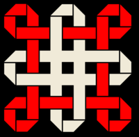
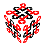
The knot logos are how close i got to dragon imagery without adding complexity to make it moreso.
(Update: (kl. 17.29 +0100) EvilDragon: comradekingu1, Well, the DragonBox Shop logo can also change. Maybe have a DragonBox logo as brand and then "Shop" and "Pyra" as it's own logos.)
The current dragonbox logo
 isnt my doing, so it communicates something else than I do.
We could expand efforts to also update that to reflect any decision made on the brand as a whole, and keep that in mind when making it.
What i meant about pyramids is that its used by mesopotamians and freemasons, neither of which fit the rest of the picture.
Edit: more fire
View attachment 8053
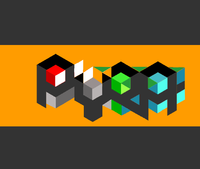
Bigger borders adds more impossible angles close up, i like it.
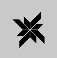
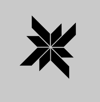
Somehow these two are noisier because the straight borders dont appear parallel to both straight outlines.
A bias towards X and Y axis rather than the intersection in between.
The knot logos are how close i got to dragon imagery without adding complexity to make it moreso.
(Update: (kl. 17.29 +0100) EvilDragon: comradekingu1, Well, the DragonBox Shop logo can also change. Maybe have a DragonBox logo as brand and then "Shop" and "Pyra" as it's own logos.)
The current dragonbox logo

We could expand efforts to also update that to reflect any decision made on the brand as a whole, and keep that in mind when making it.
What i meant about pyramids is that its used by mesopotamians and freemasons, neither of which fit the rest of the picture.
Edit: more fire
View attachment 8053
Bigger borders adds more impossible angles close up, i like it.


Somehow these two are noisier because the straight borders dont appear parallel to both straight outlines.
A bias towards X and Y axis rather than the intersection in between.
Last edited by a moderator:
comradekingu
Glowing ember
comradekingu
Glowing ember
Perhaps so, but in my opinion, your Celtic-knotty cube logo isn't :mellow:GIMP IS GREAT
comradekingu
Glowing ember
Well I'm not you, so you will have to use words. Maybe film yourself interpreting the logo by dance.
FaeMinx
Rainbow Liberation Instigation
I always took myself as being out of touch with reality, ...but now I see I'm not so special. 
Hồng Thất Công
Đả Cẩu Bổng Pháp
^Me too :lol:
your Celtic-knotty cube logo isn't :mellow:GIMP IS GREAT
you will have to use words.
1. Mixed concepts - Is it a cube? or just a pretty pattern? is the pretty pattern just 2D or are those ribbon-folds in 3D?
2. No obvious reasoning - Why is there a cube with celtic knots drawn onto its faces? What does this have to do with the product or its name?
3. Too complicated - there isn't any striking shape or outline to it
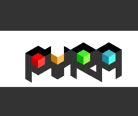
4. Doesn't work well at low resolution -50px high, 1-bit black&white: (Pyra shown for comparison)


Last edited by a moderator:
comradekingu
Glowing ember
http://en.wikipedia.org/wiki/File:Hall_%26_Oates_-_Out_of_Touch.ogg
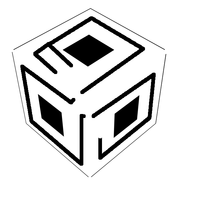
The box was just a means to get some feedback. Im thinking maybe another pattern, meant to be in the dragon/celtic/norse style in that sort of a 3d composition would work. Would have to be much simpler and add something too.
Its tilted forwards now, would have to be three equally big parallelograms. So that it makes a hexagon.
The pattern itself can be represented in a 11x11 grid at the least, so even at the smallest possible favicon size (16x16) its distinguishable, and those support colour.
Last edited by a moderator:
Am I missing something?
Who is out of touch, and in what way?
edit: for posterity, I'd like to point out that ck has just added some explanatory text to his post. When I wrote this reply, only the link was present.
Who is out of touch, and in what way?
edit: for posterity, I'd like to point out that ck has just added some explanatory text to his post. When I wrote this reply, only the link was present.
Last edited by a moderator:


