logo idea by comradekingu is logo idea


Perhaps for a splash screen anim or loading graphic, though more nicely drawn of course, with the blue having a little more glow too

30m8fls.gif
 Can you do another version of that in red rather than blue? 

I think the shapes of the P and A are most clear in number 32 ('across'). What appears as a little pig's ear on a lower case round A does not detract from the stalk of the P and even adds a little style to it.
Agreed. However, I still prefer #21 more. It still has those markings you like in #32, but it has straight markings on the Y and R that give them a more runic feel that matches more with the P and A.

-God Ginrai
 
Last edited by a moderator:
I think readability could be an issue with this one - it tends to look like a tangle of lines if not considered closely. Also, I bugs me that the outline is not a regular hexagon.

Having said that, this logo is far better than some of those previously suggested.
 
I think readability could be an issue with this one - it tends to look like a tangle of lines if not considered closely.
I don't see any problem with that. That just means at first glance it will look like a logo. It's actually quite readable if you look at it for more than just a quick glance.

-God Ginrai
 
Love the animation, it has that magic from seeing the animations when starting a game. Needs a little jingle too, fond memories.


Ive given names so that everyone can share their opinion, and be on the same page in doing so.


In lines↑ (24)


Out lines↑ (34)


No lines↑ (27)


Angle cutout.↑ (30)


Across↑ (32)


Straight↑ (35)
I like all these Pyra cubes.  Any one of them will do.
 
Can you do another version of that in red rather than blue? 
Yeah, I'll do that in a moment...

Here is another style, which Kingu came up with, having the line sort of bounce back on itself in colour from the middle

10einn8.gif
 
I like all of them, but 27 and 35 maybe are my favorites at the moment.

The concept is way better than any other one on the board now.
 
Last edited by a moderator:
Darker red one

[...]

And a little 2 tone red one, with slightly dif anim at the end

[...]
I like the darker red one. Also, the two-tone red could work if it didn't use that pinkish red for the lighter color. Maybe try switching the pinkish red for the red you used in post #125?

-God Ginrai
 
Antialiasing much welcomed, a SVG version would be even better, but i dont know how to do that.


These three seem to be the most popular ones.

View attachment 8292  (27)

27 is the original idea drawn to some sort of logical minimum in an artistic sense. It works as a figurative thing that also serves some meaning, if the reader sees letters, you choose where they are and start/stop. Also, latin script letters are arbitrary to my mind. They have an inherent ugliness, not magical. Even thought that was what I set out with, it can be made into something that is whole. If it cant be runes, it can be "runic", and the whole has a magic feel to me. Both runes on their own, in context, and as a style. Its in tune with dragons, traditional style thereof.


Aside from my aspirations, This being perhaps the most iconic, which is a logo-esque character, and its solid, removing anything from it, is a trade-off in a sense, but it is also adding something, so what do you add?
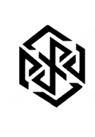
 

pyraild30.png (30)

Has a mesmerizing effect in that you can look into it, almost as if you have to, and it cant be underestimated like the first. As much as i like having a little mystery, i like it even more when its an intriguing factor. Some people see this as chaos, i don't, it relaxes me, but then again, i had dragons initially, but nobody asked for that again. I think it may also being an effect of already having seen the plain version, and maximizing what i liked about it.
If you stare into it, strange things start happening, and you can chose how to see it, more than it gives itself away. They also serve as a clue to the letters, in that it forms a square around the readable part, and the extra aesthetics form a square shape around that.

View attachment 8294 (32)


The balance between readability, aesthetics, and all things considered.


Its better if there are letters, that letters are about the same height, which is why i don't like as much the ones which forces elongated Y and Rs at the return of small P and A.
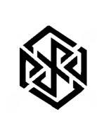

pyraild21.png


Which was the topic of the

spiffy endings on the a and p, albeit they look better alone, they look forced as a whole. Much as if it took a turn for readability at the cost of what the essence is. It could have been very readable, but then it would be that to begin with. I like extremes, going from the original one to this meant it also needed to be all black and equal spacing to lettering, it just makes sense. There is a goal and there is a game. One is one thing, the other is something else.

At any point you can ask for readability, up until the point it becomes generic helvetica, which has no mystery, it is dead. It is very good at what it does though, don't get me wrong. There is a distinct difference to me between striking a balance and making compromise.


If you are the engineering type to say everything is a continuous stream of compromise, sure, ill argue that those compromises were already made going in, and that everything is a continuous adjustment to meet targets. For a variation over the team target and what you attribute to it.


letters in the same style, which is why i don't like 35 below that much.
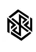
 

pyraild35.png


To have all the cutouts the same way helped, doing them downwards and in line, gave me some sort of iron bars feel,
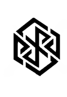
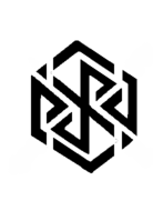
pyraild24.png

pyraild34.png


and it broke the 3d cube effect pretty hard. Across is better, but a pet peeve of mine is that still across means those cuts are abrupt, and the Y and R cuts are still going to be in a different angle.  And they cant apart from A and P be made in a way that respects the lines going through, and if then, it introduces the letter height problem.
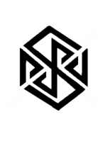

pyraild36.png (36)  Only new one for now, there are more possibilities to be explored, but feedback is needed.


Its hard to put thoughts onto paper, and its hard to give up cool additions that may work alone or introduce new problems to arrive at a result that makes sense.  Id rather not tell about most of them, because when its seen, its not so easy to unsee, so it becomes an extension to something that ends up at a dead end or being inconclusive. I think what makes sense is a shared experience somewhat, there is a mathematical truth to tap into.


In that same token, i cant put some things into words well, like energy flowing, but im happy it "worked", which is when other people pick up on the same thing without being told to. Please share your experiences. I like, or dont, isnt as constructive as letting people in as to why.
 
Last edited by a moderator:
Hmm, personally I find 32 more readable (for reasons already posted) and aesthetically pleasing than your new one, but it's better than 30 (I find all those implied right angled triangles confusing), and 27 just seems a bit plain after all these cut-up ones.
 
I can't stand those diagonal cuts on the Y and R in #32. It makes the characters lose their runic feel. I agree that I dislike #30, tho'.

#36 looks ok, but I end up seeing an S in the middle before I see the Y and R.

I still think #21 is the best of the lot. I don't think that the combination of the diagonal and straight cuts in #21 look forced at all, contrary to your opinion, comradekingu. I personally feel that #21 is the most readable, gives the most runic feel to the letters, and also keeps an adequate shape for hinting at a cube.

-God Ginrai
 
This looks interesting, could be a important step to the final logo. :) Still needs some polishing (the Y is not that clear to recognize) but overall it is a nice mix between graphics and text. I guess at first sight, nobody will discover Text in this logo but this could be exactly the interesting aspect of it.

Keep on going! ^^
Actually, the Y is quite easy to recognize in #21.

@Binky: The Y and R in your version really bother me. :\ Also, I don't see how your version is any more symmetrical than #21. Also, yours looks like a hex, not a cube.

-God Ginrai
 
Last edited by a moderator:
All the ones so far have the top and bottom corner offset slightly

Also, aren't all 2D projections of cubes hexagons (sometimes with two sides of length 0)?
 
Last edited by a moderator:
These logos are really messing with my mind. Couldn't even see the name at first.

  :lol:

I think readability could be an issue with this one - it tends to look like a tangle of lines if not considered closely.
I don't see any problem with that. That just means at first glance it will look like a logo. It's actually quite readable if you look at it for more than just a quick glance.

-God Ginrai
Isn't that a bad thing that you can't read it right off the bat?
 
Back
Top