You are using an out of date browser. It may not display this or other websites correctly.
You should upgrade or use an alternative browser.
You should upgrade or use an alternative browser.
Lerp Development Thread
- Thread starter benjymous
- Start date
bzar
A Commando
That's very nice. Do you have ideas about other forms for the player yet?
benjymous
Member
Another new video - a WIP snippet of the game's intro - not really anything to show gameplay wise, but it does show off lots of the lua scripting stuff going on:
http://www.vimeo.com/5550298
http://www.vimeo.com/5550298
Vorporeal
Yes, no, I, this is.
That looks, well, incredibly awesome. I'm really excited for lerp, it's one of the more interesting pieces of homebrew in development (IMO).
Trip
Sorry, but I suck at explaining stuff :P
Ditto, it's great to see unique homebrew starting to appear alreadyVorporeal said:That looks, well, incredibly awesome. I'm really excited for lerp, it's one of the more interesting pieces of homebrew in development (IMO).
Last edited by a moderator:
danielliu88888
i'm kind of hungry.
seconded, this is looking awesome, i'm looking forward to playing this. nice to see some great homebrew games coming up for the pandora. keep up the great work!Tripmonkey_uk said:Ditto, it's great to see unique homebrew starting to appear alreadyVorporeal said:That looks, well, incredibly awesome. I'm really excited for lerp, it's one of the more interesting pieces of homebrew in development (IMO).
Last edited by a moderator:
benjymous
Member
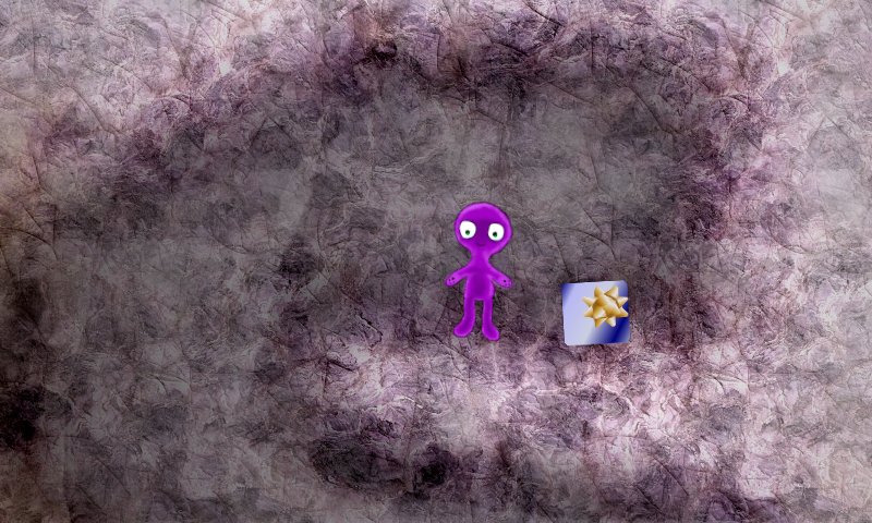
First look at the shadowy dimension that links Lerp's world and ours:
Again, the art still is highly WIP, and will probably change many, many times before I get this thing finished!

A present for me?
Again, the art still is highly WIP, and will probably change many, many times before I get this thing finished!
A present for me?
gruso
thunderbox
Loving the updates. 
Vorporeal
Yes, no, I, this is.
I love the art style. The backgrounds/environment is INCREDIBLE. Who's doing the art? Are you still doing it all yourself?
benjymous
Member
Vorporeal said:I love the art style. The backgrounds/environment is INCREDIBLE. Who's doing the art? Are you still doing it all yourself?
Thanks
Yes, I'm not an artist, by any means, but I've stumbled upon some techniques in Paint Shop Pro that seem to work well (basically filling a layer with a texture, then overlaying extra layers to darken / lighten / add different textures)
It's slow, and laborious (and probably will make it somewhat difficult for anyone else to make levels!) but it gives a pleasing effect
Last night I started working on a swirly dusty overlay for the "between" rooms, which currently makes you feel a little motion sick. As these areas are meant to be a little unnerving, I might just keep it :lol:
Last edited by a moderator:
likwidoxigen
Member
benjymous said:Last night I started working on a swirly dusty overlay for the "between" rooms,
Lol if only you could poach the FF7 battle theme for it
I'm really friggen excited for the game as well. Keep it up!
Last edited by a moderator:
SiegfriedCroes
Game Developer | Pixel Artist
Just checked the latest videos (on the Unofficial Pandora Blog), it really looks fantastic. There is only one thing, I wonder, maybe it would look better if the object you turn into is also purple, like the character itself. so the items on the map are just their normal colour but when you change yourself into it, it becomes purple. Nevertheless good luck, and also looking forward to playing it myself!
Luftwaffles
Member
- Joined
- Jul 8, 2009
- Messages
- 104
Just a thought here - not sure if your engine can use it but, I was thinking maybe in order to solve certain puzzles the game becomes a 3D overhead (like in Super Mario galaxy when gravity and camera angles change)
javaJake
Jacob Godserv
I would pay for something like this, assuming the levels come out as creatively designed as the artwork. 
Vorporeal
Yes, no, I, this is.
benjymous said:Vorporeal said:I love the art style. The backgrounds/environment is INCREDIBLE. Who's doing the art? Are you still doing it all yourself?
Thanks
Yes, I'm not an artist, by any means, but I've stumbled upon some techniques in Paint Shop Pro that seem to work well (basically filling a layer with a texture, then overlaying extra layers to darken / lighten / add different textures)
It's slow, and laborious (and probably will make it somewhat difficult for anyone else to make levels!) but it gives a pleasing effect
Last night I started working on a swirly dusty overlay for the "between" rooms, which currently makes you feel a little motion sick. As these areas are meant to be a little unnerving, I might just keep it :lol:
Since you seem to be using the same method over and over for creating the background images, it might be helpful if you try to write up a script that would make the process a bit easier. The way you're making the images might not be conducive to turning it into a script, but if it is, it might be able to save you a lot of time. (Then again, Paint Shop Pro might not be very conducive to you writing your own scripts either...)
Last edited by a moderator:
Enverex
Active Member
It does look lovely, the concept reminds me of Morph on the Amiga (did you play that? Although this looks far prettier and has lots of potential).
benjymous
Member
All's been quiet here recently, as I haven't had much of interest to post (I've mostly been spending what free time I can on adding more features to the engine so that I can eventually build the game I've been planning all this time)

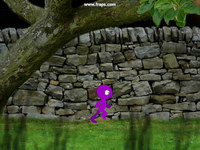
Parallax Test:

and a new one:
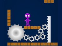
Gears:

This shows off box2d's excellent gear joints that let me drop the gear objects down in my editor, add a few lines of setup lua, and the physics engine does the rest - This should allow for lots more interesting physics based puzzles!
I know the teeth don't mesh up nicely - again these are (as per usual) just quick placeholder graphics until I get around to making some nicer ones!
Anyway, here's a few vids:
These first two have been posted on the Unofficial Pandora blog, but haven't been mentioned in this thread, so I'll post them here for completeness
A tight Squeeze: These first two have been posted on the Unofficial Pandora blog, but haven't been mentioned in this thread, so I'll post them here for completeness
Parallax Test:
and a new one:
This shows off box2d's excellent gear joints that let me drop the gear objects down in my editor, add a few lines of setup lua, and the physics engine does the rest - This should allow for lots more interesting physics based puzzles!
I know the teeth don't mesh up nicely - again these are (as per usual) just quick placeholder graphics until I get around to making some nicer ones!
greendots
Its finally here!
- Joined
- Mar 11, 2008
- Messages
- 610
Very nice ideas and artwork 
The only problem I see is that the gears are rotating in the opposite direction that they would in real life. I think the physics engine is looking are the character just as an object moving left or right rather then having weight. Otherwise the torque when the character first gets on would be rotating the gear clockwise.
The only problem I see is that the gears are rotating in the opposite direction that they would in real life. I think the physics engine is looking are the character just as an object moving left or right rather then having weight. Otherwise the torque when the character first gets on would be rotating the gear clockwise.
benjymous
Member
greendots said:The only problem I see is that the gears are rotating in the opposite direction that they would in real life. I think the physics engine is looking are the character just as an object moving left or right rather then having weight. Otherwise the torque when the character first gets on would be rotating the gear clockwise.
Yeah - I have a feeling it's that the force I'm applying to the player character to make it move is also getting applied to the gear, rather than the player character pushing against the gear. Oddly I've seen it working properly when standing on non-pivoted surfaces, so there may just be something odd in the gear setup
Last edited by a moderator:
Similar threads
- Replies
- 143
- Views
- 134K
- Replies
- 5
- Views
- 2K

