You are using an out of date browser. It may not display this or other websites correctly.
You should upgrade or use an alternative browser.
You should upgrade or use an alternative browser.
guihints - preview01, 02
- Thread starter Christoph.Krn
- Start date
Neelix
Insecticidal Maniac
I have to say that I find the 'ladybug' design confusing... the circle around the outside brings to mind a nub.
I do like the diamond design overall, but I think it would beneficial to reverse the contrast, ie Have the indicated selection lighter than the others rather than darker.
-Neelix
I do like the diamond design overall, but I think it would beneficial to reverse the contrast, ie Have the indicated selection lighter than the others rather than darker.
-Neelix
- Did you try guihints on a Pandora's screen?
- Have you looked at the downloaded files, the image 'guihints-introduction01.png', or both?
- What was the very first thing you've been looking at in these files, and when and how did you realize that the hints indicate action button locations?
- Yes
- both
- I first looked at the guihints-introduction image (on my PC I have to admit, but I feel it's not much different on the Pandora, though that experience is obviously spoiled), I got confused, started reading your post and periodically looking back at the image trying to figure out whether it was supposed to be nubs or buttons. I think I realized it is supposed to be the latter after a while (at least when I was at the part mentioning natural mapping)
The problem I see with it is the fact that the black dots are not clearly identified as other (unpressed) buttons as they are so vast different in size and colour.
EDIT: The revised version with the slimmer rim and shadow does not help at all in my eyes.
The new design you posted on the 22nd of January is better, but I don't like it much either - mostly because you used black to indicate the pressed button, which is exactly the opposite from what I would expect (and what you did in your initial icon set), so it looks like three buttons are pressed and one is not instead of the opposite.
Consider the attached quick mock-up minimenu-guihintstest01_mockup.png for example (top - new, bottom - old).
I like the horizontal- or vertical-only icons, they are very clear and fit good into context I think (except for the coloured variant, the gradient between the colour and white makes it look "cheap"). Though I think they are most usable for menus and not so much for games as in games you would want one icon for the whole d-pad for consistency (also in combos, e.g. when you display Left + Up + A in icons two different icons for Left and Up look weird and unclear).
The D-Pad icon used on the first part of the minimenu mockup looks good, but I would like to see how it looks with only one side highlighted - the separation between the cross in the middle and the arrows might not work too well.
For the D-Pad I also like the initial design, except that I would not separate the arrow-head at the end and the line "handle" of the arrow. Consider the second attached file (p01_dpad-u_mockup.png).
I like that design over the one binky posted, because the highlighted area is bigger and seems betteridentifiable(on the other hand a design closer to the real D-Pad appearance might be recognized more easily, then again an arrow pointing in some direction is pretty self-explanatory)
R and L keys might just work like in the third attached icon (r_l_sans_shading.png) - this would be the general shape, you would obviously apply some "colour" and shading, but in my eyes the difference between the R and L key is clear and also which key is meant. The N64 did something similar IIRC (can't find a screenshot right now).
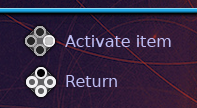
Last edited by a moderator:
Christoph.Krn
Advanced Member
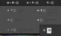
Thank you again for the feedback everyone. I have now revamped the action button hints, see the following edit: attached image ('guihints-weirdcombinations01.png') for a random-ish work in progress snapshot.
--
I'm trying to split dpad and nub hints into more specific hints (like "dpad up", "left nub up", "right nub left") and more generic hints (like "use dpad for this", "use right nub for this", "up", "move up", "left", "move left").
Since I have not experimented around enough with shoulder button hints yet, I have no more comments to add on these for now.
--
That "new" design (from 'guihints-alt01_32px.zip') was actually an implementation of one of the very first sketches. These had an inverted color usage and are overall way less than ideal.The new design you posted on the 22nd of January is better, but I don't like it much either - mostly because you used black to indicate the pressed button, which is exactly the opposite from what I would expect (and what you did in your initial icon set), (...)
In the image above edit: attached image ('guihints-weirdcombinations01.png') I have used the combination of "Left + Up + A", but have replaced the action button 'A' with the 'B' one as I'm not working on all four simultaneously. The hints from that image are still work in progress, but everyone please share your feedback anyway.(...) the horizontal- or vertical-only icons, they are very clear and fit good into context I think (...) Though I think they are most usable for menus and not so much for games as in games you would want one icon for the whole d-pad for consistency (also in combos, e.g. when you display Left + Up + A in icons two different icons for Left and Up look weird and unclear).
The D-Pad icon used on the first part of the minimenu mockup looks good, but I would like to see how it looks with only one side highlighted - the separation between the cross in the middle and the arrows might not work too well.
I'm trying to split dpad and nub hints into more specific hints (like "dpad up", "left nub up", "right nub left") and more generic hints (like "use dpad for this", "use right nub for this", "up", "move up", "left", "move left").
I had done that in the beginning, however I think that neither version is really elegant. The preview01 'dpad-u' arrow manages to have comparatively much detail while being merely a generic arrow.For the D-Pad I also like the initial design, except that I would not separate the arrow-head at the end and the line "handle" of the arrow.
This is about the way I currently intend to implement should button hints.R and L keys might just work like in the third attached icon (r_l_sans_shading.png) (...)
Since I have not experimented around enough with shoulder button hints yet, I have no more comments to add on these for now.

Last edited by a moderator:
gruso
thunderbox
The image won't load for me. I hate this forum's image plugin so much.
moz
load *,8,1
I'm getting the same problem, can you re-upload to imageshack or something please?
gruso
thunderbox
I don't see nothing wrong with a generic arrow, sometimes additional detail only convolutes the more elegant design.I had done that in the beginning, however I think that neither version is really elegant. The preview01 'dpad-u' arrow manages to have comparatively much detail while being merely a generic arrow.
Christoph.Krn
Advanced Member
Interestingly, the image appears to have completely disappeared from my account overnight as it had worked fine yesterday (from another system than the one I had uploaded the image from, without proxies).The image won't load for me.
Instead of uploading the image somewhere else I have now reattached it.
Design is all of it, not just what it looks like. It's how it works. For hints that are supposed to be quickly decipherable to the brain and to not interfere with the atmosphere of the game they are used in, having too much detail is potentially a bad thing if it doesn't serve a purpose.I don't see nothing wrong with a generic arrow, sometimes additional detail only convolutes the more elegant design.
Compare this to decorating road signs with unnecessary details (which is even potentially dangerous).
Last edited by a moderator:
Exactly what I was hinting at.Design is all of it, not just what it looks like. It's how it works. For hints that are supposed to be quickly decipherable to the brain and to not interfere with the atmosphere of the game they are used in, having too much detail is potentially a bad thing if it doesn't serve a purpose.
I don't like the action button icon in the latest draft, in my eyes it totally goes against the natural mapping approach as the character "B" is much more prominent than the position of the button (which now, btw looks more like a nub than ever).
That said I currently don't have an idea of how to integrate the letter any better, maybe just scrap that and go with the diamond approach, which I feel is superior over the "ladybug" one.
The D-Pad hints are okay, but also not my cup of tea. The pasted cross over the initial horizontal/vertical-only icons looks out of place and is disturbing in my eyes.
The "use D-Pad" icon looks good, but the one-direction versions of it have exactly the problem I feared it would have - they are not different enough and look to much alike on a quick look (which you often only have in fast-paced games).
Therefore from the ones posted I personally prefer the one in the top row, centre (though as I said one icon for the whole D-Pad and single directions seems better in my eyes).
Btw, I just noticed the initial ladybug design has a very nice aesthetic (as a generic icon), it just suffers from the problem of looking too much like a nub, which makes it unsuitable in my eyes
Ziz
Advanced Member
- Joined
- Jan 15, 2006
- Messages
- 3,583
Hi,
I read the whole thread and some ideas I really like, others I don't. First of all, I really don't like the proposed pictures for "D-Pad left" or "Button A". I don't think, that there is really a need for the context of the button or axis. Of course we need some good ideas to distinguish the icon for "D-Pad left" and "Nub left". But I don't think we need the whole input section like in the "ladybug"-design.
With a new gadget at first it is always hard to figure out and remember (!) every button. But as said before, You read one or two times, that (X) is kicking, afterwards I just kick. Especially for icons in continuous text like "Press (X) for kicking your enemy in the nuts" it would be much better, if it where e.g. just a X with a circle around it.
Sometime I have the feeling the pandora board forgets, that there are other open consoles, too. So for me it is important, that I can use the concept on other handhelds, too - or even on a PC.
In that case it would be cool, if the great "engines" like glBasic or Penjin would have something like "[[A]]" (or similar) and depending on the system you are compiling for, the [[A]] gets replaced with (A) (on GP2X, Pandora, etc.) or (Y) (on Dingoo) or with something else for the PC or any other console.
They idea to define a standard for "okay", "back", "menu", etc. would make more sense - especially for beginners.
Many gaming-applications for the Pandora are "just" ports or emulators (often ported, too), so I like the idea of a helpscreen in the beginning. But I would prefer a method with some simple HTML dialect (with title, headlines, font sizes, pictures, chapters and maybe links) instead of an image. Furthermore I like the idea of a "help package", but I would put help files in the PND, too. So the PND-starter first looks in the PND and if there is no help file, the pandora looks in the help file package.
gruso
thunderbox
I still can't load itInterestingly, the image appears to have completely disappeared from my account overnight as it had worked fine yesterday (from another system than the one I had uploaded the image from, without proxies).
Instead of uploading the image somewhere else I have now reattached it.
Christoph.Krn
Advanced Member
I have re-attached the image non-inline. Does this work better?I still can't load it
(I will write more on Wednesday evening or Thursday or so.)
Last edited by a moderator:
Tempel
Active Member
Personally, I like the ladybug design. It provides space for a background colour, showing some general context on the button's purpose very quickly. And I think that the surrounding ring helps bind the design so that it's parsed as a single image, rather than a smattering of dots. I never mistook it for a nub, though I could see why that might have happened to others. I don't know how to fix that, but it would be nice if its good qualities could be maintained.
I really must disagree. My fingers remember where the kick button is, not the letter that corresponds to it. To this day, I have to stop and think to remember the button arrangements on Playstation and SNES controllers, though I have no problem playing the games on them. That's the point of Cristoph's "natural mapping": the icon relates to position, so you don't have to look at the controller to find the right button. You're told that "kick" is the bottom button; this lets you find it quickly on the first try, and hopefully you'll remember it after that. And I should add that, on a Pandora, "Press X" is ambiguous, given there's a full keyboard on there too.With a new gadget at first it is always hard to figure out and remember (!) every button. But as said before, You read one or two times, that (X) is kicking, afterwards I just kick. Especially for icons in continuous text like "Press (X) for kicking your enemy in the nuts" it would be much better, if it where e.g. just a X with a circle around it.
gruso
thunderbox
That's good, thanks.I have re-attached the image non-inline. Does this work better?
So, my 2c. I think the graphics are too stylised. It's not that I don't like the look of them, I think you're doing good work in the aesthetics department. But I don't think they send their message quickly and clearly enough. They need a simpler design to carry out their task efficiently (that task being, shortest path of electrons from eye to brain to thumb).
Personally, my brain (which may nor may not be normal) responds most efficiently to something like this:


Just some quick mockups. Looking at it on the page now, those highlights should probably be a little thicker and lighter. [edit] And that dazzling gradient, what was I thinking.
Thus endeth my two cents.
Last edited by a moderator:
Christoph.Krn
Advanced Member
Sorry it took a bit longer for me to reply than scheduled. I'm currently working on an above-average number of things.
--
If I was the only one to use these hints, because of all its benefits I would use the ladybug design despite its potential problems (don't forget that I'm neither a usability expert nor a graphical artist). However, these hints are supposed to be used mainly by people that are not me, and unless I use a disproportionate amount of resources, I can not reliably verify or falsify that the ladybug design works. Please remember that with any hints, the typical worst case would merely be that a subset of users would be confused for a limited time; Also, don't forget that you can conduct your own user tests.
Building hints based on knowledge that every developer has is probably the only way to satisfy every developer's wants. This however would mean that the result would be ordinary, which would endanger the final goal of guihints, which is to overall lessen controls-related problems in the Pandora's ecosystem through increased awareness.
Therefore, if you intend to use guihints / intend to not use guihints / like the ladybug design / like the labeled action button design / think this is all just stupid / think that [RANDOM THOUGHT] and/or are or are not a developer, and have withheld your feedback up to this point, then it'd be great if you shared it! The more feedback, the better.
--
This is the reason I put a link into the first post that contains information about good icons. You have now already witnessed that it's not really as simple as it may seem. Try this: Open a random video on youtube.com (such as
https://www.youtube.com/embed/KMA23JJ1M1o?feature=oembed
I'm not the one who 'invented' natural mapping. (I guess you know that; this is just to prevent misunderstandings.)
--
If I was the only one to use these hints, because of all its benefits I would use the ladybug design despite its potential problems (don't forget that I'm neither a usability expert nor a graphical artist). However, these hints are supposed to be used mainly by people that are not me, and unless I use a disproportionate amount of resources, I can not reliably verify or falsify that the ladybug design works. Please remember that with any hints, the typical worst case would merely be that a subset of users would be confused for a limited time; Also, don't forget that you can conduct your own user tests.
Building hints based on knowledge that every developer has is probably the only way to satisfy every developer's wants. This however would mean that the result would be ordinary, which would endanger the final goal of guihints, which is to overall lessen controls-related problems in the Pandora's ecosystem through increased awareness.
Therefore, if you intend to use guihints / intend to not use guihints / like the ladybug design / like the labeled action button design / think this is all just stupid / think that [RANDOM THOUGHT] and/or are or are not a developer, and have withheld your feedback up to this point, then it'd be great if you shared it! The more feedback, the better.
--
Decisions are based on previous knowledge. Therefore, to be able to make educated decisions, one has to understand where one's knowledge ends so as to not set erroneous priorities.I think the graphics are too stylised. (...) I don't think they send their message quickly and clearly enough. They need a simpler design (...)
Personally, my brain (which may nor may not be normal) responds most efficiently to something like this:
<img>
This is the reason I put a link into the first post that contains information about good icons. You have now already witnessed that it's not really as simple as it may seem. Try this: Open a random video on youtube.com (such as
https://www.youtube.com/embed/KMA23JJ1M1o?feature=oembed
I'm not the one who 'invented' natural mapping. (I guess you know that; this is just to prevent misunderstandings.)
Last edited by a moderator:
Neelix
Insecticidal Maniac
This is the reason I put a link into the first post that contains information about good icons. You have now already witnessed that it's not really as simple as it may seem. Try this: Open a random video on youtube.com (such as
https://www.youtube.com/embed/KMA23JJ1M1o?feature=oembed
I can see why this effect is important, but it needs to be effected in such a way so as not to cause confusion. Gruso's examples above used a gradient background for example, which achieved the desired effect of grouping the elements of the icon together without making it look anything like any other controls.
- Neelix
Christoph.Krn
Advanced Member
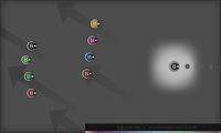
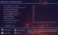
I have attached another action button hint incarnation ('guihints-roadtonextversion01.png' and 'ghft-mockup-minimenu_actbx_src-concept05edit.png'). Don't forget to also look at these on a Pandora (if you possess one).
These action button hints didn't go through the final fit and finish procedure yet.
Do not eat.
--
Neelix -- I think the same: clarity is most important. My point is that many things are easily misestimated/mis-prioritized. The clarity of a specific hint is likely one of these things. It's the "pich-to-zoom" route again.
Think about this: You probably will not forget about the function of Youtube's "un-fullscreen" icon again. In other words, the percentage of times that that icon does not immediately work typically decreases with every subsequent use. Typically, the more time passes, the better the ratio of (easily recognized this time) to (didn't work this time) becomes; in this particular case especially because the icon is very minimal and thus easily deciphered. Similarly, the ladybug design of preview01 can be preferable because it works especially well on screens with a comparatively low bit depth and response time (such as the Pandora's) as well as at reduced sizes.
For guihints, "tooltip" (which was what had helped in this particular case, in other cases other kind of context can be the key) can usually basically be replaced with "trial and error". Hints may be used to "instruct" as opposed to to "indicate function", but that's not really important here. What's more important (and makes it possible to compare hints to Youtube's "un-fullscreen" icon) is whether user interaction is typically mandatory at some point, and this is true for action button hints. The action buttons are also likely to be one of the first inputs a user tries to press if nothing happens -- nearly all of the software currently in existence for Pandora makes use of this principle, at least in menus -- and any displayed hints likely will typically begin to make sense to the user eventually (remember, human beings are very good at finding meanings). This is especially true if the hints have an interesting "personality" that encourages finding out what they are.


Last edited by a moderator:
Neelix
Insecticidal Maniac
Let me put this another way....
For my birthday last year I was gifted a copy of The Legend of Zelda: Skyward Sword and a Wii to play it on.
The control scheme is fairly complicated, but I never had any confusion about what button to press despite the fact that I was unfamiliar with the Wii's control system, because Nintendo included a very clear control hint overlay on the screen. As I got more used to the controls, I started referring to the overlay less, and I eventually turned it off altogether.
During that learning phase I was relying on the clarity of the hints above all else... what I was learning was not the hint system but the control scheme. If I had had to learn to decipher a cryptic hint system first it would have made the learning to play the game extremely frustrating.
Here's another example. I recently purchased The Nintendo 64 version of Ocarina of Time through the Wii Shop.
It's played via the Wii 'Classic Controller' which bears no resemblance to the original N64 controller. In OoT all the on screen hints are for the N64 controller. I tried working out the control mapping by trial and error and eventually gave up.
Luckily for me Nintendo included with the Wii version a help screen that spelled out the mapping, but even then I found the mental translation process for the on-screen hints clumsy and this affected my game-play experience. I haven't played enough of it to get through that phase yet.
The purpose of these hints is to get people through the learning phase. They should not require a learning phase of their own.
[edit] I would go so far as to say that if you are going to leave people to work things out by trial and error, then using a hint system such as is proposed becomes utterly pointless - an exercise in frustration which serves no useful purpose whatsoever. [/edit]
- Neelix
Last edited by a moderator:
Christoph.Krn
Advanced Member
Neelix -- Thanks for the clarification. I think wer're talking past each other. Clarity is most important, that's absolutely true. My previous posts are probably not clear enough: the term "pinch-to-zoom route" means that -- just like pinch-to-zoom -- you may not know how something works the first time you are faced with it, but every time after that it makes immediate sense.
That is obviously not given for hints that are repeatedly being mistaken for something else. Personally, I would use the initial ladybug design anyway; I would be willing to take the risk of having to re-iterate my software for the potential benefits, seeing as feedback on these hints is likely to be non-representative. However, I know that others won't do that.
I may appear to be very pushy with these hints. That is because I'm balancing out a lot of things about them and am trying to make sure I have understood other people's opinions (which is often not as easy as it seems - remember the "First Rule" of Usability).
-
By the way, in case I won't receive any negative feedback on the latest action button hints, I will begin creating visually similar Start, Select, and letter hints, and will probably adjust the directional hints a bit to that new design (in case that will turn out to make sense).
Similar threads
- Replies
- 4
- Views
- 4K
- Replies
- 2
- Views
- 2K
- Replies
- 5
- Views
- 3K
- Replies
- 18
- Views
- 4K

