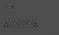
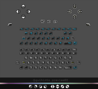
guihints - preview01, 02


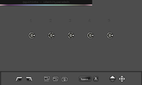
The attached image contains 5 variations of the latest action button hints with added button_offs (visual clues to the action buttons that an action button hint is not referencing).


Any comments? Which of these action button hints do you like best, and which one appeared to be the best at first sight?

guihints-identityparade01.png
 
Last edited by a moderator:
I probably shouldn't comment (although I have attempted to follow the conversation of this thread as it has progressed along) but I do like the idea of what you are aiming for with guihints (if I have understood it correctly? See attempted explanation below).


The gist?


In that you are wishing to one day, have a nice overlay explanation of any given games/apps controls, callable via an ingame button press, that will clear up any confusion that abounds, from the open nature of the many devs making control schemes of their own choosing, rather than following an arbritary standard that would limit the creativity of individual coders.


Your aim being, to have this as a user added addition to any PND manually, or perhaps the dev's themselves integrating your gui hints code into their PND package and then quickly taking the time to add their own apps control scheme, via some nice and intuitive interface for the PND packager to make this a pleasure, rather than chore, to add to their intended PNDs release.


The result would be that any PND whose maker has added gui hint functionality (or if manually added by the end user, akin to OVR editing perhaps(?)), would feature the ability for the end user, to quickly call up a reference overlay of controls, in case they haven't used it recently, or bothered to read any included read me documentation (sometimes unhelpfully generically called just 'read me' in the documentation section of the menu) on a first run of said PND.


Overall : eliminating the experiences of launching either a new, or long since forgotten PND and then playing the "hit every key and control set on the Pandora in order to either progress within the menu, achieve something as intended, or just plain quit the PND in question without calling up the killmanager via the Pandora button, or a soft - reset, when even that fails to do anything" game. Which is a form of Pandora Yoga that (whilst no doubt therapeutic for the fingers and the mind in some way) isn't so welcome, when you just want to get something done.


Therefore, as I said above I commend what your upto and I hope you can bring it to a level you are happy to release as at least a beta of your concept for people to provide you with 'working' within a PND feedback as to its usefullness.


At this point though, I need to comment upon the picture you have just provided.


I like very much the artwork for the buttons displayed in a row along the bottom of the picture. The shoulders, start, select, space, keyboard A button are very clear. The dpad indications are less clear and I prefer the first example due to its size and the lack of the + plus symbol in the middle which detracts from the arrows indications. I think a simple set of a single arrows 8 way directions would be ample to follow, or if indicating game moves such as down, down right, right + punch, the images could be shown in much the same way, as is common for game manuals/arcade cabs using your current graphics. Alternatively return to a standard D pad crossbar from earlier examples you gave and simply colour the directions required.


Of the 5 examples of the B button you have posted for comment upon though, I would choose 3 personally. This is the clearest when scaled down to the Pandora size in that the contrast of the white ring and black areas is clearest at a glance.


Yet I have responded at moderate length, in order to actually understand what I am looking at in relation to the 'B' button, even at a glance or prolonged look.


No offence is meant here either but I simply don't 'get' what is attempted to be conveyed by these examples of B buttons.


I understand the cardinal points around the B button, as much as a Christian 'gets' the Halo and overlayed Crucifix around a rennaisance image of Christ i.e not at all.


What is the ring around the button for?


What are the N, E, S, W markers for?


What is the White Dot for?


You have said "The attached image contains 5 variations of the latest action button hints with added button_offs (visual clues to the action buttons that an action button hint is not referencing). which in and of itself, I find a confusing explanation.


What is a button_off?


What is a 'visual clue' (if not a hint) to a button, that is a button whose hint, is not referencing itself to be the button in question?


Benjamin Button and Mr Spoon perving ladies from Button Moon makes more sense at this point :)


Imhho you should make a set of icons that depict the Pandora buttons and nubs with L R imposed over them and release some beta form of gui hints, so that people can explore how it will integrate with their PNDs or be able to be added in by end users, to see where this can progress to.


Its a stunning idea and it could help the overall operability of Pandora along nicely, making it far more user friendly which is pure win. So I hope you get it all sorted out to your satisfaction and that it gets integrated in some form into the Pandora library when your ready.
 
If you can't accept feedback based on intuition as a representation of an intuitive response then that feedback becomes worthless, and this whole process becomes an exercise in metrics fetishism.

Well, it is always better to make sure feedback is understood the way it was meant.

Correct. I entirely agree with this statement.

When trying to solve usability related problems however, this becomes crucial.


After all, there would be no such thing as "usability" if it was obvious how to make things easy to use. Therefore, when trying to solve usability related problems, trying to "decipher" feedback helps to avoid metrics fetishism.

Bullshit! If you are trying to "decipher" what I am saying then you may as well not read it at all. I'm not being cryptic here, and there is nothing to be gained by looking for hidden messages when I'm not hiding any.


I was going to comment further on the image you posted but I see that MarioPandio has already said what I wanted to say. (Probably more effectively that I would have.)


- Neelix
 
Just want to say I certainly didn't intend to cause any hostilities in this thread. I was trying to see if there was additional layers of complexity in the icons that was getting lost on me as I liked the idea if I had grasped it right and just felt, that a fairly simple set of icons is probably all that is required to get it going for now, as it will be great to bug test etc. I think it will be very useful if it ever gets properly implemented.
 
*shakes head* you haven't. You just happened to post while I was in the middle of composing my post, and since you already raised all my more constructive points I didn't see the point in raising those same points again. This perhaps made my post come off as being a lot more hostile than I intended.


- Neelix
 
You weren't overly hostile at all, it's just this thread had been a pure lesson in semantics and eloquent etiquette until seemingly I had stuck my oar in and said "Well the poster said that there'd be Punch and Pie? No? Aww..Screw you Guys....I'm going home!"
 
No offence is meant here either but I simply don't 'get' what is attempted to be conveyed by these examples of B buttons.
Well, taking offence from this is impossible unless ignorance plays a role, i.e. that you don't "get" what is being displayed is not YOUR fault. Don't worry, your feedback is very welcome.

[...] have a nice overlay explanation of any given games/apps controls, callable via an ingame button press, that will clear up any confusion that abounds, from the open nature of the many devs making control schemes of their own choosing, rather than following an arbritary standard that would limit the creativity of individual coders.
guihints themselves are nothing but the graphics discussed here. That developers can use them in any way they want (there will merely be usage suggestions) is one of the most important aspects of guihints, because anything that even just appears to restrict "creativity" may kill all these efforts here. As long as developers will be using standardized hints in any way that makes sense, unified controls overlays will become a bonus feature.


The uniqueness of guihints serves an additional purpose (in addition to improved natural mapping, see first post), which is to raise awareness of some controls-related problems that are not always readily apparent to developers.

Overall : eliminating the experiences of launching either a new, or long since forgotten PND and then playing the "hit every key and control set on the Pandora in order to either progress within the menu, achieve something as intended, or just plain quit the PND in question without calling up the killmanager via the Pandora button, or a soft - reset, when even that fails to do anything" game.
Correct.

What is the ring around the button for?
What are the N, E, S, W markers for?


What is the White Dot for?
In the hints from 'guihints-identityparade01.png', the white dot ('button_on') indicates the physical location of the 'B' action button (it's the right-most of the action buttons). Thus, the three other markers ('button_off') represent Y, X, and A; each of them becomes button_on in the respective action button guihint.


The white ring serves two purposes. It helps with making action button hints identifiable at smaller sizes, and it also helps with making the action button hints easily identifiable on all imaginable backgrounds.

The dpad indications are less clear and I prefer the first example due to its size and the lack of the + plus symbol in the middle which detracts from the arrows indications. I think a simple set of a single arrows 8 way directions would be ample to follow, [...]
The dpad hint with a plus symbol is a generic "Use D-Pad for this." hint.

Imhho you should make a set of icons that depict the Pandora buttons and nubs with L R imposed over them [...]
Given the comparatively large number of physical controls on the Pandora and the necessity to use comparatively high contrasts, creating hints that are easily distinguishable and easily identifiable in every environment they are put into (which is the absolute minimum requirement) is a comparatively complex task. For instance, it's problematic that the nubs don't have physical "L" or "R" labels, yet four other buttons do.

[...] and release some beta form of gui hints, so that people can explore how it will integrate with their PNDs or be able to be added in by end users, to see where this can progress to.
Well, since guihints are just graphics, the first version can be found in the first post of this thread.

So I hope you get it all sorted out to your satisfaction and that it gets integrated in some form into the Pandora library when your ready.
Since I'm working on this on a "when there's nothing else I have to do" basis and set quality as highest priority, it's no wonder it takes quite some time. You may have noticed though that the first post says that I want to have the first final version ready by the end of march.


--

Bullshit! If you are trying to "decipher" what I am saying then you may as well not read it at all. I'm not being cryptic here, and there is nothing to be gained by looking for hidden messages when I'm not hiding any.
It's a mutual thing -- saying there would be no such thing as usability if everything was self-evident is not the same as saying that someone is deliberately obfuscating information.


Let's assume I just said "13". I might have arrived at that conclusion by thinking 7+6. If you knew that what I was thinking was 7+6, then you might be able to simplify (or "improve") your own calculation, depending on what it was that we were talking about. At the same time, neither of us may be immediately aware that you are internally working with base 11 and I'm internally working with base 9 and thus we understand 13 a bit differently.


In a field such as usability where good solutions are not typically obvious, it is a good idea to try to find out whether conversations are really based on a shared understanding of 13 (to stay in the example), and it's always helpful to become aware of the other people's calculations.
 
What is the ring around the button for?

What are the N, E, S, W markers for?


What is the White Dot for?

In the hints from 'guihints-identityparade01.png', the white dot ('button_on') indicates the physical location of the 'B' action button (it's the right-most of the action buttons). Thus, the three other markers ('button_off') represent Y, X, and A; each of them becomes button_on in the respective action button guihint.

This is in no way obvious, and I would not be able to identify the function of these button_off indicators other than as a decoration if I did not already know what they were designed to represent.

The white ring serves two purposes. It helps with making action button hints identifiable at smaller sizes, and it also helps with making the action button hints easily identifiable on all imaginable backgrounds.

While I understand the function of the white border, making it a circle makes natural mapping almost impossible. How abut making the border diamond shaped?


That would:

  • Visually suggest the action buttons
  • Give context to the button_on and button_off hints
  • Distinguish the action buttons from the nubs and any of the keyboard keys with the same names.


The dpad indications are less clear and I prefer the first example due to its size and the lack of the + plus symbol in the middle which detracts from the arrows indications. I think a simple set of a single arrows 8 way directions would be ample to follow, [...]

The dpad hint with a plus symbol is a generic "Use D-Pad for this." hint.

The plus symbol is used for dpads because that's how nintendo do theirs, ours doesn't look like that so its use here seems somewhat superfluous... That being said I actually think you are on the right track with the dpad hints, but how would you show button_on for diagonal directions? just by rotating the image 45 degrees?

Imhho you should make a set of icons that depict the Pandora buttons and nubs with L R imposed over them [...]

Given the comparatively large number of physical controls on the Pandora and the necessity to use comparatively high contrasts, creating hints that are easily distinguishable and easily identifiable in every environment they are put into (which is the absolute minimum requirement) is a comparatively complex task. For instance, it's problematic that the nubs don't have physical "L" or "R" labels, yet four other buttons do.

Could you actually give us an example of what you have in mind for the nubs? Given the lack of labeling on the nubs themselves I can't see how we can get by without giving them L & R labels in the graphics, but I have yet to see any indication what you have in mind. Don't forget that its sometimes necessary to specify a nub direction, for example to show the use of the right nub as mouse buttons.


For the keyboard buttons, can we do away with the gradient? that may make the buttons more scalable.


For the Start/Select buttons, do we need to specify both functions? I'd propose two sets of these, ones labled Start and Select for use in games, and ones labled Crtl and Alt for use with applications. Which ones to use would then be a matter of context, and both sets would be more scalable than the combined set with smaller writing.

Bullshit! If you are trying to "decipher" what I am saying then you may as well not read it at all. I'm not being cryptic here, and there is nothing to be gained by looking for hidden messages when I'm not hiding any.

It's a mutual thing -- saying there would be no such thing as usability if everything was self-evident is not the same as saying that someone is deliberately obfuscating information.


Let's assume I just said "13". I might have arrived at that conclusion by thinking 7+6. If you knew that what I was thinking was 7+6, then you might be able to simplify (or "improve") your own calculation, depending on what it was that we were talking about. At the same time, neither of us may be immediately aware that you are internally working with base 11 and I'm internally working with base 9 and thus we understand 13 a bit differently.


In a field such as usability where good solutions are not typically obvious, it is a good idea to try to find out whether conversations are really based on a shared understanding of 13 (to stay in the example), and it's always helpful to become aware of the other people's calculations.

*snickers* "there are 10 types of people... those who understand binary and those that don't"


Seriously though, you have (once again) entirely missed my point. You keep looking past what I'm saying and thus missing my points and its getting to be infuriating.


The trouble is that if I say "13" you are wondering "did he mean 7+6" when in reality there was no such calculation involved. In this example if I said "13" it's because my experience in observing how people interact with computers, and my own experience interacting with various interfaces leads me to that answer. Intuitive feedback must be taken at face value, because it has no underlying calculation.


- Neelix
 
MarioPandio: You're way overthinking this ;)


Christoph's purpose in this thread is just to make icons. Have you ever played a game where something pops up, saying "Press the B button"? And sometimes they have an icon to represent the button? Christoph is making such icons for the Pandora. Now Christoph and Neelix are arguing over how to make these icons clearest to an end user. All other ideas are distinct; someone else will have to make them happen later.
 
Christoph's purpose in this thread is just to make icons.
Well if it were "just" about making icons, we would be finished by now, wouldn't we.


Though I agree, there is way to much discussion put into this and while I don't agree with the direction the icons are going (as I have pointed out earlier) and the fact that Christoph.Krn keeps sticking to his initial design idea and does not explore the diamond approach as suggested a few times, I think icons just have "just" to be done and put into games for people to judge them in a real world application (and not just argue over semantics).


So, I will just be waiting for that to happen and keep my voice out of this.
 
For the Start/Select buttons, do we need to specify both functions? I'd propose two sets of these, ones labled Start and Select for use in games, and ones labled Crtl and Alt for use with applications. Which ones to use would then be a matter of context, and both sets would be more scalable than the combined set with smaller writing.
The label does not have to be bigger, since once the user has understood the START/SELECT/LOGO hints, the indication of the button's physical location will serve a similar purpose as the label.


Yet, some people may have a need for separated hints. Does anyone else have comments on this?

[...] how would you show button_on for diagonal directions? just by rotating the image 45 degrees?
See 'direction-ul' from 'guihints-weirdcombinations01.png'.

For the keyboard buttons, can we do away with the gradient? that may make the buttons more scalable.
Of course we can, but I think it's not likely that it would be beneficial. The keyboard hints already are quite small (32px*32px including the drop shadow) and the gradient is fine-tuned so that the hint does already scale quite well (see attached work-in-progress image 'letter02-concept02_temp-small.png' -- you could have tested this yourself using the previously released images).

Could you actually give us an example of what you have in mind for the nubs?
Not yet. What I would like to do is to use the recessed part of the case around the nubs to indicate what nub to use, but I'm still experimenting.

[...] you have (once again) entirely missed my point. You keep looking past what I'm saying and thus missing my points and its getting to be infuriating.

The trouble is that if I say "13" you are wondering "did he mean 7+6" when in reality there was no such calculation involved. In this example if I said "13" it's because my experience in observing how people interact with computers, and my own experience interacting with various interfaces leads me to that answer. Intuitive feedback must be taken at face value, because it has no underlying calculation.
Ah, okay, so you are not aware that there always is a "calculation" involved. While truth (reality) itself is absolute, a human's interpretation of it is always subjective. See also: How GPS (or any other satellite-based navigation system) works. [sic]


If it wasn't, then virtually every software would have to be (near-)perfect usability-wise, because virtually every developer has enough experience in observing how people interact with computers as well as own experience from interacting with various interfaces, and therefore should know about virtually all usability-related problems and pitfalls in existence, or at least the most prominent ones.


--

[...] while I don't agree with the direction the icons are going (as I have pointed out earlier) and the fact that Christoph.Krn keeps sticking to his initial design idea and does not explore the diamond approach as suggested a few times, [...]
No matter how stupid something is, the person doing it will always believe there are good reasons to do it. ;) (Well, unless that person is being forced to do it, I guess.)


Given that the ladybug design evolved from the diamond design, that one /is/ my exploration -- from everything I know, I can see fewer problems with the current design than with any plain diamond design, but I won't stop anyone from proving me wrong.

[...] I think icons just have "just" to be done and put into games for people to judge them in a real world application (and not just argue over semantics).
Indeed. That is the only way to "benchmark" guihints, and the reason I created this thread. preview02 will be at least close to being a release candidate.


It might look as if most of the guihints work was discussion at this point, but that's not the case. For instance, on friday I have spent about 1-2 hours just on the 1st level keyboard letter hints (A through Z) fixing bugs, clearing up, and adjusting them to make sure they all look consistent and none of them looks weird, because there are quite a few things to be considered and tested.

letter-concept02_temp-small.png
 
Last edited by a moderator:
preview02 is almost finished, with all hints except for brightness-up, brightness-down (See: Brightness symbols (keyboard) - what's their origin?), and nub hints. I've put them through some tests and am making some final adjustments. All hints have a default size of 40x40 pixels, except for keyboard-space and keyboard-tab, which are double width by default.


Also, I think I have found a solution to the issue of "helpscreens" vs 'proper' documentation, and developer-provided vs. user-provided documentation. I'm creating an example documentation now.
 
Last edited by a moderator:
Hey and very late in my reply ;)


Thanks for the explanation of the button offs and the need of the white ring. Makes perfect sense now and yes, it does indeed indicate which button of the diamond/ladybug is required and help to show the icon against any background.


I also apologise for seeming to hassle you, as I had missed your original deadlines mention.


Tempel: :lol: overthinking, or thinking at all, requires something I lack in abundance, yet I may well have read far to much into this but I hope it eventually is utilised by other dev's, to be widely incorporated into most PND designs. If for nothing else except it's cool looking icons man, like wow, like Ghana is our trashcan man, like wow :wacko:


Foxblock: I probably should have done both but it does make more sense to me now :)
 
I know this is still a wip, but are there any (nearly) finished icons I can use in OpenFire?


Thanks :)


I need ABXY, dpad at the moment.
 
preview02 of guihints is now available in the first post of this thread. preview02 is a near-final version, but keep in mind that future versions may still bring along larger unplanned changes nonetheless. Source files are available on request (the source files of final guihints versions will be available, but they need to be cleaned up first).

Further notes:

  • Hints for nubs are missing in preview02
  • The keyboard hints for brightness-up and brightness-down are missing in preview02 (see Brightness symbols (keyboard) - what's their origin?).
  • Color variants are missing in preview02 (except for special 'neutralcolor' variants of keyboard-shift and keyboard-enter -- which have yellow arrows in their default variants -- for use when other hints are color-coded).
  • Hints from preview02 are not sprites, i.e. hints from preview02 do not have default animation states for 'blink' and 'pushed' yet.
Please report in case some guihints from preview02, especially if displayed next to other guihints, are difficult to identify or looking weird wherever it is that you are using them.

--

[...] like Ghana is our trashcan man, like wow :wacko:
...what?guihints-preview02.png

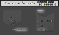
how-to-type-angstrom.png
 
Last edited by a moderator:
Hey Christoph.Krn,


i really like your work, it is very nice that you started this project!


I don't understand what is the big deal with these graphics but it's good to have the buttons in digital format to use them in games/applications.


Thanks and keep that work up to date :)


For all those who didn't get the idea of this:


I know this is still a wip, but are there any (nearly) finished icons I can use in OpenFire?
Wait... does this mean you need the source files (Photoshop PND (edit: Photoshop PSD, of course :) )), or do the .png files suffice?

Thanks and keep that work up to date :)
You're welcome.

I don't understand what is the big deal with these graphics [...]
Well, for instance, in the shrunken screenshot you just posted, guihints would be more easily identifiable than the ones from the screenshot (which doesn't mean that these are less good).
 
Last edited by a moderator:
The "How to type Angstrom" example is very nice and very explanatory :)


I like your style
 
Back
Top