GPD Win (x86 Computer / Palmtop)


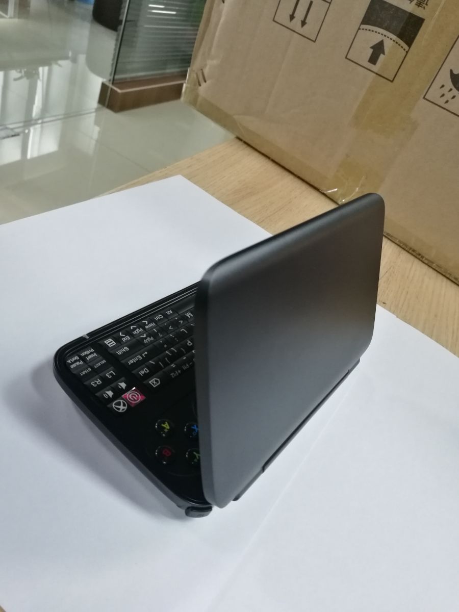
@Grench Insert is there, top left (combined with PrntScreen).

However, I don't see an R3 key in the official prototype design. And I despise not having proper pgdown/up controls on my laptop and far prefer the way my Pandora does it, but I guess in Windows you might want to have the game buttons in joystick mode, but still have page up/down keys, and they don't have our team of amazing porters making sure keymaps fit the device's controls well.

Wade is still thinking how the shoulder buttons and the thumbsticks are going to be implemented, so instead of waiting for a bad decision, we try to find a balanced one for everything.

About the access for pgdown/up controls, we don't really need it, neither anyone to port games for key mapping as we have quite good third party softwares (my two favorites are Controller Companion, and clavier +, you can do everything).
 
Here is Saber's one :

He put the sticks on the Edges because Wade talked about putting them there.

Here is mine :

I like both of those better. They should allow for chording Alt+Ctrl with the left thumb then tapping Delete with the right. (Windows login screen default.)

Did anyone try to put L3 on the top left and R3 on the top right in the corners? It would have been a logical extension of the game controls then.

Insert placement can be tricky. Standard copy/paste isn't the Ctrl+C and Ctrl+V that a lot of people use. There is an actual standard to use Ctrl+Insert (copy) and Shift+Insert (paste). With Insert relegated to the Fn layer on those, that standard could be a difficult combination for those of us with only two thumbs.

I don't mean to make this a keyboard thread. I simply find it interesting how different projects approach this. Seemingly simple on the surface, but very complicated when you dive into the actual details and use cases.
 
What's wrong with incorporating the Win1 clickable stick mod into the Win2 for L3/R3?
I'd like to have that mod and the start, select and xbox buttons in between the two sticks
 
The problem I have with wades layout is that my core issue with the current WIN is not really fixed. My biggest issue with the keyboard is that the keys are too small, it's not uncommon to hit two keys at once. Unfortunately that issue is hard to see in pics

The plan is to have the WIN 2 be 96mm deep again, like the WIN 1. The new 6 row keyboard has to fit in that same keyboard space. I see no other way for that to happen other than the keys will be shorter than the 6.8mm they are currently on the WIN. Mind you, I had been advocating for the key sizes to increase in height - so this is a big back step (if true) IMO. Getting rid of the right column of keys now allows for slighly wider keys, but if they had of gone for a 14 key per layout instead of the 15.5 key per row, that would have led to yet bigger keys.

Also, there are some fundamental issues like escape not being on the top left where expected - escape being often used to break out of games or go back a menu etc. Or the backspace not being top right were expected.

The tiny keys also make it difficult to use them for games that use the keyboard keys. You are not going to hit them in a hurry, that's for sure. And the risk of hitting the neighbouring key is always there. Especially when there is near no space betweeen keys.


That is why I had proposed a 14 key per row , 5 row keyboard. It ends up with 36% bigger keys and escape and backspace are back on their respective corners


Here was my 5 row, 14 key per row suggestion:

yUS49Ia.png


Below is the key size difference, my 5 row keyboard keys overlayed on wades 6 row keyboard:


zJFkQO6.png


Note: As for insert, that has been deliberatly left off (can be re added though) , it is not used very much these days and is alsways listed amongst the least used used keys. It is left of keyboards more and more these days. ie like with macbooks or the surface 3 type cover which has the same SOC as the current WIN. Or a lot of other WIN laptops
 
Last edited:
Putting the power button inside the keyboard is a bit of a wreck too. I realize that the space between the joysticks is heatsink - but what is that above the center? Is that a left-right switch? What is it for? If they can put one switch up there, they could have put the power button up there too.

Anyone who grew up using IBM computers in the DOS era uses Insert regularly. It is the Real/Right way to copy and paste.
https://en.wikipedia.org/wiki/IBM_Common_User_Access

The modifier key + XCV is actually an Apple Mac methodology that Microsoft blatantly copied and pasted into Windows.
https://en.wikipedia.org/wiki/Cut,_copy,_and_paste

"Most terminal emulators and some other applications support the key combinations Ctrl-Insert to copy and Shift-Insert to paste. This is in accordance with the IBM Common User Access (CUA) standard."

Insert is freekin' important. Mac/Windows users are simply too tied up in their mouse cords to learn how to use it.

If you're going to leave off a key, ditch the 'Windows' key. It is a redundant waste of space. Ctrl+Esc does the same thing.
 
The insert can be re-added , I did origianlly have it under function on the \ key (the other two Fn keys moved left). But I don't know, it seems if there is a paste alternative with ctrl V, then why add another way to do paste on a UMPC keyboard where everything is being simplified and streamlined.

The switch at the top is for Xinput, dinput and mouse mode. It exists now on the WIN. May or may not exist there on the WIN 2

It would be wonderfull to put buttons between the sticks, we all wanted that and had put together layouts with keys between the sticks. That solves a lot of problems. But then GPD said becuase of internal components, nothing can be put between the sticks.
 
Last edited:
The insert can be re-added , I did origianlly have it under function on the \ key (the other two Fn keys moved left). But I don't know, it seems if there is a paste alternative with ctrl V, then why add another way to do paste on a UMPC keyboard where everything is being simplified and streamlined.

It isn't just copy/paste. It is also used to flip between insert mode (normal these days) and overwrite mode. There are solid reasons why 'Insert' was given it's own key starting in the days of green screen terminals. It can be a significant key stroke saver when used properly.

Your logic could be the same for 'Home', 'End', 'PgUp', and 'PgDn'. They can be left off too because there are arrow keys that will eventually get you there.
 
@Grench

I was replying to your comment of Shift Insert being used for paste (which can be done with Ctrl V), ie I didn't mention it's overwrite fuinction (when pressed - insert being default)

As for using insert to overwrite
I used insert once or twice 20 years ago, since then - never. And this is why, overwriting text in an area would often result in overruning or running short of the text you wanted to write over - thus causing further edits or worse, trying to work out what was there before that you didn't want overwritten and re typing it. That is why pretty much everyone these days adds text, then removes what they don't want by highlighting and hitting delete. Sure , if you are good at using insert and judging what needs to be over written, then it would be ok, but according to polls , it is often voted one of the least used keys. Also, when I add text to replace something , what I'm replacing often has some points/data I want to just rephrase. If I straight up write over it, you lose your reference for what you want to rephrase. Which is anoher reason for me , adding and then deleting what you don't want, is superior.

One mouse click held to highlight what needs to be deleted plus hitting delete once, vs hitting insert ,potentially fixing what you didn't wont overwritten or deleting what still remains to be deleted, then hitting insert again. This is exactly why few people use it. But of course with everything , it's a numbers game, there is always people that say they use any key you would like removed. It's a matter then of gauging if enough people use it to warrant it remaining. Always good to hear from those that do use keys though

P.S Oddly enough, and I must admit I expected the opposite to be the case, I ask my wife who is a book editor about the Insert key, her reply was - whats that do. Surprised, I asked if she ever used it - nope. I showed her what it does , and she said that was retarded - especially how it doesn't control what you type over . Probing further, she said, if you want to replace text , you highlight what you want to replace, then while it's still highlighted you type over it . That limits the type over to what is highlighted and completely wipes what was there. Not limiting what gets over written is why she thought insert was retarded . I must admit, I never knew you could do that ie highlight text and overwrite it. But even that she doesn't use,, she actually does what I do (and most others), and that is to insert text and then remove whats not required. The reasson given was exactly what I said, to keep the original text as a reference when you type in the new text
 
Last edited:
i understand keyboard threads about the pyra on the pyra forums.

i'm not sure i understand keyboard threads about the gpd win2 on the pyra forums. at least with the former there was a non-negligible chance that your design contributed to the final design...

but don't let me rain on your parades :)
 
Just wanted to post a new update I messed with Hans De Goede's custom kernel last night on the ship and got this! Battery indicator and brightness. Haven't anything else yet.
View attachment 30282

nice!
[doublepost=1492741734,1492741523][/doublepost]
It is far better than the nightmare that was the GPD Win 1 keyboard.

The coloration of WASD keys and the arrow cluster seems silly. The Fn layer is not color coded - so F7-F12, which would be on the Fn layer, are displayed on the keys as if they were on the Shift layer.

Where did Insert go?

Since this is a Windows device and a thumb keyboard, it will need easy access to the most commonly chorded set of keys on a Windows unit. How does one hold Alt + Ctrl and tap Delete with that supported mid-air using two thumbs?

What is the Select, Start and X on the top-right? Seems VERY similar to the Select, Start and Pyra/Pandora key...

Screen brightness looks to be either on the shift+volume keys or Fn+volume keys. IMHO turning the display brightness up needs to be a top-layer action.

Using 3 top layer keys to control volume seems a bit silly given the constraints. One key could do it.
Volkey = Volume Up
Shift+Volkey = Volume Down
Fn+Volkey = mute/unmute

Same with brightness, currently residing on the Shift or Fn layer behind the volume keys. Doing the above would free up two keys, one of which could be the screen brightness.
ScreenKey = Increase brightness
Shift+ScreenKey = Decrease brightness

That frees up a key that could be used for getting rid of the GPD Win's silly fan switch.
FanKey = Increase fan speed
Shift+FanKey = Decrease fan speed

I see no indicators for keyboard backlight control...

Was this a Saber design? It isn't bad for a first cut. Again - far better than the original GPD Win.


Maybe having some kind of unique texture on the WASD keys and arrow would make more sense than a color? Something that provides tactile feedback would be superior to a unique color because fingers will be blocking the view of the keys anyway while playing.
[doublepost=1492742028][/doublepost]
i understand keyboard threads about the pyra on the pyra forums.

i'm not sure i understand keyboard threads about the gpd win2 on the pyra forums. at least with the former there was a non-negligible chance that your design contributed to the final design...

but don't let me rain on your parades :)


Actually, I'm on good terms with the GPD company. Sometimes they ask me for help with packaging/brochure design and written English on their material. If I give unsolicited feedback about other design elements, they might take that into account.
 
Seems perfectly fair given this is in the Everything Else section to me. Hopefully fewer people care about GPD devices here, so fewer will reply to this thread about keyboard designs.
 
i'm not saying it's off topic from the OP, i was just thinking it was completely futile and a waste of time... apparently it isn't, though!
 
Did some testing of the heatsink.
In case anyone was wondering how airflow is or thinking of modifying the heatsink this may be of interest.
8tMjHx0l.jpg

Now that I've made a setup to test them I kinda wish I had a original heatsink with fins to see what flow through that looks like.
 
Looks like GPD has pretty much settled on the following for the WIN 2 keyboard layout , port layout and shoulder button layout. I suspect small changes may still happen.


dxeRCxO.png

C2kowGa.png


...............


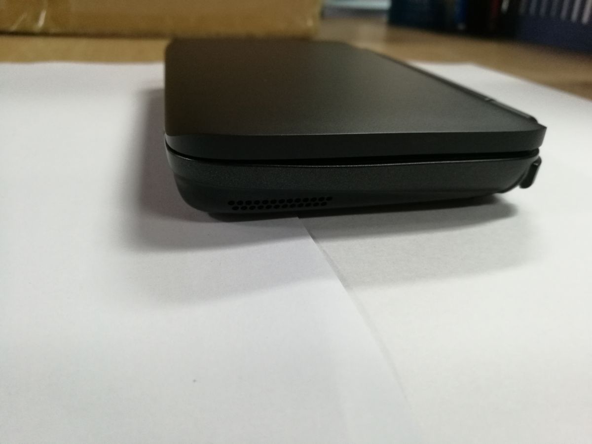
On adifferent note, here are somepics of the Current GPD WIN version with Aluminium top, don't think the bottom ended up being aluminium.


C-MfInpUQAIs1UJ.jpg

C-RGqmpV0AA3z4E.jpg
 
Last edited:
Back
Top