Finding a proper name and logo :)


On this page it's in GBP and is a .co.uk site:

http://99designs.co.uk/pricing

Probably loading based on where we are then?

Anyway, yeah I see on the testimonials page at some of the contests and some people getting 70 designs for their £199 package, so I guess it can fluctuate a lot, probably based on how interesting the designers find the challenge?

A lot of them do look nice and professional standard.

Also, this might be happening anyway eh? :) Don't think ED has expressed how/where the logo design will come from has he?

This thread is just unofficial, don't think ED has mentioned anything about the logo at all has he, not that I've noticed anyway.

He may well source it to somewhere like 99designs or have someone he knows who is a graphic designer do it
 
cuetzpalin speaks a lot of sense. Subtle branding nuance is one of those areas where our voice should at least be heard, but ultimately largely ignored.

Design by committee doesn't work. That's why designers are paid to have expertise and tell the rest of us to shut up.
 
Way too kill this thread. Looks like we are running out of time with the logo. :P
 
Last edited by a moderator:
The reason design by committee fails, or came to be a saying, isn't because there was more than one voice.

An involved approach is just as much what you put in it as what you get out of it. Unless "1 logo please", is what you bring to the table, at which point you will probably end up with a generic logo or lucky somehow,

is when you bring something to the table.

Avoiding any input from people is arbitrary. It doesn't make anything easier, just like listening to all of it is just as much a random chance way of saying it could turn out perfect.

Real designers do use feedback groups to great value, they can learn from feedback, there is a method to the madness, so there is also a systematically scientific way to produce results. All involving people somehow.

If the target audience is people why should they be disregarded outright?

Just because a logo advertising page saying on its own testimonial page that its great, doesn't mean much. I think that is the 101 of advertising.

The argument could have been, logos, fonts, take a +1 time to make, and cost +1 amounts of whatever you are spending.

All in all its just as true as, you cant do music because someone else is a professional at it, and a continuation of A is better than B.

ED is just as wrong as any one individual is wrong the times that he is, however often that happens, an ability to listen is that same ability to not allow design by committee to fail.

Artwork isn't a higher discipline that we cannot touch, it is if we think so, but instead of pretending, instead bring it down to size, do the work, and make the results magical.
 
Last edited by a moderator:
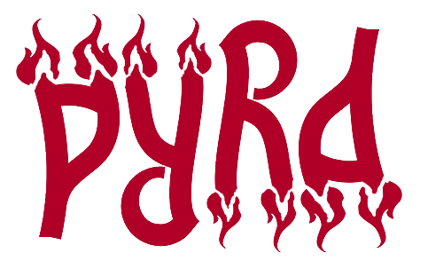
The logo evolves, nice. Only the "flames" in the last pics should look more like flames, above it looks more than a crown.  Maybe more something like this, would also work in mono and relief, of course it should look better than my sketch, just imagine it looks good. :D

pyralogo9h-normaljrk57.png
Something like this please :)
 
I still like the Dragon logo the most.
 
Last edited by a moderator:
Oooh! Nice :)

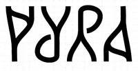
You might want to tweak the P to avoid DYRA though...
 
Last edited by a moderator:
I think it's clear that any logo that will be chosen from this thread will be treated as a starting point and not a finished image? The range of artistic talent in rendering visions here varies a lot, but many of the ideas could be very appealing with a proper artist. Without expressing any specific logos, I hope the decision will be based on the idea, not execution. :)

Possibly obvious, just pointing out :)
 
I like that one _wb_

Still seeing that infinity loop in the middle too there
 
I like that one _wb_


Still seeing that infinity loop in the middle too there

You see a ∞ in there? OK, why not :)

In this design I like that it has a universal quantifier Ɐ, meaning you can use it for all possible things :)

It's also a logo that can nicely be shortened. If you keep just the PY, all the information is still there (just turn it upside down to see the RA). The P alone is still recognizable.

@Binky: I'll see if I can make the P less D-like without ruining the A.
 
The logo evolves, nice. Only the "flames" in the last pics should look more like flames, above it looks more than a crown.  Maybe more something like this, would also work in mono and relief, of course it should look better than my sketch, just imagine it looks good. :D

pyralogo9h-normaljrk57.png
 
Something like this please :)
A fan!  :wub:

Your new Idea is also nice, it just needs some more rounded/thinned/ or sloped adjustments at the hard 90° edges of the letters. Something that makes these areas "smooth". ^^"
 
I think actually more hard line is needed on that one...

Bit like this...

24yv79v.png


...To give that [P] a cleaner look and not looking like a [D] at all.

But in a way that the [A] still can work of course.

I think the sloped angles cut into the ends which are currently 90degrees could look good too
 
Back
Top