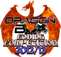
DragonBox Coding Competition: Logo needed :)


That kind of font.
Hm ok, I think that would be too much but i will make one version with this gothic font and we will see. :)

The second one is really cool. Maybe you could try to replace the pink with light blue?
The version with the textured dragon? Which pink should i replace with blue? Do you mean the lines around the "coding competition" text?
 
Yes. This is what I meant. I like the purple blue texture though.
 
Yes. This is what I meant. I like the purple blue texture though.
Ok here you go:

dragonboxlogosmallnew7_zpsfb75479e.png


Aaaaaand two new variations :)

dragonboxlogosmallnew5_zps3fef0e11.png


dragonboxlogosmallnew6_zpse181bd28.png


@Linux-SWAT: This is imho the best gothic font :)  At least for logo texts ;)

Edit: Tweaked the last one (new coloured Dragon texture and edited text)
 
Last edited by a moderator:
Flames + Gothic (but 2012/13, not 2013/13 ;^) )
 
Last edited by a moderator:
flames one is pretty sick.


dragon is very nicely drawn too
 
Ok it's "tomorrow" now :D Here the flaming dragon with gothic font:

dragonboxlogosmallnew8_zpsc2843d59.png


With the brown/grey contrast i think this looks more consistant than the red/yellow contrast on the above version. Is the "coding competition" text size ok or should i make it smaller? What do you think?
 
Last edited by a moderator:
Maybe use violet (or whatever adequate), and also in 2012/13 to recall it ?
 
Maybe use violet (or whatever adequate), and also in 2012/13 to recall it ?
This still wouldn't fit to the fire dragon. Violet and red/orange in contrast are a pain for the eyes. It's like chocolate and fish. You can eat both at once but then you will barf. ;)
 
And I eat many cocolate Santas during Christmas but the exception proves the rule!  :p
 
Back
Top