DragonBox Coding Competition: Logo needed :)


The "coding competition" lettering looks a bit to wordarty :(
 What do you mean with "wordarty"? Should I remove the 3D-effect?
That would probably help; a good question of graphic design is "would my logo work in 1-bit black & white?"Try making a B&W version of your logo to see if it works, and if not, change it until it does ;)

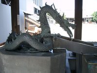
Did you draw the Dragon ?
No not really. I searched for a picture and highly reworked it. 
You might want to check the copyright/licensing on the original picture
 
I'm not a fan of black and white logos. Though I'm a fan of "less is more" especially when it comes to colors. That is why you only find three colors in the logo (the colors of the DragonBox Shop logo) except for the "Coding Competion" text. I thought it would be nice to make this line somehow special.

You're right about the picture. I will draw my own dragon when i find the time.
 
Last edited by a moderator:
I never meant the finished logo should be black & white.

I suggested redrawing it in B&W to highlight areas of poor contrast/clarity

After that colours can be drawn in if they make it look better (which is highly possible)
 
Ok sorry for misunderstanding! Simplicity is all! ;)

Without 3D text:

dragonboxlogosmallalternative1_zps23c26208.png
 
Last edited by a moderator:
Couldn't sleep and reworked the logo. Now with my own dragon and "2012/13".

dragonboxlogosmallnew1_zps47f8d185.png


Edit: Did some minor tweaking.
 
Last edited by a moderator:
Couldn't sleep and reworked the logo. Now with my own dragon and "2012/13".

[img=[URL="http://i89.photobucket.com/albums/k214/knotenpunkt/dragonboxlogosmallnew_zpsfd457495.png%5D"]http://i89.photobucket.com/albums/k214/knotenpunkt/dragonboxlogosmallnew_zpsfd457495.png][/URL]

Thats really neat. I like it :)
 
Thanks guys! :)

Two variations:

dragonboxlogosmallnew2_zps8b8f5354.png


dragonboxlogosmallnew3_zps028c518a.png
 
Last edited by a moderator:
Nice design, but please no pink...

Just silver and black would be nice

or dark green and dark red.
 
Last edited by a moderator:
Those color remind-me a little of one the few available palette for CGA 4 color mode. The default one with black/magenta/cyan/white.
 
Last edited by a moderator:
The second one is really cool. Maybe you could try to replace the pink with light blue?
 
Back
Top