Designs


CoMiKe said:
Here's another design. Just learning Inkscape a bit more ;)

This is another clamshell design, and should have the real size when printed, and also when viewed on a 96 dpi monitor (my monitor is almost 99 dpi, so it looks a little smaller on it).

It's exactly as wide as the official Pandora design (140mm), but has less height, so it's even smaller!

And has a full keyboard, as my previous design.

Anyway, it has only sense with a rotating hinge that makes the screen lie over the keyboard.

Remember, I'm expecting nothing from this designs, I'm doing it to learn Inkscape and to avoid being bored. :)
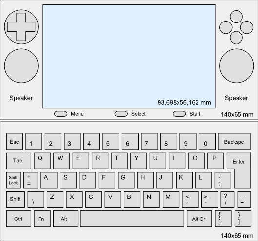
mypandorall2.png
Have you drawn this out to see how it feels?

The analog controls look like they would feel okay but how about the dpad being jammed right under the shoulder buttons? Your hands will not be centered around the console to balance the weight in your hands and it will feel very awkward and you will drop the device. This is my opinion, please comment :)

Also, there is no way to make this thing smaller than the current Pandora. You are forgetting the LCD bezel under the plastic and if this was to scale, that dpad would have a diameter of no more than 15mm. This is even smaller than the DS lite which I find tiny. These custom redesigns need to be drawn to scale to have any merit.
 
Last edited by a moderator:
Great, two design threads! I only just saw this one - some nice designs here.
 
so many of these designs are freakin awesome. if there is one thing that would make the current design that much more awesome is curving the edges like http://img148.imageshack.us/my.php?image=p...kroundedku0.jpg

Im sorry but now that looks awesome.
only thing I would want more than that design is a swivel screen for tablet mode. tablet mode would be awesome.... lotsa awesome in my post....
 
aphexpusher said:
so many of these designs are freakin awesome. if there is one thing that would make the current design that much more awesome is curving the edges like http://img148.imageshack.us/my.php?image=p...kroundedku0.jpg

Im sorry but now that looks awesome.
only thing I would want more than that design is a swivel screen for tablet mode. tablet mode would be awesome.... lotsa awesome in my post....


I'm inclined to keep the original shape - that new render looks like a soap box. But yes, tablet mode would be... radical! Yeehaw!
 
Last edited by a moderator:
Considering the price point and speaking as someone who would expect to be able to replace his PDA and iPod with this device for day to day use, I would strongly advise the ability to either fold over the LCD to the back of the unit (if a full swiveling option to slide the screen over the controls was not possible.) Otherwise touchscreen use for such applications would be a rather cumbersome affair.... you'd have to support the screen with your hand, leaving the base of the unit mostly hanging. It'd be pretty awkward. I could see myself using the touchscreen to move windows around listening to music or surfing the net to some minor degree, but in doing so I really don't need the keyboard exposed and being able to hold it like a sideways or upright PDA would work wonders for such tasks. For gaming the default orientation definitely works better.

Of course, in such a situation there should be a software or hardware control to flip the display to match the way you're holding it.
 
DaveC said:
Well Ok here was my render of what it was going to be. This was actually what the Pandora was going to be at one time. It had a 640 x 480 VGA screen.
I hate to say it, but I actually like this design better than the new one. Really.

edit : After giving some thought about it, the ergonomy really would be a problem if you want to place analog pads.
 
Last edited by a moderator:
Stealth Bagel said:
you'd have to support the screen with your hand, leaving the base of the unit mostly hanging.
If it has a strong hinge and sensitive touchscreen, you won't need to do this.
 
Last edited by a moderator:
Back
Top