Concerns Regarding Pyra Branding


Its the opinion of the person who made it, i respect that.
Nice one but it's too wavy and organic  for  a steel brick like Pyra, philosopher font is still the be st IMO it fit the logo and give it some squareness.

I think these triangles are pretty and having them on action buttons would make them pleasant to look at and to touch.

Some graphic label like that would be cool but with recognizable forms like earth/wind/water/fire.
 
This looks kinda cool...

PA_HGlass.jpg


=~. O =

I agree, think it would be a nice touch to use as a subtle repeat border, or damask type background ... like this mock up 

2llggef.png
 
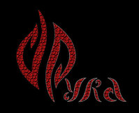
I really like all of the ideas and I updated one a bit. My idea is to distinguish "Pyra" text and logo but at the same time make them appear as one.


Red color is obvious and the cube pattern is sort of a tribute to Pandora.

Pyradora.jpg
 
This idea is trying to use the elements of the logo, to create the text from negative space

2nv6qh0.png
 
I think doing a circle of the flower/organic  PY  RA  is better than a border.  One is militant and rigid, the other flowing.

Also mixing an ambigram logo with latin letters always struck me as something thats just short of excellent.

Because if you cant flip and have the _same_ meaning then its not optimal.

And if you cant read pyra, or _the whole of what you are trying to convey_, then that questions the ambigram to begin with.

We have been over that, and there has to be some basic readability that doesnt include quesswork.

If its a p, then it cant be _just as likely_ and e, it has to have some p-like quality to it, albeit artistic if thats the intent.

Because if what you are after is pure readability, its a non-slippery slope directly to a basic font.

I may not enjoy the design-language, but on the flip side i do see what was done. The philosopher font just makes mockery of greeks and germans.
 
Oh boy!  Are we redesigning the logo all over again?

*This horse was beaten to death long ago*
 
Last edited by a moderator:
Oh boy!  Are we redesigning the logo all over again?

*This horse was beaten to death long ago*
Ha :)

I don't think so, as you say it's done and done.

More just some thoughts on what could be an accompanying font for the textual use of Pyra ... which I don't think is set in stone yet.

Don't think either the text for Pyra on this board logo or the pyra-handheld.com site is planned to be the final font
 
Who wants to change logo?


I don't think anyone does, aside from purplegoat in original post, but I think everyone knows the logo has been decided some time back
 
Ah yes you right, alternative or accompanying logo idea there I forgot that one...


Have to wait to see what ED is saying on potential for using multiple logos, not sure if that will come to fruition.


Though true say some brands do use multiple, like Adidas with their 3-stripe-triangle as well as their older 3-leaf style logo.


I think you probably need to have well established your brand and recognition before going down that route though myself, for something new on the market I think it's best to keep a single one and get it out there and recognised
 
I think its the opposite for something that is small, in competition with the bigger companies the "exposure-noise is silence" approach to marketing doesn't favour the smaller player. Branding is something done by big companies that can afford advertisment, not only is that different from how the pandora has operated, it is diamentrally opposite.

Similarly, diversity and choice is squarely in the centre of what the pyra offers in all other aspects.

I am not saying the current logo is bad, it is just bad for some people, and that makes it a bad choice overall to enforce on everyone, because partly that means a great deal of people will pass up buying the device over something that is just unfortunate.

That is what i understood the thread-starter to mean, at least thats what i read out of it.
 
Last edited by a moderator:
I believe that was purplegoat's point in his initial post too... That a dislike of the logo was enough to cause him to swerve the Pyra altogether.


To me that sounds a bit extreme, but of course each to their own.


Trouble is, on the actual device itself, you can [surely?] only have one logo, and as the saying goes, you can't please all of the people all of the time.


I reckon even purplegoat would finally cave in and get a Pyra eventually once it's released and shown in all its powerful glory :) even if he don't like the logo on the lid.


...when you using it you wouldn't have to look at logo anyway eh.


Or...put a sticker on it
 
Just about every console i can think of has been released in a japan only variety. Some also differing with the base model based on market.

I understand the sentiment very well, but then again im one of those people that care about that sort of thing a lot. Good design sells, and good decisions can weigh up for bad ones. It doesnt answer any questions someone have that they are considered an extremity. It is just alienating. The changes made to what the final pollvote winner was, were more substantial than the margin it won by...

The pyra commands a fair bit of money, outside of common impulse buy territory, that preposition has to represent value for those who purchase it.

Even if you do, it is not enjoyable having to resort to hacks. Rationalizing something is natural when its very different, you cant help but notice the design is going to get noticed, if not by yourself, then by others, which people care about. The pyra isnt mainly a design only product, so left to do its own thing without swaying people away it has a sound place in the market.

However I have trouble understanding why "this is the way it is", doesn't support a different option, if that option financially supports itself and then some. Is that what people think isn't going to happen?
 
Last edited by a moderator:
Back
Top