Concerns Regarding Pyra Branding


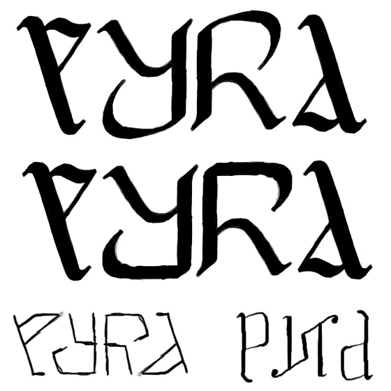
I still like those ambigrams we did months ago.

Like this one:

pyralogo13.png


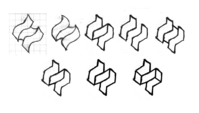
Since the logo itself is also an ambigram, that would allow a full ambigram logo+name.
 
The type used on the main Pyra site is pretty decent I think, this one

Logo.png


It's kind of simple but not bog standard font.

Not sure what font it is or if something someone made themselves?

Also liking this new font on openfontlibrary called Robotech-GP

2aipsp5.png


Nice and bold ... but perhaps not very [3] fits in well with the logo :)
 
Last edited by a moderator:
cool ideas t4b and binky

fzero I also like that font but the logo would have to be reworked for it. it's actually promising tonally though, IMO
 
Yeah I get the calligraphy pen style, but if I'm honest I don't actually know the correct use of them, as in when you should tilt the pen or not :)

I do love calligraphy though, should really practice it myself.

So on that type, the pen nib is horizontal throughout, apart from those 2 line strokes, where the pen nib is tilted 45 degree anti-clockwise...

...But I didn't know that was the correct way of doing it, which is why I guess I should learn it.

[i gave up on fountain pens early on in school and used biro, the nibs on fountain pens scratching on paper had a nails-on-blackboard effect on me]

Still, having seen purplegoats examples, I do prefer the original one still.

As I suspected, the balance looks wrong when the ending line is not a thick line
I think that if you look at older calligraphy, you will see that the tilt is the same on most lines. That is something that many modern fonts have gone away from with horizontal lines. But the thicker lines are in the positions they would be if using calligraphy.

So on the p in old days the horizontal part would be thick. Some would solve this by having the letter go not horizontally in, but at an angle.

The direction of the tilt most likely comes from what is comfortable to write with the right hand.

One could of course go away from conventions when designing the font, but one would have to give it careful considerations, since it should not just look randomly. The font should also be extendable to the rest of the letters, for future use.

/Your friendly neighbourhood Ewok
 
I still like those ambigrams we did months ago.

Like this one:

Since the logo itself is also an ambigram, that would allow a full ambigram logo+name.
That looks absolutely terrible.
I'm not proposing to use that specific style of font, you can make ambigrams in many font styles.

Here are some other examples from the old thread, just for inspiration :

pyralogo9h-normaljrk57.png


pyra-rotsym.png


pyralogo9e.png


2iitq93.png


pyra2.PNG


t19m.png


PyraVersion2.jpg


pyra-pixel.png


v5l8v4.png
 
They are some nice one's, but they all have one problem: They don't really fit the logo.
 
This one fit well:

mini_141019025646287761.png
 
Last edited by a moderator:
<edit>No it doesn't. Not in my opinion.</edit>

dOverP.png

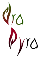
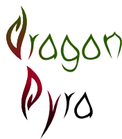
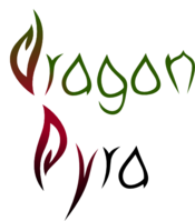
I polished my idea a bit and noticed I could copy the "ra" letters for the beginning of dragonbox... The dragon-green is a bit more of an experiment than the rest.

RFC.

dOverP.svg.zip
 

Attachments

  • dOverP.svg.zip
    2.2 KB · Views: 134
Last edited by a moderator:
Some more letters:

Small bitmap: dOverP.png

Larger bitmap: dOverPL.png

The n isn't really good yet...

This is actually fun, I should make stuff like that more often.

dOverP.svg.zip
 

Attachments

  • dOverP.svg.zip
    3.6 KB · Views: 138
Ok, well I had a bit of free time this morning so I decided to redraw the lettering from one of the ambigrams.

Very nice! Similar style to the logo and an ambigram to boot. Fairly readable, too.
 
Idea.  Because the logo looks good, and many of the ambigram fonty names look good, but none of them look good together, why don't we just stop considering these two things to be shown at the same time?  Just one of them could be on the lid, and on the "start" button, while the other one could be on the top of the forum, and prominently featured on the box.

Another reason that the icons look awkward beside above or below the text is that they're different wordings of the same thing.  "Dragonbox Pyra Pyra."
 
Last edited by a moderator:
Back
Top