Concerns Regarding Pyra Branding


There arent that many ambigrams that are also emblemic, they are mostly fonts, so they need a bit of flare/imagery to make them rememberable and distinguishable. 

Of the ones that are, they could be more dragon or flamelike. Some conjure up images of retro 60s or scissor parlour.

For a "dp" or "DP" it would have to have a font next to it atleast till the design settles in. Above I tried to make something that works with the fonts people want.

(edit: come to think of it, some of the dps are emblemic too)

2aipsp5-3.png

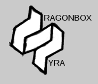
It is pyra twice in some sense, but

flammehav2.png

just looks imbalanced.

While the round flame dp with the font that matches looks ok in its own respect, it is very feminine for something ending up with very predominantly male people.

I understand the quality, but given a 100 years the people making logos wont come up with anything not activly despised by some party.

And thats good. By having more options you cater to someone who has an opinon, and thats all of us in some way or another it seems.

TL;DR Some people like this, some people like that. I think some choices is the best way to cater to more people.
 
Last edited by a moderator:
TL;DR Some people like this, some people like that. I think some choices is the best way to cater to more people.
You are missing the point that the logo was discussed and vote to death already and is fixed by now. Multiple logos for the same thing is a marketing catastrophe.
 
Like adidas? Or any number of brands.

The topic of the thread is this, and i quote from firstpost:

I was thinking about it earlier and I'm already on the fence about the Pyra (price) and the branding is so bad I'm leaning toward not getting it.
That is a problem. It is alarming, and i agree. Yes i like it for the technical side, but people shouldn't be dissuaded by branding.

Maybe there are people that actively love it, maybe it will win design-awards, if it can win over those people thats good, still, that doesn't answer the question for those that dislike it.

And dont get me wrong, if someone likes it and it adds value for them, super. For me its the opposite, and im concerned moreso with selling more units, because that is a net benefit whichever way you look at it.

Landing on something that makes sense in that respect, be it in any sense, is something that you cant directly consult your way to.

Voting on a logo without the font, or in this case, with many different fonts that you are meant to not vote on, makes for a problem when you want to actually pick one.

Any visual combination, be it this that or the other, has to make sense. If you just want to have _one thing_ then you could argue that point, otherwise that is pretty arbitrary.

The winning logo only won by a small margin over nr2. Which is to say yes, you can still get the nr1, but it doesn't mean the sentiment that made nr2 almost as popular just vanishes once nr1 wins.

It is extremely hard to meet demands when you are given an arbitrary name to work with.

Ideally it has something to do with fire, dragons, geekery.

And people like things like ambigrams, low-fi, romanticised, organic, etc.

Curiously, nr2 in the poll had nothing to do with either of them. But that didnt matter to me (it does), the deciding factor for me was that it had nothing to do with nr1.

Depending on your demographic, the mileage varies, but some things are good, and some things are bad, by themselves.

People are different, and thats not about to change. Choice is very great in the foss world, and that is a strength. I see your point about brand unity, but that is assuming you are uniting anyone to begin with.

Design by committee is no way to overcome this.

Its not the vote that is bad, its bringing things to the table bit by bit with no foresight or overview that fails.

1. Pick a name with no logo to go along with it.

2. Pick a new name as an addition to name one, since name one was more popular, but couldnt be used alone. Add name two to name one.

3. Pick a logo without having a font to go along with it.

4. Pick a font

To illustrate what that looks like. https://www.dragonbox.de/en/pyra/194-pyra-t-shrit.html

For some people, maybe thats the shirt they want to wear, what do i know.

Now here am I, wanting to purchase and wear a pyra shirt. My money is just as valid as anyone elses.
 
Last edited by a moderator:
I still want a Pyra shirt, but would prefer a polo over tee.

just the small logo on chest and on the shoulder/sleeve ... with PYRA written on the back collar baseline of the back.

Chances of that cropping up on the dragonbox shop? :)

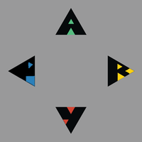
I was just messing with some type for Pyra, using triangles, started off wanting to keep really minimalist and somewhat representative of dpad directions [but yes, the text didn't lend itself for a 'left' arrow :) ], then started cutting out the whitespace using smaller triangles, then added more colour... here's the progression anyway :)

112br0w.png
 
Last edited by a moderator:
I still want a Pyra shirt, but would prefer a polo over tee.

just the small logo on chest and on the shoulder/sleeve ... with PYRA written on the back collar baseline of the back.

Chances of that cropping up on the dragonbox shop? :)

I was just messing with some type for Pyra, using triangles, started off wanting to keep really minimalist and somewhat representative of dpad directions [but yes, the text didn't lend itself for a 'left' arrow :) ], then started cutting out the whitespace using smaller triangles, then added more colour... here's the progression anyway :)

[snip pics]
You did quite a good job with the design, FZERO, but there are a few issues with the contrast.  If the contrast between the colors was tweaked, then it would look even better. 

-Glyph Reader
 
@comradekingu: the point of a logo is that it's a memorable and recognizable symbol to represent something. One way to help make something memorable and recognizable is by repeating it and using it in many different places. If you have multiple logos, you're basically cutting that effort in two (or three or K if you have K logos).

Of course if you're just talking about something like community-designed desktop wallpapers or something like that, sure, why not have 1000 different logo designs. But in the "official" material -- i.e. ED's websites, on the device itself (hardware and software), its packaging, flyers, t-shirts, and so on -- I think sticking to one logo is best.
 
The round flame is a nieche logo for a nieche object, however i think they are two different nieches.

If you have a logo that someone cant work with, then you are shunning that piece of the market for no good reason.

Misrepresenting those people doesnt bring anything good, its a loss.

Same thing with the name, its dragonbox - pyra, not without its compromise, but at least something people can live with.

Art by repetition is, to some speculative, but it works for brutal and industrial design.

In that respect, starting with an original design is key, not even the pandora logo is that.

You will have less circulation going with a logo in particular that many people dont like, because they wont be wearing t-shirts et cetera.

Everything else in the linux|gnu world is freedom of choice, best of breed.

Try many different things and see what flies, money talks. Multiple ideas are on the board already.

Its dp, dragonbox - pyra, pyra, in many different colour variations.
 
Last edited by a moderator:
Nice one but it's too wavy and organic for a steel brick like Pyra, philosopher font is still the best IMO it fit the logo and give it some squareness.
 
No, it is the exact way that it should be. Because the logo is like that. If you dont like it, dont, but dont change it into something nobody likes because that is more palatable.

Edit: I think http://boards.openpandora.org/uploads/post-10616-0-36453500-1413631712.png would be very good for a japan only version of the pyra. Just about every respectable console has had one of those.
 
Last edited by a moderator:
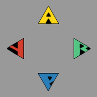
I think if the R had a full square cutting into the right part instead of a triangle it would look more R-like. There is the issue that a and y are part of pyra, and then you run into abxy bayx problem territory

abxypyrazero.png
 
Last edited by a moderator:
No, it is the exact way that it should be. Because the logo is like that.
That's your opinion and IDGF but art is about mix of different things and find a balance not about  placing side by side things which look alike.

If you dont like it, dont, but dont change it into something nobody likes because that is more palatable.
What are you talking about? Philosopher font isn't only more palatable it's like it was made for this logo and a lot of people do likes it here and on the former thread.

FZero's triangles would look great on the action buttons.
Anything but roman letters is good : )
 
Last edited by a moderator:
I think if the letters are colour, and the cutouts are black it makes it more visually pleasing. Triangles only was the original focal point to bring attention to, so if it isnt then it can be reversed.

I used one square above which i dont think did much. I find the p easier to understand.

nr7.png

I think maybe the bottom one would be a better P, and the left one is a better y, since then the p isnt the wrong way

nr8.png
 
Last edited by a moderator:
Agree that the square would make for more obvious readability ... but then completely lose the original idea of using just triangles, for the overall outline and the negative spaces.

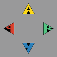
Here's another take at these letters as buttons, I've tried something with the [R] which is not ideal, but does use the same triangles still.

It's a pretty abstract [R], sure :)

And I'm not keen that I've got the outside tip of the triangle black/negative space here, whereas on the other 3 buttons/letters that is part of the fill

dqiw5h.png


... And with some wonky letters, like the chip :)

amv3h4.png
 
Last edited by a moderator:
Just to clarify guys... I was just doing the ambigrams for fun, not as a serious consideration. I agree that the logo and ambigram together is 'too much'.


I'm actually one of the people who think philosopher font would be a great choice


=~. O =
 
Back
Top