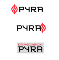
Concerns Regarding Pyra Branding


thank you! if it was unclear, in a final version all lines would be vector paths and see a more similar (clean treatment). that was just a sketch.
I like yours better BECAUSE it's unclean and a bit grungy - thumbs up! Of couse a clean look like Androids new Material look would be somethin else. Its very tasty - jummy ; )

Edit: Nobody is angry at you. Sometimes you gotta flame, thats all xD
 
Last edited by a moderator:
thanks and lol

L for amusement, I don't think it matches the tone but fuck it

edit: + clean normal version.

pyral2.png

pyral.png

pyralogore4.png

pyral2-1.png
 
Last edited by a moderator:
I think I recognise the filled in "flames" from some other companys logo. But I can't remember which.

So that may be protected.
 
I, too, have the feeling that I've seen the newly proposed logo somewhere before. It feels very familiar in a rather boring sort of way :unsure:
 
I don't think it's owned by anyone, but agreed. scratch it out, still I think it's funny with L styling
 
I too like your new letters.  They look original.  Kudos!

Like others said, no one is angry  at you, just your arrogant first statement.

Welcome to the board by the way :)
 
Last edited by a moderator:
thanks Shenmue. I took it from a sketch so they are indeed original!

I've been thinking about it and in english I don't like the name Pyra (pie-ra, like Pyrex or pyre) but Pyra (peer-ra) sounds great. I don't know if that's one way it could be pronounced. If so, I take back everything I said and it's a great name.
 
'Peera' is the way ED and most Germans pronounce it I think.  Personally I haven't got out of the habit of thinking it pronounced like 'Pie-ra', but I'm British so I'm naturally lazy in these domains.

I really like your new font by the way.  Less keen on the new logo - while the existing logo isn't my favourite of the logos I've seen designed, it was the best of those chosen for the shortlist, and I like how it includes the 'DP' name.  And it's a settled argument IMO.  Font though, very nice!  I like the contrast been the cursive strokes in the Y and R and the boxy neat overall design (although I worry that the R and A look pretty similar from a way away).
 
'Peera' is the way ED and most Germans pronounce it I think.  Personally I haven't got out of the habit of thinking it pronounced like 'Pie-ra', but I'm British so I'm naturally lazy in these domains.
The 'ee' sound would short, with two 'ee' it looks long to me, but that might be because English isn't my native language.I think French people would usually pronounce it with a short eee sound too.

But lots of German speaking people would not pronounce an eee sound but they would pronounce the "y" in the usual German way, i.e. very similar to umlaut u ü. Like in "Xylophon", which you can listen here: https://dict.leo.org/ende/index_de.html#/search=xylophon
 
glad to hear I just didn't understand how to pronounce it. Levi you also like the new dp logo I put up? If so, why? looked at it again, I don't like it either

I'd also like to suggest maybe a smaller change to the logo, attached, just to clean up some slightly awkward shapes

post-3032-0-38788800-1413574978.png
 
Last edited by a moderator:
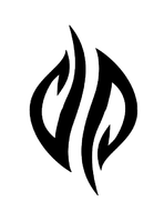
That bottom logo loses the clarity of letterforms though for me... Not seeing the dp in it. It reminds me of something else too but not sure what. Maybe Nescafe Gold Blend adverts, which used to show a coffee bean like that?


The font Sony and kiga have posted here is ok, like the little serif flick on top of Y and base of R...


...but the A looks backwards to me, to suit the other 3 letters shouldn't the left line be heavier?
Actually no!

Fonts with thicker lines are designed around the ide that they are drawn with a pen. The tip of the pen is not round, it is flat.

The pen is a little tilted, which means that lines drawn in different directions get different thickness. If you compare the Y and the A, it is very clear that lines in one direction are thin and lines in another direction are thick.

This way the font imitates hand drawn letters.

/Your friendly neighbourhood Ewok
 
Don't know if it was mentioned, but I think the last design that ED decided on went to Taylorpark, a professional artist, who does a bit of cleaning up.
 
I really like the cleaner logo you posted. If you look at the pandora logo at the top of the forum, its simple and looks better next to the name. the current Pyra logo is cool by itself, but it looks like it was never intended to look good with the Pyra name besides it (compare it to pandora). anyways, nice work and I hope pyra ends up with something closer to the cleaner logo.

glad to hear I just didn't understand how to pronounce it. Levi you also like the new dp logo I put up? If so, why? looked at it again, I don't like it either

I'd also like to suggest maybe a smaller change to the logo, attached, just to clean up some slightly awkward shapes
 
Don't know if it was mentioned, but I think the last design that ED decided on went to Taylorpark, a professional artist, who does a bit of cleaning up.
I didn't know that, thanks for the info. I can rest  :)

I really like the cleaner logo you posted. If you look at the pandora logo at the top of the forum, its simple and looks better next to the name. the current Pyra logo is cool by itself, but it looks like it was never intended to look good with the Pyra name besides it (compare it to pandora). anyways, nice work and I hope pyra ends up with something closer to the cleaner logo.
I'm glad you like it! I like it too (as opposed to the dp I posted with it) and definitely agree with your (now bolded) comment
 
Last edited by a moderator:
Please can we stop using the banner at the top of this page as a benchmark?

The gradient sucks, the font choice is uninspired, but the logo itself is absolutely fine.

Its only supposed to be temporary

The chances of coming up with a new logo that everyone agrees is better than the current one are tiny.

Ditto the name. Debated, doodled and discussed to death. Its time to move on.

What we need is a font/style for the name that:

  1. Looks nice
  2. Is legible
  3. Fits in well with the logo
 
That bottom logo loses the clarity of letterforms though for me... Not seeing the dp in it. It reminds me of something else too but not sure what. Maybe Nescafe Gold Blend adverts, which used to show a coffee bean like that?


The font Sony and kiga have posted here is ok, like the little serif flick on top of Y and base of R...


...but the A looks backwards to me, to suit the other 3 letters shouldn't the left line be heavier?
Actually no!

Fonts with thicker lines are designed around the ide that they are drawn with a pen. The tip of the pen is not round, it is flat.

The pen is a little tilted, which means that lines drawn in different directions get different thickness. If you compare the Y and the A, it is very clear that lines in one direction are thin and lines in another direction are thick.

This way the font imitates hand drawn letters.

/Your friendly neighbourhood Ewok

Yeah I get the calligraphy pen style, but if I'm honest I don't actually know the correct use of them, as in when you should tilt the pen or not :)

I do love calligraphy though, should really practice it myself.

So on that type, the pen nib is horizontal throughout, apart from those 2 line strokes, where the pen nib is tilted 45 degree anti-clockwise...

...But I didn't know that was the correct way of doing it, which is why I guess I should learn it.

[i gave up on fountain pens early on in school and used biro, the nibs on fountain pens scratching on paper had a nails-on-blackboard effect on me]

Still, having seen purplegoats examples, I do prefer the original one still.

As I suspected, the balance looks wrong when the ending line is not a thick line
 
Agree with Binky.

We should perhaps consider some typefaces now.

Purplegoat's one is nice, I like the way those little curve bits look ... perhaps could get one onto the [Y] char too.

Also, as mcobit said, Traylorpark is doing the final touches, ED did mention that in previous logo discussion threads, forgot about that, look forward to seeing how that does end up, and confident it will look real good once he's done his thing
 
What about separating the logo and adding "agonbox" and "yra" to the parts in a slightly flamey but legible font?

I attached a very quick mockup (I didn't do "agonbox", just "yra", but should be enough to know what I mean).

Edit: And when I say "quick" I mostly just mean "terrible quality and I'm not an artist anyway"

dOverP.svg.zip
 

Attachments

  • dOverP.svg.zip
    2.7 KB · Views: 151
Last edited by a moderator:
or like this? (Again, a dodgy mockup, and the font isn't quite right)

pyra-logo1.png

I should dig out the custom flamey lettering I did a while back
 
Last edited by a moderator:
Back
Top