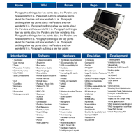
The mobile view page is as minimal as functionality permits. The software category is going to be reduced significantly. Just about every repo entry is on the chopping block. Colour codes for grouping is not yet implemented.
Having something that works means it is supported in mediawiki, not buggy, maintainable code and little markup, makes good use of space, has good SEO, is good in any browser, works for blind people, and within our ability; this is it for the time being.
Come to think of it, someone did throw them together in a heap, it was me

Its important to have something that visually separates each category, which is where the blue tile-set comes up a bit short. Dont really know what to do about them, other than they need to be there for the mobile view.
In desktop modes all those are replicated by the side-menu, so its a bit daft to list them again. Problem is it they often get overlooked there because people are used to that menu having nothing useful in it. Sidemenu in mobile mode isnt implemented yet, but thats not a showstopper. If all the bugs get ironed out i would like to see mobile mode as per default on the wiki.
Having the wiki double as frontpage would also be nice. Even if we funnel a lot of effort into building a good website now, its just bound to be outdated sometime in the future. Wiki is secondary in many aspects, but its great in terms of distributing power. ED doesn't scale that well. He is less people and has other things to do than oversee/implement changes.
I dont really believe in minimal, it usually means lackluster form instead of function. Utilitarian is what works.
The OP frontpage has some features still not implemented on the wiki, but per every n+10 number of things thats wrong with the first, there is only n missing on the latter.


