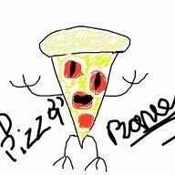
Anyone wanna analyze my spriting?


I've put over 80 hours into Aseprite, and this is probably the best thing I've ever come up with:

View attachment 30605

At least it is good though, right? Or maybe not? Go ahead, I'm not afraid of criticism. Not when I have Wendell Best, a.k.a. the Best in the West backing me up. ;)
Thanks for the post JDTAY.
I didn't know this was a thing, I'm going to have to install and check out Aseprite!
I have been using Flipnote studio 3d on my 3ds for my animated GIF art projects.
But if I end up liking Aseprite, I may end up doing this on my pc :happy:!

Art wise, If your sprites are small in your game than they look great (you don't want to over clutter them), other wise I would add more detail.
Also sense we are in a art critic thread, can I get some on mine?

My latest Gif made in Flipnote:
7t7u1xH.gif

some don't take me seriously for this but for most of my stills I end up using MsPaint, no joke.
My Latest MsPaint:
Z03fcoj.jpg

These two are more jokes than artxD!

GT1woG0.png

U4oxyAn.png

MsPaint Pro tip / tutorial:
Step 1: open MSPaint
Step 2: Save and change format to Mono Bitmap
ha9cy1g.png

Step 3: save it
Step 4: Profit!
oB8Hycg.png
 
Last edited:
I should mention, I made some three color sprites for a potential GameBoy Color style roguelike that I might make. 20 by 20 pixels though, 'cause I like to keep things easily scalable to HD resolutions, and also because I don't want to accidently copy any real GameBoy Color art.

dsprite.png


Pretty snazzy, eh?
 
.. you are getting better at this JDTAY. Keep it up.

The hard part is telling which part of the sprite is the obstruction BASE on the "ground". This way you can have some overlap in the head, so it looks like you can walk up to something.

spritebase.png


So, for example, the soldier is a 20x20 solid block (much like chess), and can not walk any further up to the table, but would be able to walk behind the tree, like the Ninja does.
Your explorer, has a smaller spritebase (obstruction rectangle). This way he can walk up to things, but you need to take care that he does never put his head below the tree.

Of course, Good sprite management (print the sprites sorted by Y value) solves all these "conflicts"
 
it worked for the Borderlands series..
Sure shot! Also used on my TREEHOUSE game https://sites.google.com/view/fuedhq/th_avocado?authuser=0
But I have been checking uses of the black borders and I enjoy how they were applied on the likes of Golden Axe or Vigilante, like they double as a shadow since they are only at one side.
That lead me look for creative ways to use the border.
I have been looking at stuff like this guy do here and am interested in trying/learning, maybe that is also useful to people here.
Check him out, specially his tweeter duck banner and the Quick Finn piece.

I will add a still here
E8h9db0WUAMFzAj.jpg
 
The thought of doing a game with Gameboy Color style palettes is crossing my mind again. Tell me, who does this look like to you?
Outlines can go a long way for readability in an actual game, especially with a limited color pallet.
Most of the time you dont need outlines inside of a sprite though, save them for when you want to emphasize the separation of two elements. Removing them can also give you a lot more room for details.
edlargeisht.png
 
Hang on a second! Are you saying that ED has red hair? Damn my color blind eyes. Can't say its the first time happening to me though. I knew my best friend for nearly two years, thinking that he had brown hair, before he cracked a joke about being a "ginger."

(Or I'm just being color blind with your sprite)
 
I assumed it was a limitation of the palette used by that sprite. Better red than black or grey.
Perhaps, I guess that means the pants aren't brown either (I can kinda see that now). Ultimately though, I assume you're saying his hair is brown.
 
Back
Top