The Tournament Hub (Launcher)


Attached another design idea.

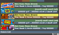
Thanks for the feedback so far. I like the banner images on these, but I think it's a bit sparse - and I think finding the game you want might require unnecessary time scrolling through screens.

Wondering if we could find some happy medium (maybe if I shrunk the banners down)

c4aui4.png
 
This is making me really thirsty for my Pandora.

I want to get involved with C4A and compete for the high scores. Great idea having this.
 
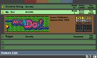
Okay, another layout idea. With the games being in a somewhat list style, but on selection, a details section drops out.

So you've now got 5 layouts to choose from. Thoughts?

c4aui5.png
 
I like the one in #40 the most, although the layout in #43 could be very cool as well (I imagine it with some kind of fancy smooth selection change animation).
 
I like #43. It as both some nice picture, and title of the game (so you can use a "first letter quick jump" when the list will be very big).
 
I'd recommend showing the details of the active C4A profile somewhere too...  perhaps with a button to launch the profile manager?
Yeah, I'm going to hopefully add a status page which will show you your profile name, let you access the profile manager and show latest scores, or your rankings for each game, or something.
That's a good idea too,  but I'd like to at least see the profile name on the main page,  perhaps at the top of the screen.
Okay, another layout idea. With the games being in a somewhat list style, but on selection, a details section drops out.

So you've now got 5 layouts to choose from. Thoughts?
 

There's something about #43 that really appeals to me. 

That being said I wouldn't mind seeing a variation of  #41 with scaled down banners, and two columns of games instead of just one.

 - Neelix
 
pmprog, plan ahead for WIP (work in progress); I'm rewriting the server, as some of the features I've wanted since day two aren't very easily done as-is, and its stuff I'm sure you'll go crazy with :)

ie: Right now its game-oriented, but not profile oriented; so its easy to get a list of top-N scores for a game, or to get profile-details for a given profile; but when you want to see 'personal top N' scores, or personal achievements or the like, that it can't do very well at all. Still, when you're getting to filling in code for a page like that let me know, and I'll get you the API function to use to get it, and then make it work brute force on the server if I don't have the more elegant way yet. Still, not too hard to get that stuff going, I just don't have it right now.

I really like the look of post#41 .. I like where you're going with this :)

I can track favorutes for a profile on the server if needed (ie: possibly, if a guy runs games from his r-pi and from pandora and from desktop, then does he have one set of favs?) or is it best left to the launcher (you), so you can have your own gamename and frequency count? be easier for me if you do it I guess, but it makes sense to me to also do it on the server (where the profile lives.)

Heck, I could almost make a API to set/get 'cookies', so you could store some tidbits of info on the server, withotu being 'well defined' by me, but I think thats going 'too far' :)

jeff

edit; oh, I think I saw a question up there about how you run stuff; well, if we end up dropping this into c4a-mame, then I can let you know hwo to run the apps; but its quite trivial; if you're talking about running non-mame stuff, ie: other pnd files, its also very easy.. libpnd can do it all for you, and I can let you know how, or you can cheese it; ie: given a pnd unique-id (which we can store on the server as part of the game conf file), you can look up the Exef line in the .desktop in /usr/share/applications, as one easy way; or given a filename, we can use libpnd to discover and launch it. I think minimenu or libpnd has a routine to load up the .desktop line and get the good bits out, so should be a no-brainer.
 
Last edited by a moderator:
I like #43.

But I also like the current layout...which is the new one which was just released on the Repo.

I DO like how #40 shows whether or not the gam eis installed.

I assume that, in #43 - the stars represent whether or not the game is installed, by the star being filled in or not filled in.
 
Last edited by a moderator:
Thank you to everyone for your feedback.

That's a good idea too,  but I'd like to at least see the profile name on the main page,  perhaps at the top of the screen.
Well, I'm half in the thoughts of using the blue bar across the bottom for that. Not 100% yet
That being said I wouldn't mind seeing a variation of  #41 with scaled down banners, and two columns of games instead of just one.
I might make a quick mock in a bit after I've got some food

pmprog, plan ahead for WIP (work in progress); I'm rewriting the server, as some of the features I've wanted since day two aren't very easily done as-is, and its stuff I'm sure you'll go crazy with :)

ie: Right now its game-oriented, but not profile oriented; so its easy to get a list of top-N scores for a game, or to get profile-details for a given profile; but when you want to see 'personal top N' scores, or personal achievements or the like, that it can't do very well at all. Still, when you're getting to filling in code for a page like that let me know, and I'll get you the API function to use to get it, and then make it work brute force on the server if I don't have the more elegant way yet. Still, not too hard to get that stuff going, I just don't have it right now.
I don't mind if I have to do some processing on the client-side. Stage 1 of the UI is to list the games, and let the user play them, then we'll start fleshing out the actual data on the screen.
I can track favorutes for a profile on the server if needed (ie: possibly, if a guy runs games from his r-pi and from pandora and from desktop, then does he have one set of favs?) or is it best left to the launcher (you), so you can have your own gamename and frequency count? be easier for me if you do it I guess, but it makes sense to me to also do it on the server (where the profile lives.)
It's a tough call. I think favourites sit better on the computer, from the perspective of if we had a mouse driven game, for example, you probably wouldn't play it often (or at all) on the Pandora, so you probably wouldn't install it, so showing up at the top of the list just clutters games you can and will play. I guess we can start it this way, then if people want to sync favourites, then we add it in later.
Heck, I could almost make a API to set/get 'cookies', so you could store some tidbits of info on the server, withotu being 'well defined' by me, but I think thats going 'too far' :)
Might be handy for later, but certainly don't need it for now :)
edit; oh, I think I saw a question up there about how you run stuff; well, if we end up dropping this into c4a-mame, then I can let you know hwo to run the apps; but its quite trivial; if you're talking about running non-mame stuff, ie: other pnd files, its also very easy.. libpnd can do it all for you, and I can let you know how, or you can cheese it; ie: given a pnd unique-id (which we can store on the server as part of the game conf file), you can look up the Exef line in the .desktop in /usr/share/applications, as one easy way; or given a filename, we can use libpnd to discover and launch it. I think minimenu or libpnd has a routine to load up the .desktop line and get the good bits out, so should be a no-brainer.
Yep, will look at this when I'm ready to launch games :)

I assume that, in #43 - the stars represent whether or not the game is installed, by the star being filled in or not filled in.
The stars are "favourites". I was going to "dim" uninstalled games (with the option to hide them completely). Favourites will one of the sorting methods, meaning you can push games you like to the top.
Cheers
 
Last edited by a moderator:
Thank you to everyone for your feedback.

I assume that, in #43 - the stars represent whether or not the game is installed, by the star being filled in or not filled in.
The stars are "favourites". I was going to "dim" uninstalled games (with the option to hide them completely). Favourites will one of the sorting methods, meaning you can push games you like to the top.
Cheers
In that case, I definitely like #43 the best.

I like the idea of pushing Favorites to the top...and that ability to hide uninstalled games.

I like the look of the layout on #43.
 
Last edited by a moderator:
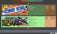
Another mock up for feedback (ignore that two are the items are "reversed", I was trying the banners on alternating sides, but it looked messy)

Thanks

c4aui6.png
 
Looks nice!

Actually most of what I saw here looks nice, so maybe you should keep alternate themes in mind while coding this, start with the one you prefer, and you can then later add other themes so people can choose what they prefer.
 
Thanks. I did think about multiple layout support, but I don't want to overcomplicate things at the minute. I'll see how things go.

The backend is working quite nicely so far
 
I really like that last one,  it seems to work well.   (Though for indicating favourites I prefer the stars to the text)

- Neelix
 
(Though for indicating favourites I prefer the stars to the text)
I'll still be using star icons for favourites, I just couldn't be bothered finding which tool I used to do it last time ;)
 
I did something!

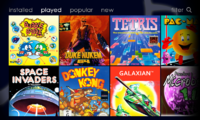
The layout is similar to the XBOX dashboard, because I think it displays the games nicely (big images) and I felt like the current layouts try to cram too much data onto one screen, while it only needs to be shown in parts or separately.

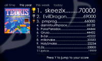
Therefore I would like to see a completely own screen for the full highscore table and only a small excerpt on the "home" screen. This also adds more, well earned, exposure to the top scores and shows them in a spotlight instead of a simple textual list like every other entrant.

Ideally things would be animated to some degree (every panel could be), like transitions between screens and scrolling of the games.

mockup1 is the general home screen

c4aui_mockup1.png

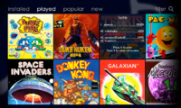
mockup2 shows how selecting a game looks on the home screen

c4aui_mockup2.png

mockup3 is the full highscore screen

c4aui_mockup3.png

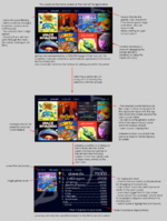
and here is an annotated version of each screen and how I imagine the program to work

note: the score display is ugly and would need to be aligned properly, also I think GUI hints can be placed in many places necessary

c4aui_mockup_all_annotated.png

also not shown is a screen to manage the user's profile, this would be accessed either using the menu on "mockup1" (add one item "settings") or by a combination of buttons
 
Last edited by a moderator:
Of what I've seen of them, I think I'm most impressed with foxblock's layout up above, I can easily visualise how that could work. My suggestion would be to add another tab for profile, be able to cycle across them with the shoulder buttons, and to be able to switch between that large banner view and a text list view with the press of a button. Also you could have a star in the corner of the banner of your favourites, and an "install now?" button on any games that were available but not installed yet.

I do like the idea of finding out your actual ranking with the press of a button though :)
 
I really like foxblock'S layout, too.


Seems to be easily navigateable with or without the touchscreen and has all the information.


Even reminds me on PND Manager a bit, which is a good thing :)
 
Another touch that might be cool would be if you hovered over a banner (prior to selecting it), that it cycled through a few screen shots, just in case you weren't familiar with the game?
 
Back
Top