The Tournament Hub (Launcher)


Wow, that's a lot of posts since I last looked. Unfortunately my long weekend is now over and I forgot to add my UI to my GitHub :( I need to rework some of it anyway.

My original plan was an all in one - basically an exact replacement for the current C4A UI. However, after Jeff informed me that he's built a new profile manager, that bit is unnecessary. So now it'll be listing and launching games - hopefully with an option to filter off games not installed; adding games to a "favourites" list for quicker access; and some scoreboard information.
 
Yes, perhaps I should apply our finally-agreed-upon filter rules to the json-get for the sorebaords, and then we'd all have the same rules thataway. Save you doing it in the .js you have now.


Summariuze the rules you have in place, and maybe I can do it?


I think the main difference was.. you just show the first occurance of any given person, and thats that?


jeff
Yup I essentially loop though the scores starting with the person at 1st position then I only print unique (c4a account) entries no additional entries by the same person get printed... When you do move to the DB version this can be done easy at the DB level with some simple sql like:

SELECT distinct(a.short_name)
, a.*
FROM score_table a
ORDER BY a.score ASC

Or something like that or depending on what language the back end is you could create a filter though doing at the DB level should be the fastest method all round.
 
Last edited by a moderator:
Yes, of course I know SQL ;) (and we all hate it, but sadly its not going anywhere fast :p )

I'll likely be replacing chunks with sqlite, as I'm rather fond of it; I've given up on mysql and msql, so for me I usually use postgres or sqlite3, depending how big the project is..

jeff
 
Kumaki.. be sure to grab the updated C4A-Mame I just posted; not much has _really_ changed, but a few tweaks to the launcher. I'll be adding some more games to it soon, so you'l;l want it.. otherwise, you won't be able to see all the games anymore :)

(yes, adding some good old retro, not just enabling homebrew; trying to please everyone :)

For some reason, I really want to get Burger Time in there. Side news story .. I really want a hamburger right now. Damn :)

jeff
Grabbed the file last night, Jeff.

Haven't had a chance to install it yet.  I was up till 2 in the morning, doing work for my client.

This is not uncommon for me...but I am busier than a one-armed paperhanger...there are days I feel like a one-legged man in an ass-kicking contest!

Yes, of course I know SQL ;) (and we all hate it, but sadly its not going anywhere fast :p )

I'll likely be replacing chunks with sqlite, as I'm rather fond of it; I've given up on mysql and msql, so for me I usually use postgres or sqlite3, depending how big the project is..

jeff
LOL, SQL is a pain in the butt.

I know a little SQL from my online RPG.

Speadsheets are another pain in the butt, even without SQL.  Especially accounting stuff.  It's a nightmare - which is why I have an accountant for my business.  I don't want to deal with all the numbers, and I'd just as soon pay someone to do it for me, and show me the crunched numbers.
 
Oooh, would I be allowed to use SQL? Just kidding, I have no idea how to access SQL in C++, I would imagine it would be quite horrible. (Edit: I actually don't mind SQL much though)

Not overly fond of JSON, but I think I've found a library that looks "clean" enough that I understand it, and would probably be better than any SQL library :)

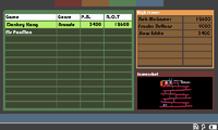
I was thinking of something like this for the layout on the "All Games" page - ignore colours and fonts for now, I'm just after feedback on the "three box" layout

c4aui.png
 
Last edited by a moderator:
I'd take it the SQL would be on the server side.
 
yes SQL would be server side anyway, everyone else would get the JSON feed.

SQL is great for data storage and retrieval and even dare I say it manipulation.

takes away alot of the pain of doing it with your chosen programming language.
 
I've designed some fairly large database projects with SQL, actually before I started my current position at IBM, I was mostly dealing with database design and data collection scripts.. It just seemed from pmprog post that he was thinking it would be on the Pandora side.
 
Last edited by a moderator:
It just seemed from pmprog that he was thinking it would be on the Pandora side.
I was just joking about that ;) People shouldn't expose SQL servers directly on the internet IMO. I suppose it's arguably just as secure as a website, but still, I think it's a bad idea.

Anyway, can I have some feedback on the UI please? Or am I solving a problem nobody has now that Jeff's added scrollbars? :)
 
I'd take it the SQL would be on the server side.


You'd be correct.


As best I know...there is no other use for SQL.


Now someone tell me I'm wrong, LOL


don't worry, I won't get offended.  But I know of no other use for SQL except on a server side.
Yes sql can be used locally for data storage on apps too lots of mobile phone apps use sqlite to store data locally, but mainly sql is used on servers.
 
Wow, imagine that.. open up a few SQL ports on a public internet server -- say a VPS just for fun -- see how long it lasts before the building catches fire :)

"hey guys, so my protocol is just postgress on port 1234"

<10 minutes pass>

* earth crashes into sun

jeff
 
Anyway, can I have some feedback on the UI please? Or am I solving a problem nobody has now that Jeff's added scrollbars? :)
Looks pretty tidy... but I'm not convinced by the idea of squishing it all on one screen.  As it is, the screenshot looks a little cramped (perhaps excessively so since it's in the wrong shaped box), and I think the highscores should have more space, since I'd personally like to be able to see the scores around my current best score, and where the leaders are in the same view (which by my reckoning needs at least 9 lines in the worst case).

If it was me designing it, I'd have two screens - the first being the list of games like you've currently got (I like how you show the user's best score and the system best score), and the second coming up once you've selected a game, showing the screenshot and the high scores.  It'd be nice to have extra details there like year of release, developer - I like having a bit of history behind my games, though I don't know how easy it's going to be to get that information.
 
I'd recommend showing the details of the active C4A profile somewhere too...  perhaps with a button to launch the profile manager?

Thought:  What's the plan on how to package this?  is it going to become the frontend packaged with C4A MAME or  will it be standalone and launch the C4A MAME PND  to start the selected MAME based games?    If the latter, then It should probably be merged with the profile manager. (or eventually include that as a function)

Thought:  If its going to be possible to navigate using the gaming buttons then it it would be worthwhile to make use of the guihints graphic set to indicate how to use the interface.

- Neelix
 
Looks pretty tidy... but I'm not convinced by the idea of squishing it all on one screen.  As it is, the screenshot looks a little cramped (perhaps excessively so since it's in the wrong shaped box), and I think the highscores should have more space, since I'd personally like to be able to see the scores around my current best score, and where the leaders are in the same view (which by my reckoning needs at least 9 lines in the worst case).

If it was me designing it, I'd have two screens - the first being the list of games like you've currently got (I like how you show the user's best score and the system best score), and the second coming up once you've selected a game, showing the screenshot and the high scores.  It'd be nice to have extra details there like year of release, developer - I like having a bit of history behind my games, though I don't know how easy it's going to be to get that information.
Well, there's nothing to say we can't have two screens - however, me immediate thoughts are if you're hovering over a game, you probably want to see it and maybe the top 10 (or top 9 and the user's entry if they are below 10th). We don't necessarily need the "R.O.T." column on the game list, but that was more indication of having a couple of columns.
Regarding the screeshot box shape, well MiniSlug is widescreen, and so is Microbes... Okay my dimensions probably aren't exact, but like I said, this was a layout suggestion.

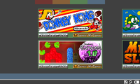
The other option for the menu is that I use the banner images from compo4all, and then delve into the game. See the attached image (though I dislike the amount of colours used in the score boxes, I don't think they fit, but they give the idea of what they're for). The thing I consider bad about this is that you have to scroll about in order to see what's available. Maybe that's not a major issue?

I'm wondering if it's worth having a "favourites" tab, or if it's easier just to have a "sort by favourite", and you toggle them in the main list?

I'd recommend showing the details of the active C4A profile somewhere too...  perhaps with a button to launch the profile manager?
Yeah, I'm going to hopefully add a status page which will show you your profile name, let you access the profile manager and show latest scores, or your rankings for each game, or something.
Thought:  What's the plan on how to package this?  is it going to become the frontend packaged with C4A MAME or  will it be standalone and launch the C4A MAME PND  to start the selected MAME based games?    If the latter, then It should probably be merged with the profile manager. (or eventually include that as a function)
When I started this, I was planning to have the profile manager within it, but then Jeff told me he'd already done one and wanted me to just make the game launcher. I guess to start it'll be a drop in replacement on C4AMAME in order to launch those games (Unless I can launch them through a command line? Jeff?)
Thought:  If its going to be possible to navigate using the gaming buttons then it it would be worthwhile to make use of the guihints graphic set to indicate how to use the interface.
Yes, primary design will be for "keyboard" input, but mouse support will be there too. I'm not sure about guihints. I think they'll look out of place in an obviously retro design. I guess they'd be no harm in trying thoughc4aui2.png
 
Oooh, would I be allowed to use SQL? Just kidding, I have no idea how to access SQL in C++, I would imagine it would be quite horrible. (Edit: I actually don't mind SQL much though)

Not overly fond of JSON, but I think I've found a library that looks "clean" enough that I understand it, and would probably be better than any SQL library :)

I was thinking of something like this for the layout on the "All Games" page - ignore colours and fonts for now, I'm just after feedback on the "three box" layout
Some feedback:

I like this approach. I'm assuming the selection cursor is in the big box on the left, and when you move it, the small boxes get updated. If you press B or Enter or something like that, the game gets launched.

The aspect ratio of the screenshot box is still a bit too wide (even for 800x480 games), so either it should have a bit more height, or the small boxes should have a bit less width. But that's a small detail.

Suggestions:

- Columns are now "Game", "Genre", "P.B." and "R.O.T". Maybe merge the two score columns to show the personal best as a large number and the world best in a smaller font under it. That makes room to add another column, "Rank" (which indicates the position of your best score in the ranking).

- Make it so that you can sort the list on each column, either by clicking on the column header, or with the keyboard with dpad left-right (or shoulder buttons), where the current sort column is somehow highlighted. Sorting on "Game" and "Genre" would just be alphabetically; sorting on "Score" could use the ratio of P.B. / R.O.T. to compare the rows (since you cannot compare absolute scores from different games), and sorting on "Rank" would be just numerically.

- Just showing the top N highscores is fine, but if you want to extend this, you could perhaps have a key to toggle focus to the highscore box, and then you can scroll the highscores with the dpad, and maybe switch between all-time and monthly, or zoom in on a highscore to get more information (I guess the only extra information would be the 3-letter nickname and the timestamp corresponding to that score, but perhaps you could add some derived stats about that player).

- If possible, it would be nice to also show the non-installed C4A aware indie games (greyed out or something), and if you select them, PNDManager gets launched with that game selected, so it's just a few button presses away to install it. That would probably require some small modifications to PNDManager (e.g. make it accept a command-line parameter to select a screen to show at startup).
 
Awesome! Yes! Great work!

Also, the open pandora logo at the start is squished :rolleyes:   sorry, I notice those things.
 
I like this approach. I'm assuming the selection cursor is in the big box on the left, and when you move it, the small boxes get updated. If you press B or Enter or something like that, the game gets launched.
The light-green boxes were the selection that you'd move up or down (mouse support to click as well), and yes, a button to start the game. Was also considering another button for more details - which maybe includes full score tables, game information and multiple ingame screenshots or something, and another button for launching the game
The aspect ratio of the screenshot box is still a bit too wide (even for 800x480 games), so either it should have a bit more height, or the small boxes should have a bit less width. But that's a small detail.
Again, this was primarily for getting the layout style. One other thing to consider is that, unless you want to break the flow, it'll have to remain the same width as the score table above it, and if that's too narrow, scores and names will be unreadable. So as much as it might waste some space, might have to anyway.
- Columns are now "Game", "Genre", "P.B." and "R.O.T". Maybe merge the two score columns to show the personal best as a large number and the world best in a smaller font under it. That makes room to add another column, "Rank" (which indicates the position of your best score in the ranking).
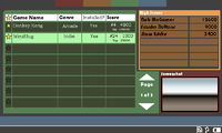
Attached a new layout design. I stuck "Installed" as a column, but I don't think that should really be there. I guess columns are still open for discussion
- Make it so that you can sort the list on each column, either by clicking on the column header, or with the keyboard with dpad left-right (or shoulder buttons), where the current sort column is somehow highlighted. Sorting on "Game" and "Genre" would just be alphabetically; sorting on "Score" could use the ratio of P.B. / R.O.T. to compare the rows (since you cannot compare absolute scores from different games), and sorting on "Rank" would be just numerically.
Yeah, rank over actual score would be good for that point of view. Sort orders is definately on the list
- Just showing the top N highscores is fine, but if you want to extend this, you could perhaps have a key to toggle focus to the highscore box, and then you can scroll the highscores with the dpad, and maybe switch between all-time and monthly, or zoom in on a highscore to get more information (I guess the only extra information would be the 3-letter nickname and the timestamp corresponding to that score, but perhaps you could add some derived stats about that player).
See further up about another button to go into game "details" including full scoreboards. Maybe if the scoreboard is too wide on the front screen, I show only the 3 letter names, and to see the full names you have to go into the "detail" page?
- If possible, it would be nice to also show the non-installed C4A aware indie games (greyed out or something), and if you select them, PNDManager gets launched with that game selected, so it's just a few button presses away to install it. That would probably require some small modifications to PNDManager (e.g. make it accept a command-line parameter to select a screen to show at startup).
I do plan on making them visibile/invisible by an option, launching PNDManager isn't a bad idea. Does PNDManager support command line to take it to a specific PND?
Awesome! Yes! Great work!

Also, the open pandora logo at the start is squished :rolleyes:   sorry, I notice those things.
Actually, that's just the recording that did that... the image is fine ;)

I'm I missing something is there a pnd to test?
Nope, not yet.c4aui3.png
 
Back
Top