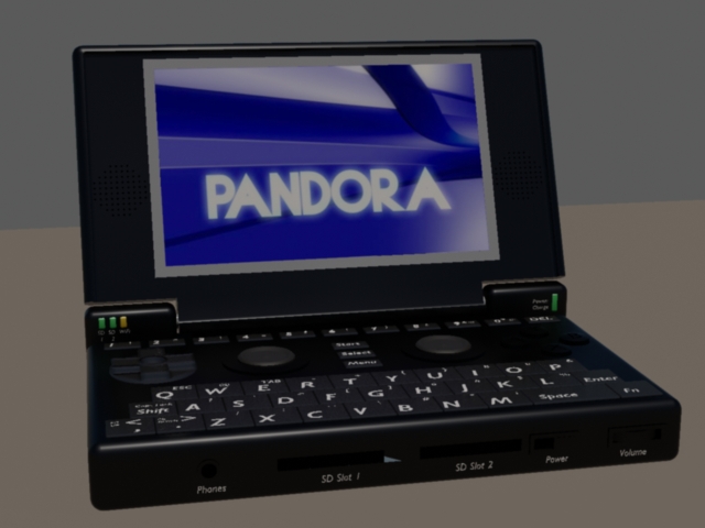
This is the layout for the beta board. I didn't have access to a couple of the parts (such as AV port and volume slider) for this layout so the first design will look like this. ED designed these changes based on a dimensional diagram I gave him from that PCB. There will be one more board revision to clear up any errors that could be found plus a finalization on component choices.
The volume control (a wheel for now due to ease of purchase) is jammed into the corner to allow a JTAG port to be accessible from the bottom without affecting the battery compartment.
What I have proposed for the final design is a volume slider more centered between SD2 and the edge, and the power switch moved way up on the right side of the unit. The slider is less deep and should allow me to fit a stylus in behind it running along side the battery, extending about 100mm into the body of the system. Injection molds have not been made yet because they are very expensive and they don't take as long to make as some of the lead times of other parts in the design! We are continuing to use rapid prototyping methods until everything is nailed down.
Also, the internal microphone is located in the right hinge area, next to the power/charging LED. The hole is at the top and front edge so that you could use it even with the lid closed, should the need to dictate notes come up.

It's not shown in this picture. That LED is to extend to the top as well so it can be seen with the lid closed, also not shown.
The Dpad is still unmodified but will change. The analog nub colors are still not changed and we all know they are silver with black pads in the middle. All of the silk screening for final character selection on the keys is not printed on the render either.
I investigated the possibility of four shoulder buttons but found it quite uncomfortable in the vertical configuration (as we are not extending controls out of the bottom of the case). A configuration in the horizontal direction was easier to handle but still not perfect and was obscured by way too many components on the PCB! There is a fair bit of supporting hardware to go along with the OMAP chipset. As you know, we have done what we can to make this a fairly self-sufficient device, free of cradles and such. There are lots of components crammed into the little space available around all the buttons. I can't place a bunch of parts under the main gaming controls because the plastic case has support structures to make sure this is a rigid and sturdy unit for even the toughest gamer out there. Having said all that, I took the liberty of running extra GPIO's to pads and placed them in the corners so that if some hacker wants to figure out a way to strap on more buttons, they have the pins at their disposal.

The current plan is not to provide the second audio jack. The AV port needs more room and there isn't enough space to stick it in the left lower corner. The only option is to move it up near the middle of the left side which puts it into the battery compartment and it doesn't make sense to shrink the battery down for this feature. The headphone part of the AV connector will be as close to the corner on the front edge as is practical without getting in the way of your palm, so a right angle connector will be the best solution here (for pocket use).
I don't think RED is currently a selectable color for product launch but perhaps we can have a selection of colors from most favorite to least favorite with the pre-orders to see if we get large enough grouping in select colors to make it worth doing a batch? We shall see.
I hope this was informative enough to answer any questions this picture created.


